The network for creativity
Join 1.25M professional creatives like you
Connect with clients, get discovered, and run your business 100% commission-free
Creatives on Contra have earned over $150M and we are just getting started
Back to feedPost

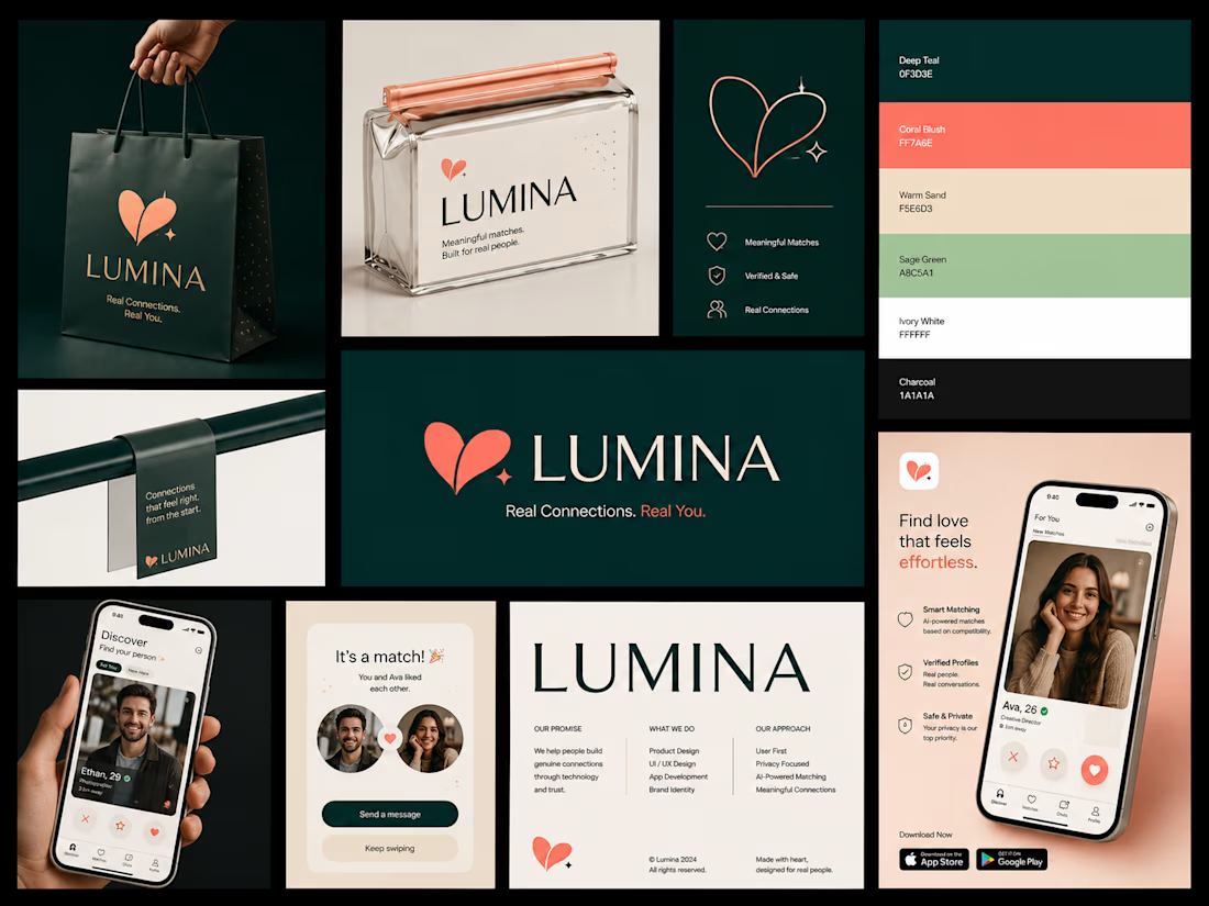
Brand identity for a dating app built around real connections. ❤️
Created a complete visual identity concept for Lumina, a modern dating platform focused on meaningful matches, trust, privacy, and genuine conversations.
I explored the brand from the identity level all the way into the digital product experience.
What I created:
• Custom logo and visual identity
• Brand color system and typography
• Dating app UI/UX concept
• Match, discovery and profile screens
• App store / promotional visuals
• Brand guidelines and messaging
• Custom mockups and presentation assets
• Responsive product direction
The visual system uses deep teal, coral, warm sand, sage and ivory to create something that feels more mature and premium than the typical dating-app aesthetic.
Designed with Figma, with the product experience shaped around the kind of clean, modern interfaces I build for Framer and Webflow.
Real connections. Real people. Better design.
#BrandIdentity #Figma #UIUX #ProductDesign #DatingApp #AppDesign #Framer #Webflow #BrandDesign #Contra



The network for creativity
Join 1.25M professional creatives like you
Connect with clients, get discovered, and run your business 100% commission-free
Creatives on Contra have earned over $150M and we are just getting started







Related posts


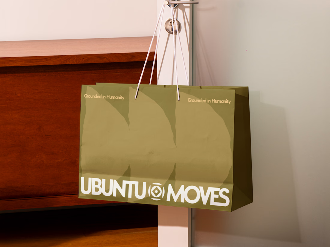
Grounded in humanity, made for movement.
Packaging and custom Framer website design for Ubuntu Moves, a wellness brand inspired by the belief that “I am because we are.”
Earthy colors, expressive patterns, and bold typography bring its sense of connection into the physical and digital experience.
Thanks @Can Girgin for the Framer development💫


The olive shopping bag with the wordmark split around that circular emblem looks great in the warm light, and the big tonal arches printed behind it add movement without shouting.

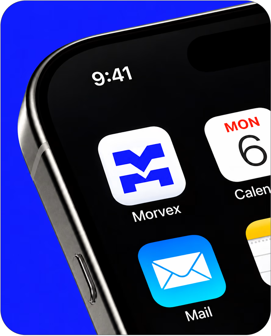
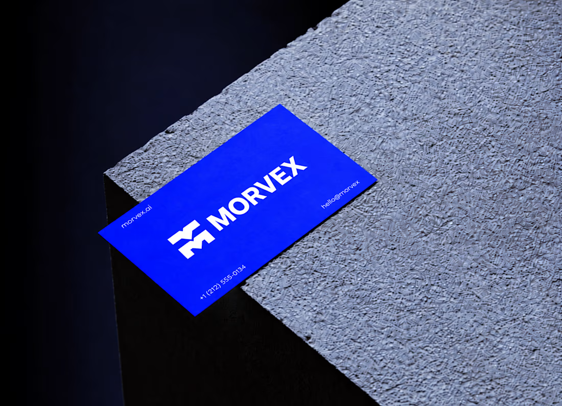
Morvex is a cybersecurity brand with a strong, bold visual identity. The idea behind the logo was to create something simple but recognizable, using a custom geometric M with sharp angles and carefully balanced shapes.
The identity brings together electric blue, bold typography, and a dark visual style to give the brand a modern, confident look. I carried the same design approach across the brand applications, keeping everything clean, consistent, and easy to recognize.




This is a really creative piece! I love how the visual elements come together to create something that feels distinctive rather than predictable. The composition, the overall visual direction, and the way the idea has been executed all contribute to making this stand out. It’s a...

NEOL. Making of the Hero
NEOL develops CuGlide™, a copper-based lubricant technology that reduces wear between metal parts.
I recently designed their website. The hero was the hardest part: two gears in contact, with a thin copper film where they meet. That's why I built it in 3D instead of generating it: AI video can't give that level of control and precision.
From the first draft to the live site.


Sleek work!