The network for creativity
Join 1.25M professional creatives like you
Connect with clients, get discovered, and run your business 100% commission-free
Creatives on Contra have earned over $150M and we are just getting started
Back to feedPost
Taste Test

Which Shopify hero section would make you explore the brand? 👇
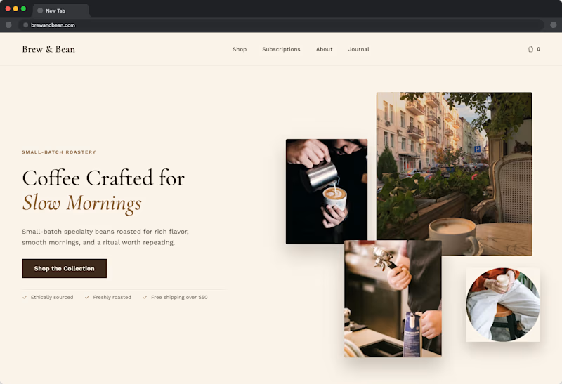
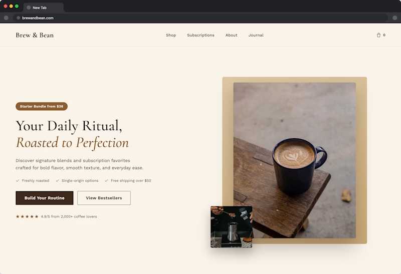
I created two hero-section directions for the same premium skincare store.
Version 1 uses an editorial, lifestyle-focused layout to communicate luxury and brand personality.
Version 2 puts the products, benefits, and shopping actions front and centre for a more conversion-focused experience.
Same brand. Same products. Two different approaches.
Which direction works better for you: A or B?
I would also love to know what influenced your choice: the imagery, product visibility, messaging, or CTA placement.
6 voted
60%
4 voted
40%
10 votes
Closed


Nice design !
Thankyou

looks great
Thank you! Really appreciate it.

I’d choose B; the clearer product focus and stronger CTA make it feel more conversion-ready.
Absolutely, B communicates the product and next action much more clearly. Thanks for sharing!

Went with B. The product front and center with a visible add to cart makes intent clear right away, where the moodboard in A is nice to look at but doesn't tell me what I'm buying until I scroll. CTA placement was the deciding factor for me.
Thanks! That makes sense. The clearer product focus and CTA definitely make B feel more conversion-driven.

B
Thanks for voting! B definitely feels clearer and more product-focused.

I’d choose A for this premium skincare brand because the lifestyle image establishes positioning and perceived value faster. I’d borrow one thing from B: keep a clear product-led CTA and one proof cue above the fold. That preserves the luxury feel without making the shopper work to find the purchase path.
The network for creativity
Join 1.25M professional creatives like you
Connect with clients, get discovered, and run your business 100% commission-free
Creatives on Contra have earned over $150M and we are just getting started

Challenges
View all


Related posts


Same content. Two completely different vibes.
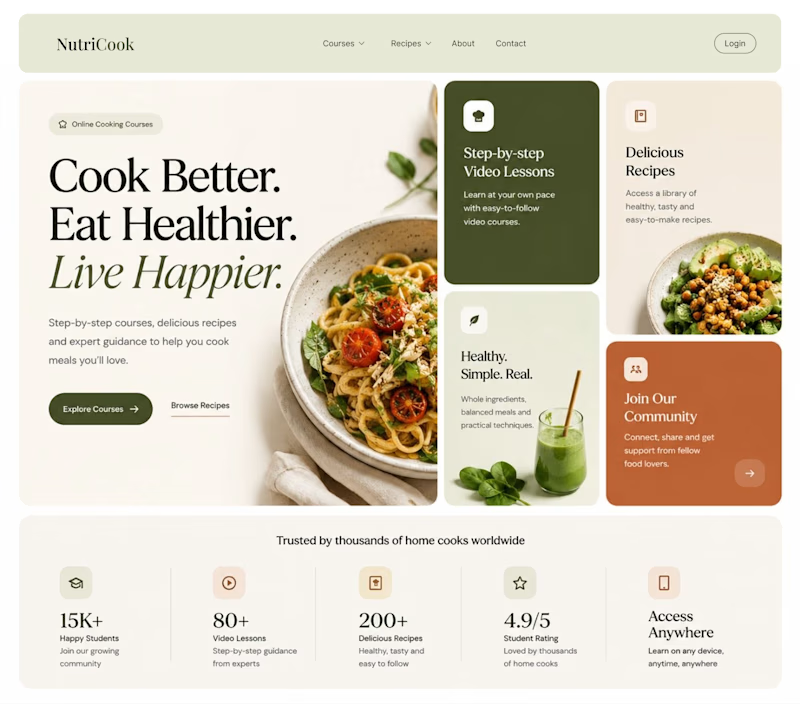
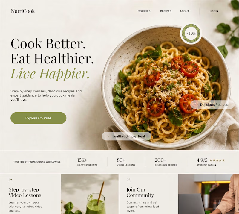
What happens when you keep the course content the same, but change the structure, typography, and color palette?
Two hero sections. One course. Two different visual experiences.
Which one would you choose? 1 or 2?
29 voted
41%
42 voted
59%
71 votes
Closed

Option 1 works well , the heirarchy and card layout on the hero is very smart

A or B? Two brand directions for a wellness practitioner. Drop your pick in the comments. Curious what you see first.
5 voted
50%
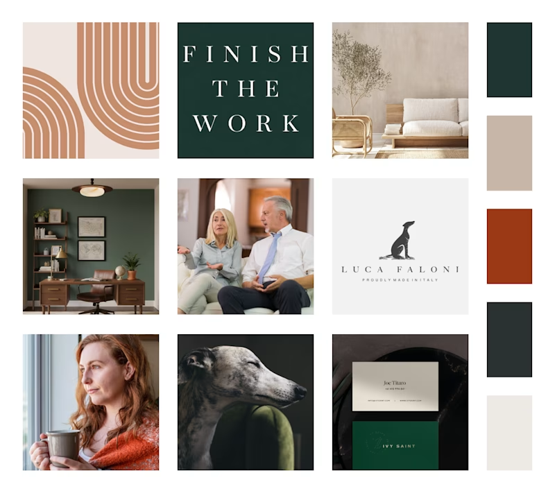
5 voted
50%
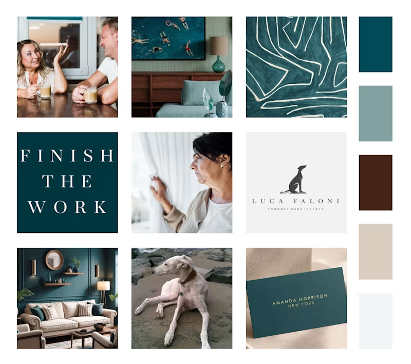
10 votes
Closed


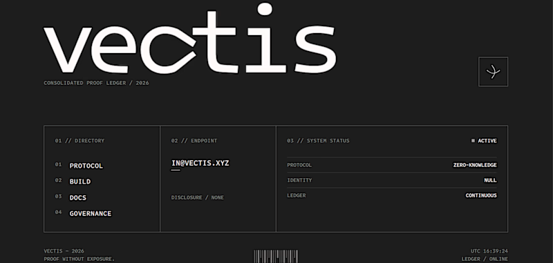
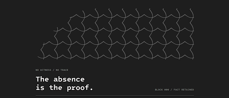
which one gets the domain?
Same brand.
Two different builds, two different agents.
One is carved and still. One feels alive and watching you back.


14 voted
56%
11 voted
44%
25 votes
Closed