The network for creativity
Join 1.25M professional creatives like you
Connect with clients, get discovered, and run your business 100% commission-free
Creatives on Contra have earned over $150M and we are just getting started
Back to feedPost
Taste Test

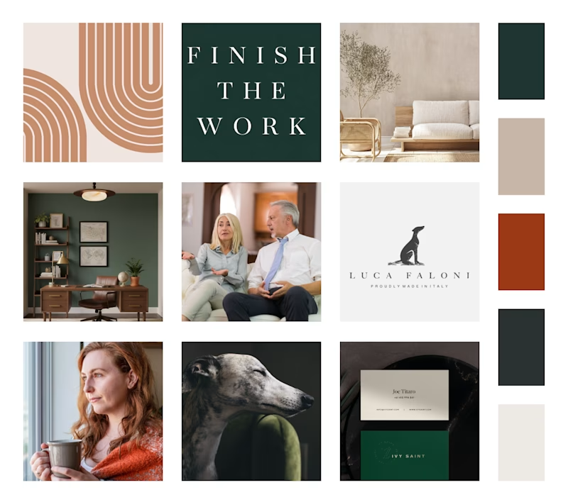
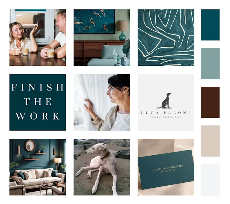
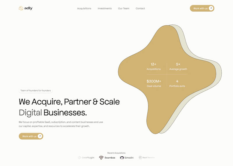
A or B? Two brand directions for a wellness practitioner. Drop your pick in the comments. Curious what you see first.
5 votes
Ends in 1d

Thank you!
That was the initial idea. The client wanted to stand out from the crowd.

Direction A feels more distinctive to me—the softer palette and clearer type hierarchy give the wellness brand a calm, ownable point of view.

The network for creativity
Join 1.25M professional creatives like you
Connect with clients, get discovered, and run your business 100% commission-free
Creatives on Contra have earned over $150M and we are just getting started

Challenges
View all


Related posts

We're stuck 😅
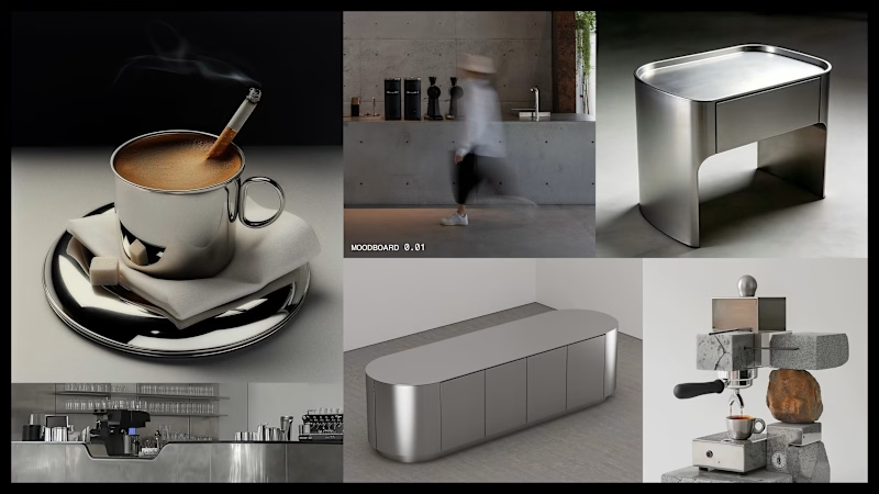
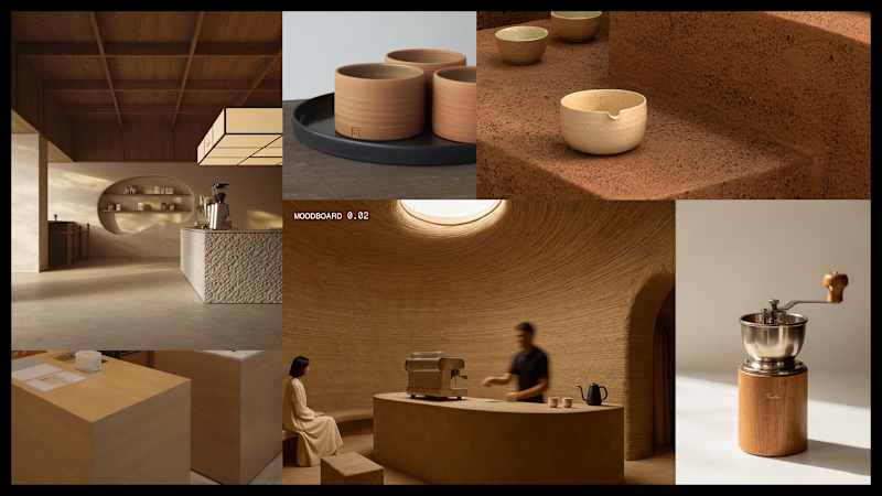
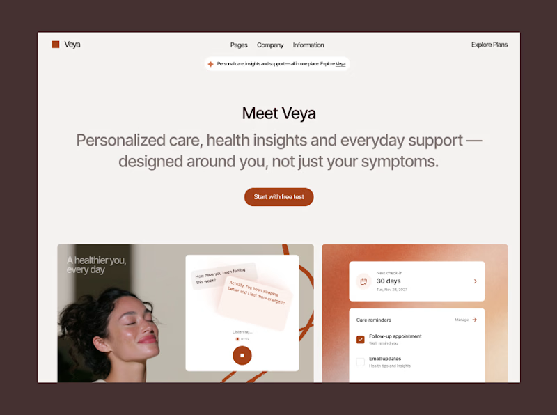
Which one feels more premium and unique to you?
Comment 01 or 02 below your opinion will genuinely help us lock this in.
7 voted
33%
14 voted
67%
21 votes
Closed



A i think

Two different audiences, two different directions,
which one are you into?
58 voted
48%
64 voted
52%

122 votes
Closed

Amazing designs 😊