The network for creativity
Join 1.25M professional creatives like you
Connect with clients, get discovered, and run your business 100% commission-free
Creatives on Contra have earned over $150M and we are just getting started
Back to feedPost

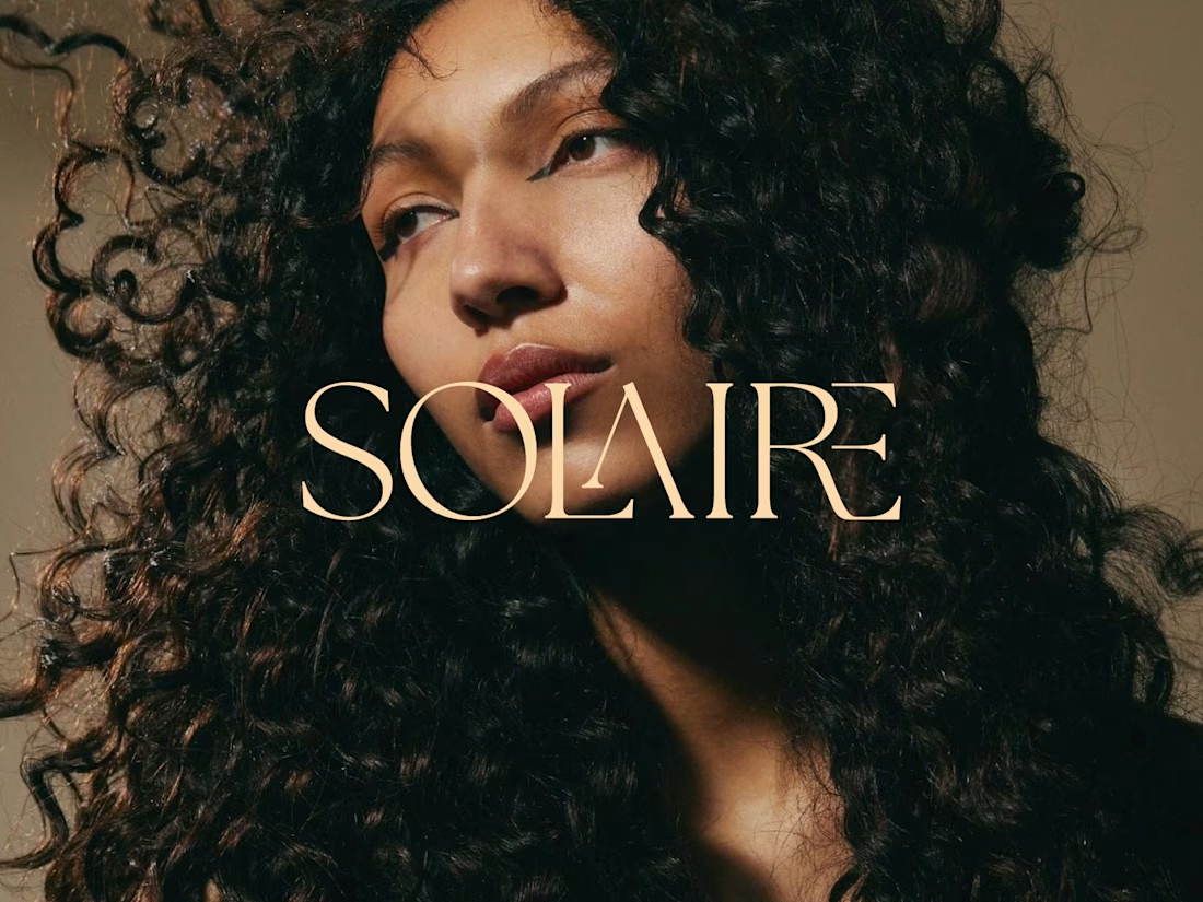
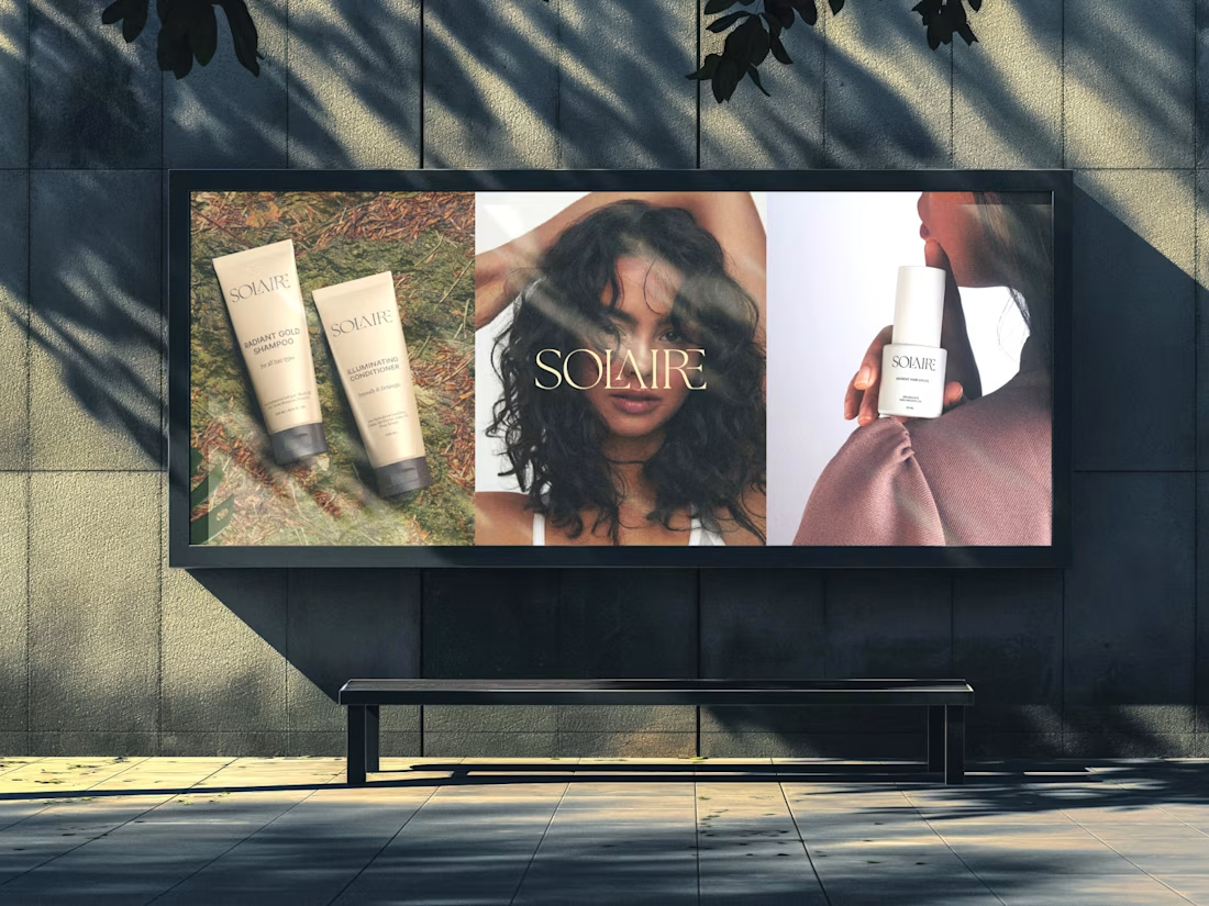
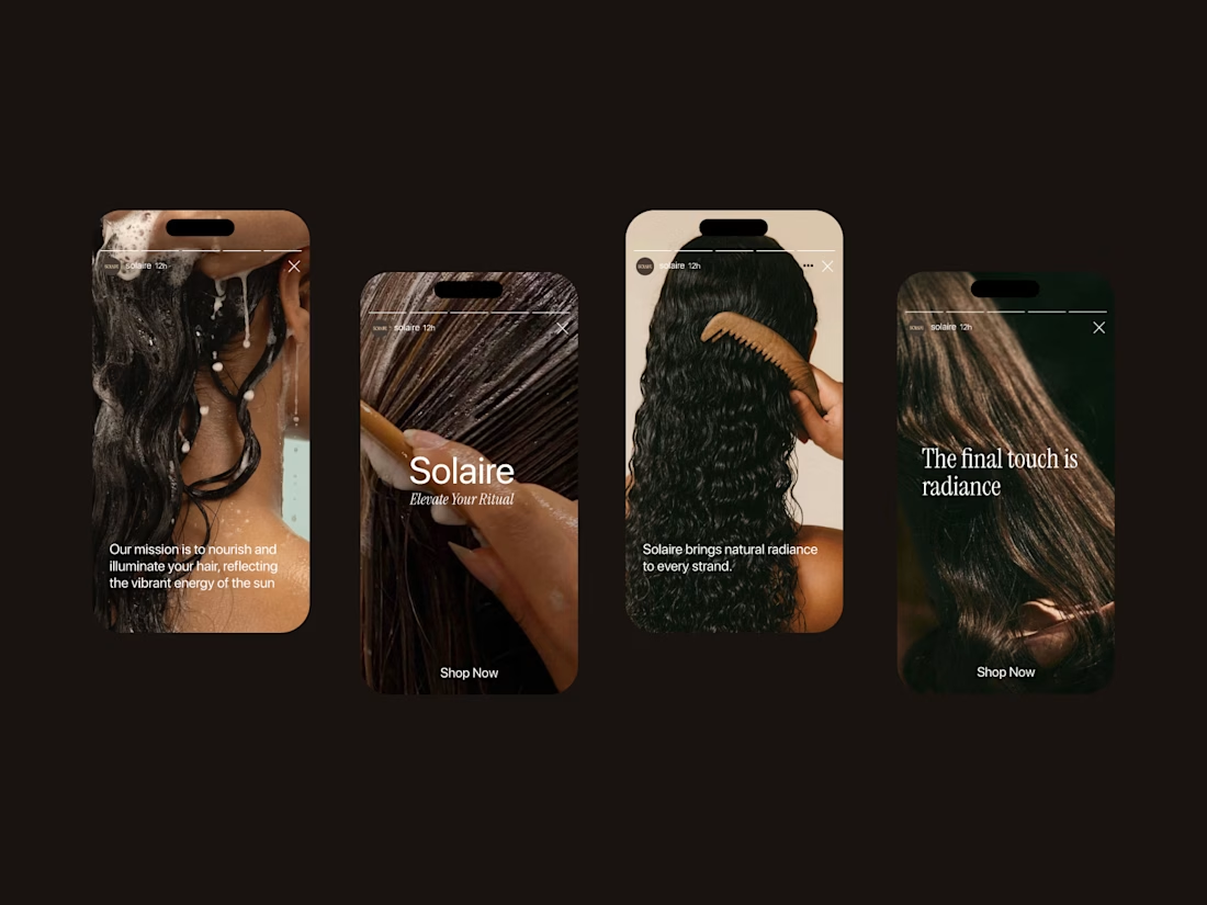
Solaire: a haircare brand identity rooted in warmth, texture, and light.
For this project, I wanted the brand to feel as dimensional as the hair it celebrates. The custom serif wordmark has elegant, ligature-style details where the letters overlap and intertwine, echoing the movement of a curl. The warm champagne tone against rich, golden-hour photography keeps everything feeling sun-kissed and confident rather than clinical.
The goal: a brand that feels luxurious but never precious, made for people who wear their texture proudly.
Brand identity • Logo design • Art direction

Overlapping ligatures that echo strands of hair is a bold move for a wordmark. How do those joins hold up at small sizes, like on a pump-bottle neck or a favicon?
Thanks, Artur. Good catch. The joins are slightly thickened at small sizes so they don't drop out, and for tiny spots like a favicon I use a standalone S monogram instead of the full wordmark.

lovely wordmark
thanks 🙌🙌


Cool
thanks 🙌🙌

Nice


Great work 🔥

Those overlapping letters in the wordmark really feel like flowing hair. Warm and elegant, nice one Varun

nice work
thanks 🙌🙌

well done
The network for creativity
Join 1.25M professional creatives like you
Connect with clients, get discovered, and run your business 100% commission-free
Creatives on Contra have earned over $150M and we are just getting started





Related posts

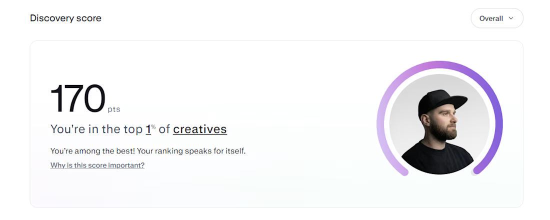
Top 1% on Contra. 🎉
A little milestone, but a reminder that showing up and doing good work consistently actually pays off.
If you're just starting out and wondering if it's worth it: it is. Keep going.
Thanks to all my clients and everyone here who's been so supportive.


That's Legendary bro congrats 🔥🔥🔥🔥


Beautiful work.


Your homepage should answer one question: what do you do? If a visitor can't answer that in five seconds, everything below the fold doesn't matter.
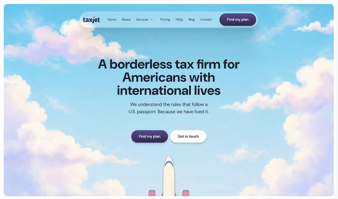

I just saw Bright Studios’ new website. You guys nailed it! Really like it.