The network for creativity
Join 1.25M professional creatives like you
Connect with clients, get discovered, and run your business 100% commission-free
Creatives on Contra have earned over $150M and we are just getting started
Back to feedPost

High Converting Website for Amazon Ads Agency


The network for creativity
Join 1.25M professional creatives like you
Connect with clients, get discovered, and run your business 100% commission-free
Creatives on Contra have earned over $150M and we are just getting started



Related posts

Recently completed this landing page for a client, then i decided to try this motion design for the page promotion.
How did I do, guys?
Kindly rate this😊


Nice 3D tilt into the booking card, a clever way to show the page. One note: the yellow bits at the start move too fast to read, a slower first second would help. Is it for the client's launch?

Design Agency Website
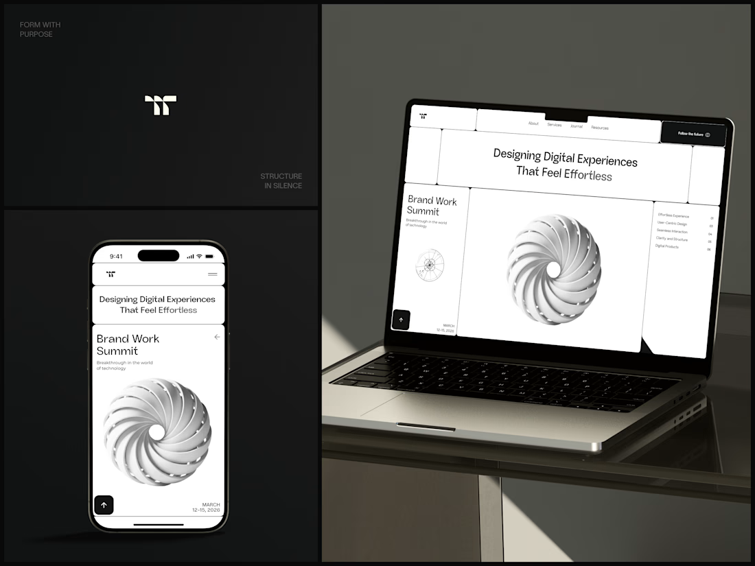
Only one cell on this homepage is black.
The rest of the page is a grid of rounded white cells: the headline, an event card, a white 3D spiral and a list of services. The black one, top right, holds the "Follow the future" button and stands out against all that white.
On the phone, the cells stack into a single column. The navigation folds into a menu icon, and the event card and spiral merge into one cell.
The headline reads "Designing Digital Experiences That Feel Effortless", so the grid has to look organized before anyone reads a word.
Designed by the Hue & Machine team.
#DesignAgency #WebDesign #AgencyWebsite #LandingPage #BentoGrid #MinimalDesign #UIDesign #ResponsiveDesign #MobileDesign #FigmaDesign



Looks cool


Meet MUXSCAPE, my entry for the Video.js Skins Design Challenge.
I wanted to explore a different approach to video playback, something that feels more like a cinematic experience than a traditional video player.
Built on the Video.js v10 Scaffold skin, MUXSCAPE features adaptive ambient lighting inspired by movie posters, floating frosted glass controls, contextual menus, and a responsive layout.
It supports both YouTube trailers and Mux hosted movies, with accessibility and performance being an important part of the experience.
This was a fun opportunity to experiment with spatial UI, glassmorphism, and cinematic interactions while pushing the possibilities of Video.js.
Hope you enjoy exploring it!

MUXSCAPE has a nice cinematic feel. Good luck Shantanu!