The network for creativity
Join 1.25M professional creatives like you
Connect with clients, get discovered, and run your business 100% commission-free
Creatives on Contra have earned over $150M and we are just getting started
Back to feedPost

Recently I challenged myself to build a product course landing page using Vibe Coding, and I wanted the design to do the talking before a single word was read.
The pixelated aesthetic was intentional. Product courses are about breaking things down, zooming in, and understanding the grid beneath the surface. The texture reflects that it is clean but tactile, structured without feeling cold.
This design starts with a single image, then unfolds into three hidden cards on interaction. One visual, three reveals. It felt like the right metaphor for what a course actually does; it opens up what you couldn't see before. Technically tricky to get right, but the payoff was worth it.


The network for creativity
Join 1.25M professional creatives like you
Connect with clients, get discovered, and run your business 100% commission-free
Creatives on Contra have earned over $150M and we are just getting started



Related posts

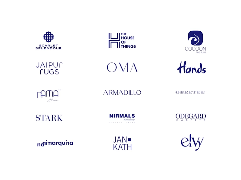
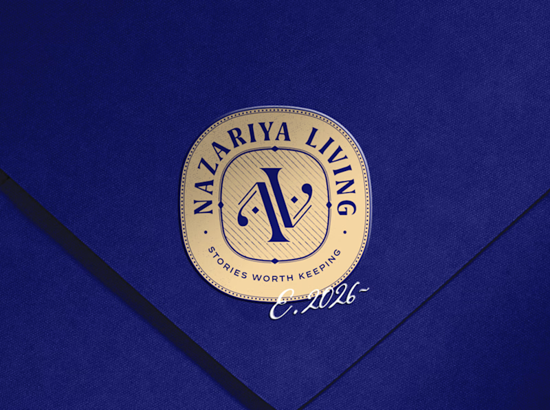
A little look at how Nazariya Living stands apart from its category.
On one side, familiar visual conventions. On the other, an identity with its own character, rooted in stories worth keeping.
We chose not to blend in. :)
Which side catches your eye?

3 voted
30%
7 voted
70%
10 votes
Closed

That side with all the competitor logos in one grid is the slide I'd steal for a client presentation. Nothing explains "why this direction" faster than showing the sea of sameness first. The navy seal wins easily after that.

A great example of how a course landing page can have its own personality.
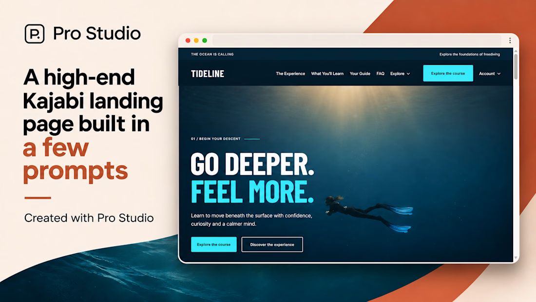
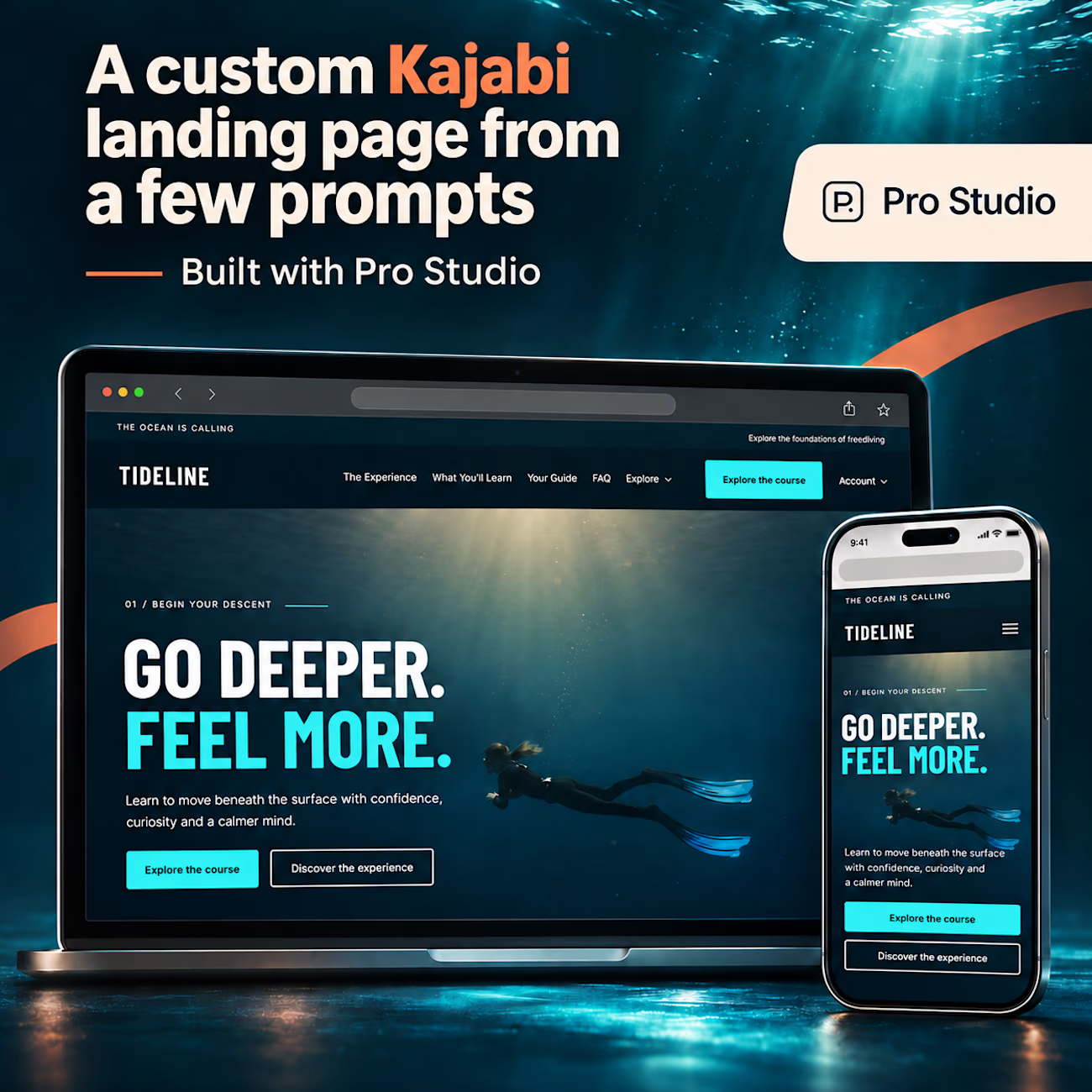
I really like the bold typography, immersive visuals, and how the entire design reflects the freediving experience.
Good work👏
#Kajabi #KajabiWebsiteDesign #WebDesign #LandingPageDesign


A high-end Kajabi landing page, built in just a few prompts with Pro Studio. 🌊
Meet TIDELINE: a fictional freediving school demo with immersive visuals, oversized typography, a custom header with dropdown navigation, and carefully crafted layouts. One page, with a whole lot of...

Amazing

🚀 Just completed the UX/UI design and website redesign for Spartan SEM!
The goal was to bring their refreshed brand identity to life with a modern, conversion-focused website and a better user experience.
Really enjoyed working with the team and seeing the design go live!


This is amazing