The network for creativity
Join 1.25M professional creatives like you
Connect with clients, get discovered, and run your business 100% commission-free
Creatives on Contra have earned over $150M and we are just getting started
Back to feedPost


Most execution problems are structural.
Not talent.
Not motivation.
Not strategy.
When decision rights are unclear, authority is misaligned, or reporting distorts reality, teams work harder than they should.
Growth exposes structural weakness quickly.
I design governance, decision architecture, and operational systems that remove that friction.
If your organisation feels heavier than its size suggests, it’s rarely effort. It’s structure.

The network for creativity
Join 1.25M professional creatives like you
Connect with clients, get discovered, and run your business 100% commission-free
Creatives on Contra have earned over $150M and we are just getting started



Related posts

Why do most law and accounting firm websites look like 2012? 🤔
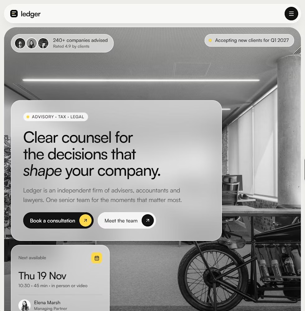
I kept seeing the same thing: stock handshakes, blue gradients, walls of text. So I designed Ledger, a Framer template for advisory, tax, audit and law firms that want to look as senior as they are.
The idea is simple: these firms sell trust, not features. So the site leads with people, outcomes and plain English. Big photography, calm spacing, one accent colour.
What's inside:
– Hero with a live availability badge and next-appointment card
– Five practice areas, a three-step process and real-looking outcomes
– Partners grid, testimonial, FAQ and insights
– Team, Insights and Contact pages, fully responsive
If you run a boutique firm, or build sites for one, you can download the template from the Products tab on my profile.
Which industry still has the worst websites? I'm taking requests for the next one 👇

Really nice work. The simplicity works beautifully here.

A presentation should build toward a decision.
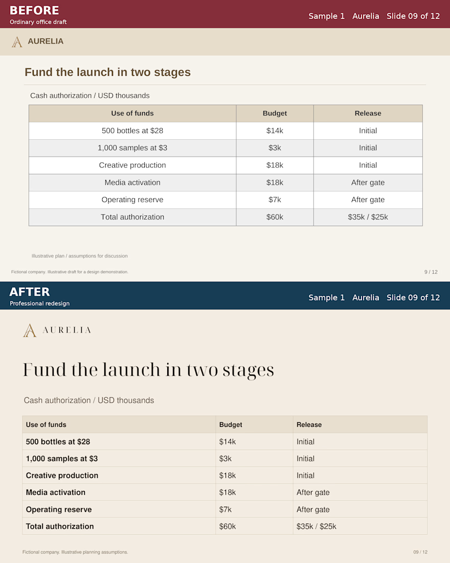
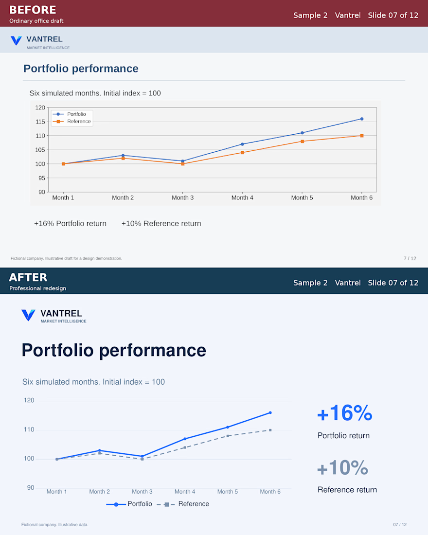
For these Aurelia and Vantrel studies, I developed two complete 12-slide business presentations. Aurelia builds toward a staged launch authorization. Vantrel builds toward a defined pilot.
Each BEFORE/AFTER pair keeps the same message and illustrative data, making the design changes easier to judge. The downloadable PowerPoint includes editable text, tables and charts.
These are self-initiated fictional projects developed with AI assistance and checked for content consistency, chart data and final rendering.
Looking at the AFTER slides, what would you simplify further to make the decision clearer?
Have a rough business deck? Send the deck, audience and deadline for a scoped redesign quote.
https://contra.com/s/v7NPev2Y-power-point-cleanup-and-presentation-redesign
Full case and downloads:
https://contra.com/p/esqL6Bvc-power-point-redesign-aurelia-and-vantrel



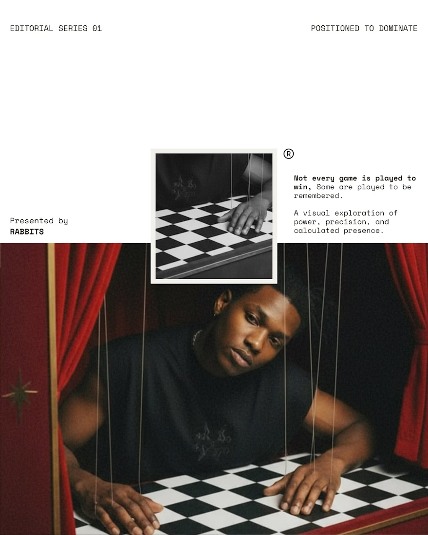
A visual exploration of power, precision, and presence.
Inspired by the timeless symbolism of chess, this editorial transforms strategy into a language of confidence and control. Set against a bold red backdrop, each frame is carefully composed to reflect ambition, intention, and the beauty of calculated movement.
Presented by RABBITS