The network for creativity
Join 1.25M professional creatives like you
Connect with clients, get discovered, and run your business 100% commission-free
Creatives on Contra have earned over $150M and we are just getting started
Back to feedPost

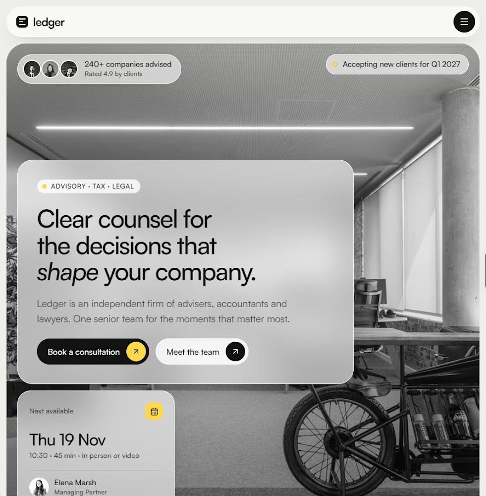
Why do most law and accounting firm websites look like 2012? 🤔
I kept seeing the same thing: stock handshakes, blue gradients, walls of text. So I designed Ledger, a Framer template for advisory, tax, audit and law firms that want to look as senior as they are.
The idea is simple: these firms sell trust, not features. So the site leads with people, outcomes and plain English. Big photography, calm spacing, one accent colour.
What's inside:
– Hero with a live availability badge and next-appointment card
– Five practice areas, a three-step process and real-looking outcomes
– Partners grid, testimonial, FAQ and insights
– Team, Insights and Contact pages, fully responsive
If you run a boutique firm, or build sites for one, you can download the template from the Products tab on my profile.
Which industry still has the worst websites? I'm taking requests for the next one 👇

Really nice work. The simplicity works beautifully here.
The network for creativity
Join 1.25M professional creatives like you
Connect with clients, get discovered, and run your business 100% commission-free
Creatives on Contra have earned over $150M and we are just getting started



Related posts

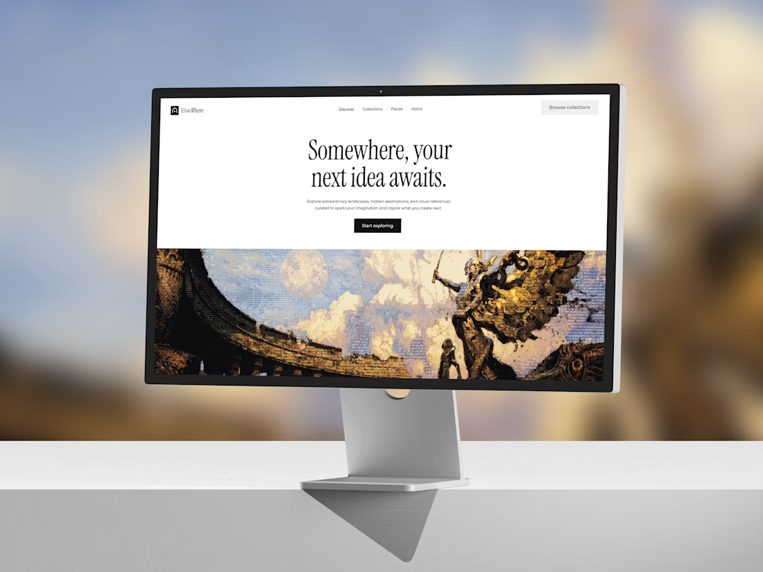
My first Framer template is officially LIVE on the Marketplace! 🎉Finally, the wait is over!
Check it out: https://www.framer.com/marketplace/templates/elsewheree/
Meet ElseWhere, an editorial travel website crafted with immersive visuals, thoughtful interactions, and plenty of little details.
This one has been a journey of its own. Excited to finally share it with everyone!



Nocturne is now on Framer 🌙
A sleep-app template where one night plays out as you scroll: dusk to dawn in three acts, with the sky, the clock and the widgets changing as you go.
Native Framer layers, a CMS, code components with properties and five skills for Framer's agent.
Get it on the Framer Marketplace, $59:
https://www.framer.com/marketplace/templates/nocturne-app/

Nice!

Website design and development in Framer for an architecture studio, combining clean layouts, refined visuals, and subtle interactions to create a modern digital experience.
