The network for creativity
Join 1.25M professional creatives like you
Connect with clients, get discovered, and run your business 100% commission-free
Creatives on Contra have earned over $150M and we are just getting started
Back to feedPost
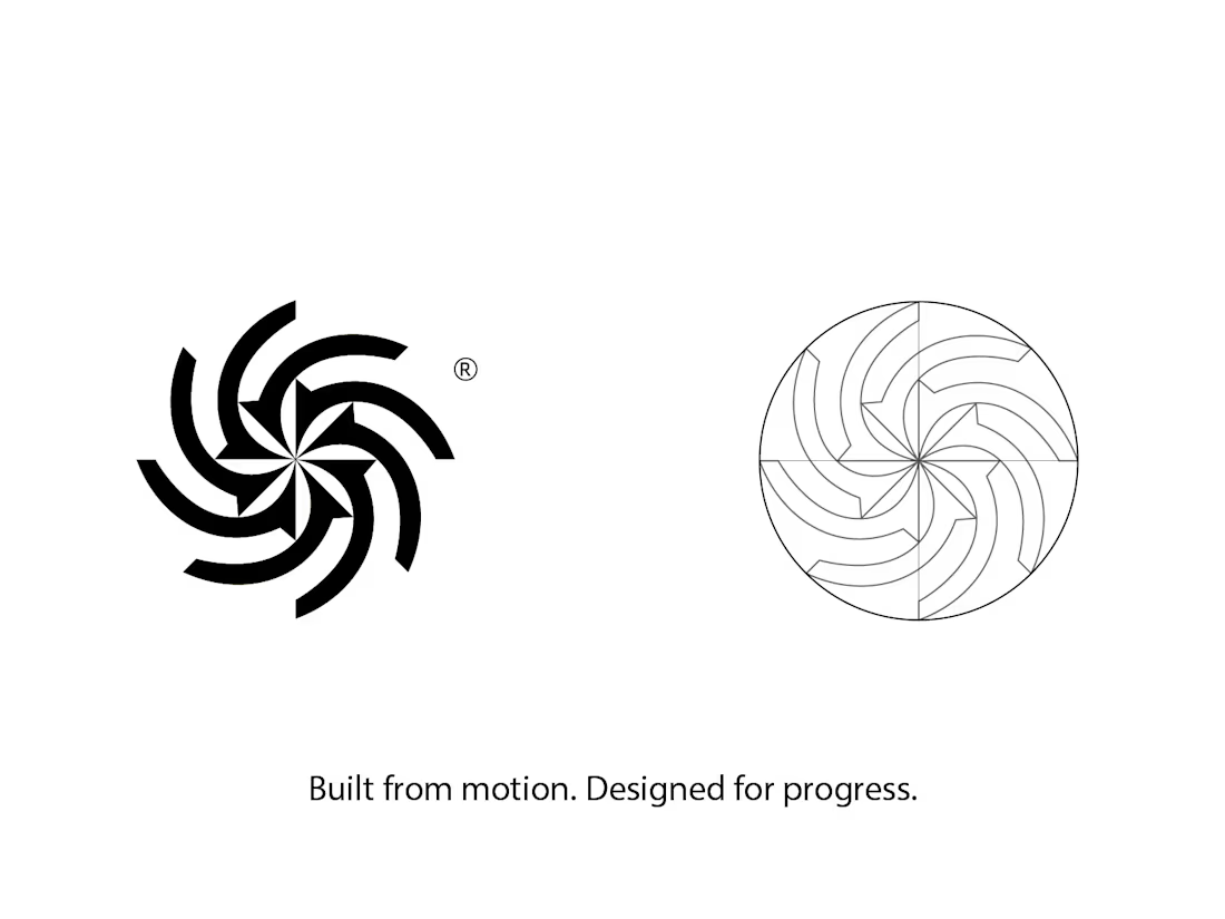
Tech Brand Identity Concept
A geometric identity built around rotation, rhythm, and continuous motion.
The symbol was developed to communicate:
precision, progress, and connection — then extended into a clean visual system across color, scale, and digital applications.
Designed as a concept identity for a modern technology brand.
#LogoDesign #BrandIdentity #TechBranding


Outstanding work

Thank you
The network for creativity
Join 1.25M professional creatives like you
Connect with clients, get discovered, and run your business 100% commission-free
Creatives on Contra have earned over $150M and we are just getting started





Related posts





Rejected logo concepts 2026 - Which one did you like the most?
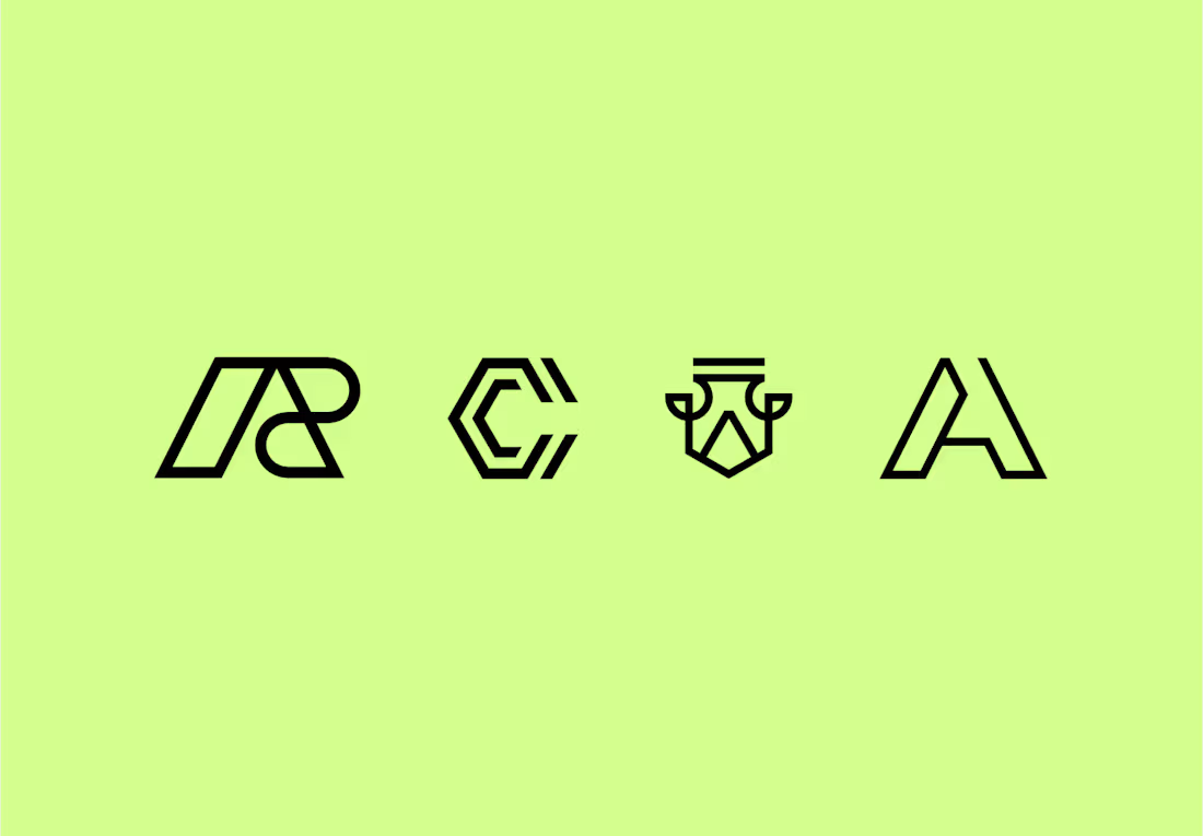

The C-shaped mark is my pick. The notched outline stays readable even when it gets small. Did the rejections come down to concept, or to how they held up at tiny sizes?

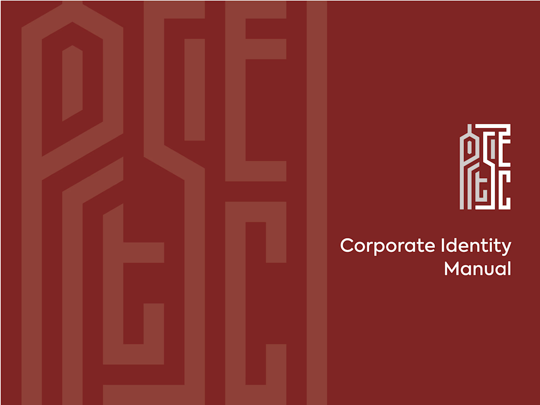
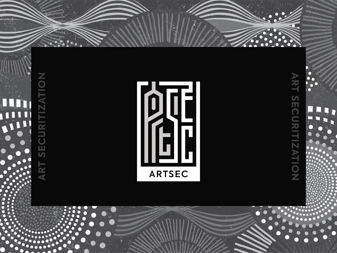
ARTSEC is an art investment platform focused on making African contemporary and indigenous art more accessible to collectors and investors.
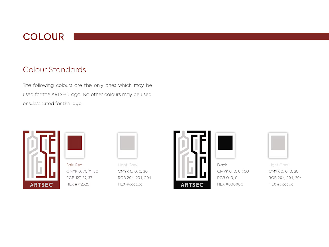
I developed a complete visual identity system for the brand, including the logo, colour palette, typography and usage guidelines.
The identity was designed to give ARTSEC a distinctive, consistent visual presence while reflecting its connection to African art and culture across print and digital applications.

Can't stop looking at this! 😍