The network for creativity
Join 1.25M professional creatives like you
Connect with clients, get discovered, and run your business 100% commission-free
Creatives on Contra have earned over $150M and we are just getting started
Back to feedPost

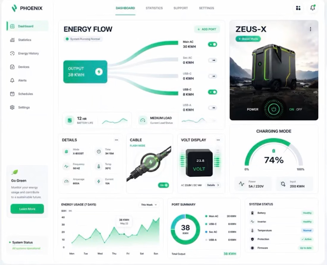
Transforming complex data into a clean, user-friendly digital experience! ⚡📊
Just wrapped up this modern and intuitive dashboard design for Phoenix (Energy Management System). The goal was to make energy monitoring seamless, presenting real-time stats, energy flow, and system statuses in one clean view.
Key Design Highlights:
🖥️ Clean & Modern Layout: Easy-to-read cards for energy flow, stats, and device metrics.
📊 Visual Data Representation: Clear graphs and progress rings for instant insights.
🟢 User-Centric Navigation: Smooth interface tailored for optimal user experience.
Good design is all about making the complex feel simple. What do you think of this layout? Let me know in the comments! 👇
Got a project in mind? Let's collaborate and bring your ideas to life. Send a DM! 📩
#UIUXDesign #DashboardDesign #WebApp #UserInterface #UXDesign #ProductDesign #FigmaDesign #DesignSystem

The network for creativity
Join 1.25M professional creatives like you
Connect with clients, get discovered, and run your business 100% commission-free
Creatives on Contra have earned over $150M and we are just getting started
Trending
retrofuturism
Share your favorite designs from the past exploring the distant future. Or your own take on the aesthetic 🚀
halftone
Dots. Texture. Grain. Let's see your designs using the halftone technique.

Midjourney
Creatives are showing off what they're making with Midjourney.
colorgrade
Video editors sound off: How do you enhance the mood of your video in color grading?





Related posts

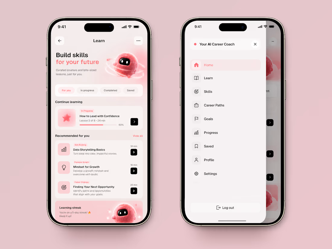
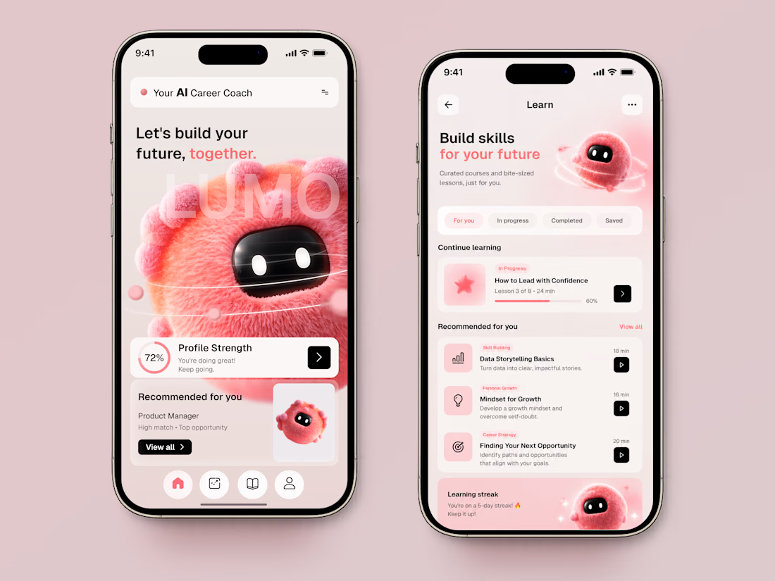
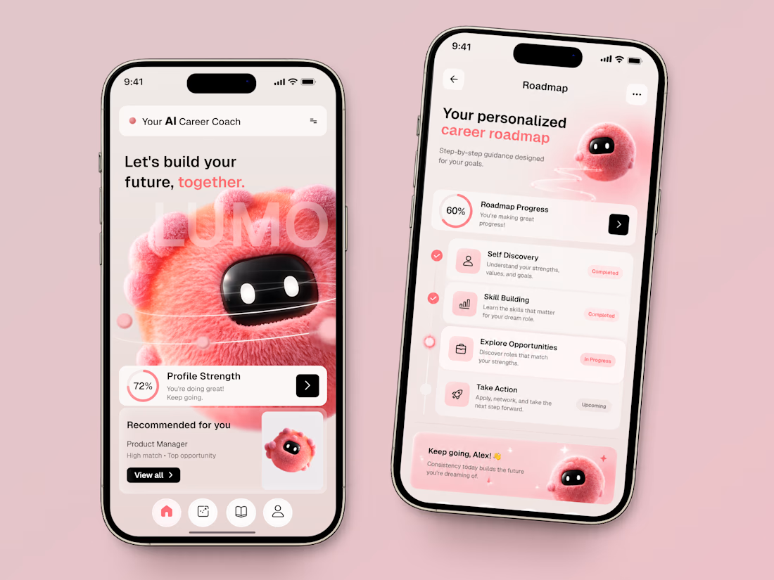
LUMO — AI Career Coach & Learning App 🤖✨
LUMO is an AI-powered career development app concept designed to make professional growth feel more personal, structured, and motivating.
The idea was to move away from the typical “serious career platform” look and create an experience that feels more like a supportive companion — with a friendly AI character guiding users through their next steps.
The product brings career planning and learning into one connected experience:
• personalized career recommendations based on the user’s profile;
• profile strength and progress tracking;
• curated courses and bite-sized lessons;
• personalized career roadmaps with clear milestones;
• skill building and opportunity discovery;
• a friendly AI coach that makes the experience feel more human.
Visually, we balanced a clean product interface with soft gradients, warm pink accents, and a playful 3D AI character to give LUMO its own personality without distracting from the product itself.
The result is a career platform that turns a complex question — “What should I do next?” — into a clear and approachable journey. 🚀
Would you trust an AI coach to help plan your next career move? 👀



The idea of making a career app feel more like a companion than a platform is pretty smart. The 3D character fits that direction really well too.


design of the day, how do you do this and where did you get inspiration from. 🔥❤️

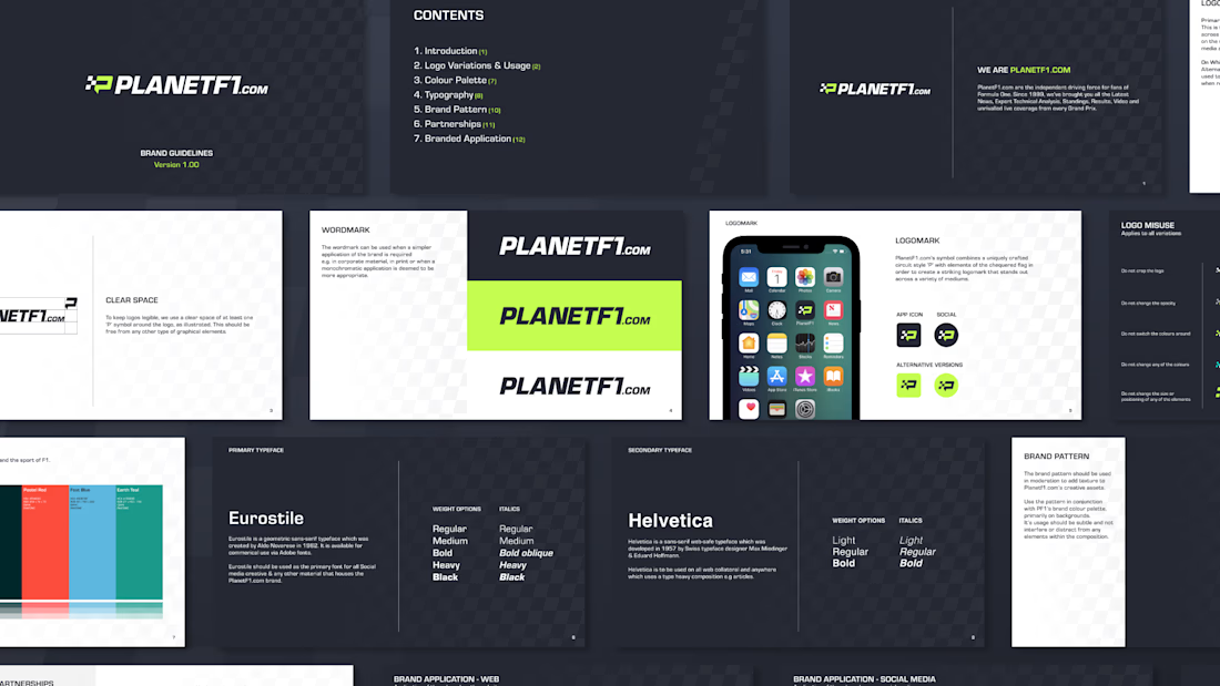
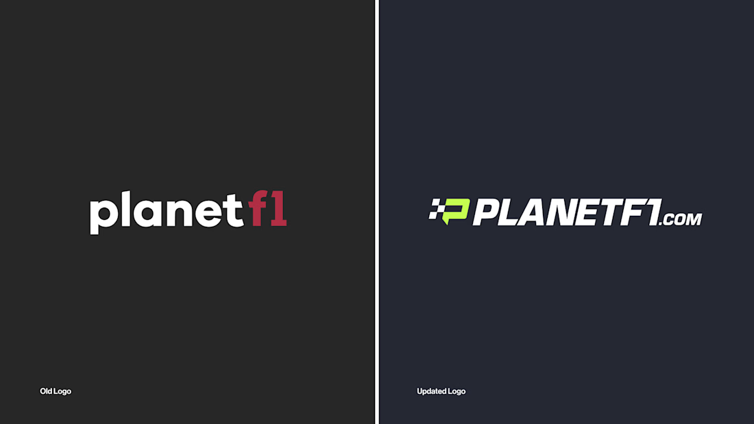
PlanetF1 Rebrand 🏁
PlanetF1 is one of the world’s leading independent Formula One media platforms, established in 1999 and part of the Planet Sport Group. Known for its global audience and trusted race coverage, it delivers breaking news, analysis and live weekend reporting to millions of F1 fans worldwide.
I led the rebrand and wider visual overhaul of the platform. Working closely with key stakeholders, I drove the research and discovery phase before designing and presenting a refreshed identity system built to position PlanetF1 as a modern, digital-first brand for Formula One audiences.
The identity needed to feel fast, precise and unmistakably connected to the sport, while elevating the platform’s presence within an increasingly competitive sports media landscape. It also needed to support high-frequency publishing across news, live coverage and social content.
The final identity introduces a new icon inspired by the Formula One “mini-map”, acting as a directional system to reflect speed, positioning and race tracking. Supported by updated brand guidelines and enhanced motion capabilities, the system creates a more dynamic and consistent visual language across digital and social platforms, strengthening PlanetF1’s presence as the sport moves “On the Grid”.