The network for creativity
Join 1.25M professional creatives like you
Connect with clients, get discovered, and run your business 100% commission-free
Creatives on Contra have earned over $150M and we are just getting started
Back to feedPost
PlanetF1 Rebrand 🏁
PlanetF1 is one of the world’s leading independent Formula One media platforms, established in 1999 and part of the Planet Sport Group. Known for its global audience and trusted race coverage, it delivers breaking news, analysis and live weekend reporting to millions of F1 fans worldwide.
I led the rebrand and wider visual overhaul of the platform. Working closely with key stakeholders, I drove the research and discovery phase before designing and presenting a refreshed identity system built to position PlanetF1 as a modern, digital-first brand for Formula One audiences.
The identity needed to feel fast, precise and unmistakably connected to the sport, while elevating the platform’s presence within an increasingly competitive sports media landscape. It also needed to support high-frequency publishing across news, live coverage and social content.
The final identity introduces a new icon inspired by the Formula One “mini-map”, acting as a directional system to reflect speed, positioning and race tracking. Supported by updated brand guidelines and enhanced motion capabilities, the system creates a more dynamic and consistent visual language across digital and social platforms, strengthening PlanetF1’s presence as the sport moves “On the Grid”.



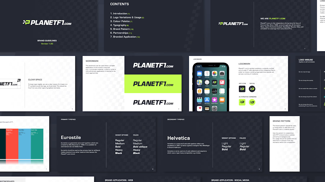
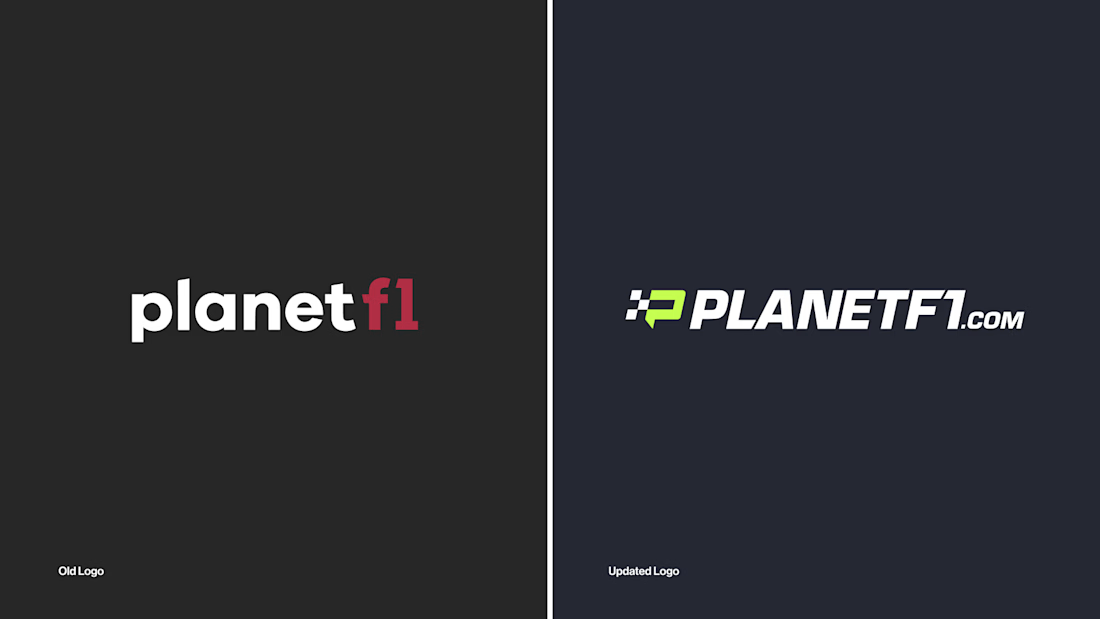

TOP 🔥

Thank you, Celia!


Really like how the new icon connects back to the F1 mini-map. It gives the rebrand a clear idea behind it, not just a new look.
Thanks Kabir!


looks properly broadcast ready
Cheers Nazar!

The subtle race flag incorporation and the tilt give that fast, race feeling. Excellent work!
Cheers Mario!

Rebranding something as established as PlanetF1 without losing the audience that already trusts it feels like a real tightrope walk, and the mini-map inspired icon is a smart way to stay connected to the sport instead of just going generic-modern. Was there a moment in the...
There were plenty of moments where the direction changed. This was one of the final ideas that I created before showing the client the initial routes!
That's rare restraint, most people would ship every direction they explored instead of narrowing it down first. What did the client's early reactions actually sound like, more "too safe" or more "too far from PlanetF1"?

Love the mini-map icon idea — smart way to nod to the sport without leaning on clichés. Congrats on the rebrand!
Cheers, Alamgir!


Amazing work👏🔥🔥
Thank you 🙌

Appreciate it!

Dropping the old logotype for a brand this established feels like the riskiest part of this, but the mini-map inspired icon gives you something distinctly F1 to fall back on instead of going generic-modern. My guess is the account and social engagement end up being what...
It's been a while since we launched this rebrand (Over two years now). It was definitely part of a wider push for social content and it's 100% seen the benefits of this. They wanted to attract a younger audience, so it was key that the rebrand appealed to the new generation of formula one fans.

PlanetF1 has been part of my daily routine for nearly two decades — not a single race weekend goes by without it open on my screen. To come across someone who's shaped the very identity I interact with every day is a genuinely special thing. Brilliant work.
Thank you, Mahesh! So great to hear your a fan of the platform 🙌

Vibes🔥

wow this is nice keep it up
Thanks Mayowa!

awesome work dude 🔥
Cheers man 🙌

That rebrand looks incredibly sharp and modern! The way it captures the energy and speed of Formula 1 without relying on overused clichés is brilliant. Fantastic work on the identity system!
Thanks mate!
The network for creativity
Join 1.25M professional creatives like you
Connect with clients, get discovered, and run your business 100% commission-free
Creatives on Contra have earned over $150M and we are just getting started

Challenges
View all


Related posts

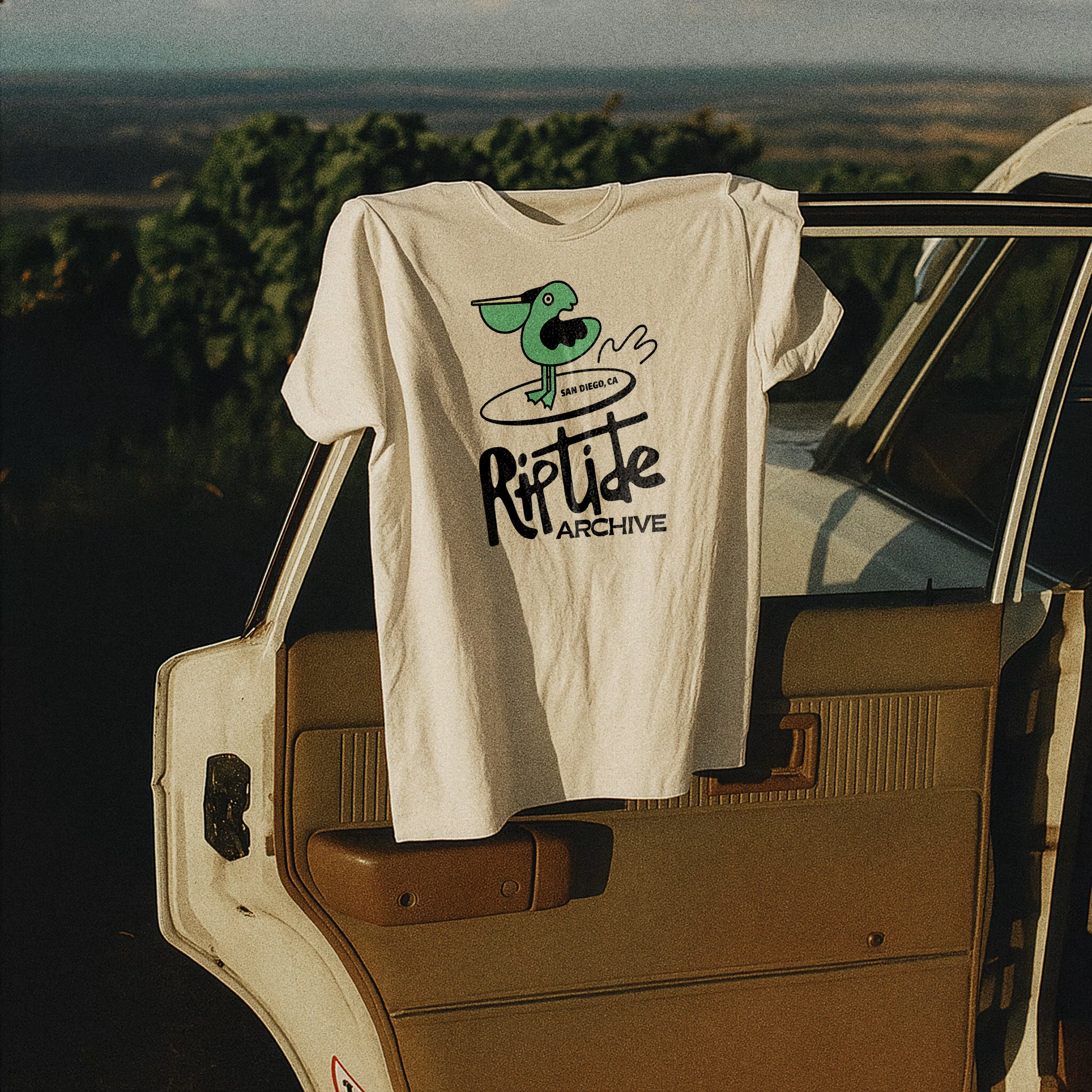
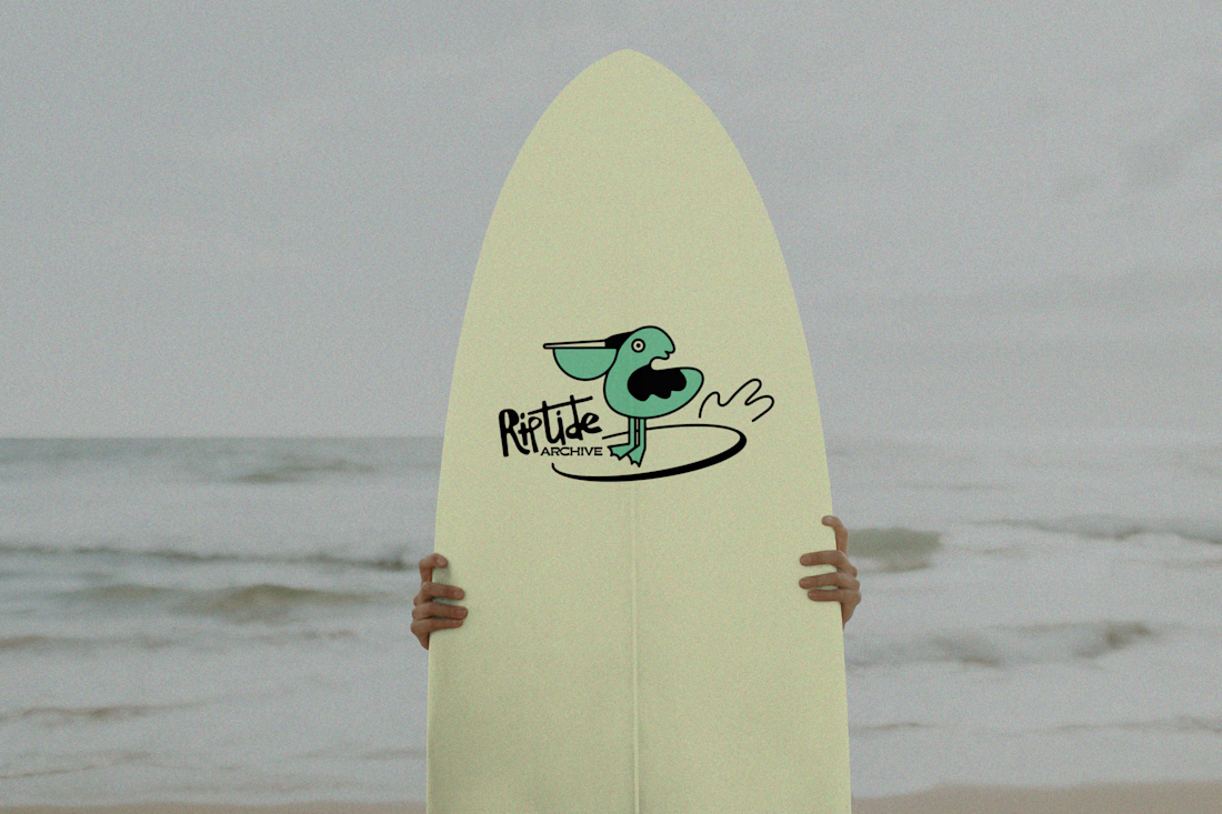
Logo for Riptide Archive. They document underground surf culture through limited run apparel, photo zines and short films.
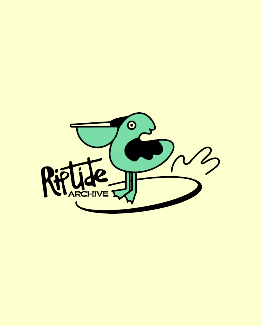
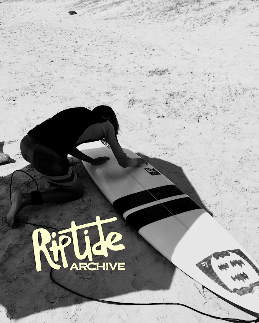

Love this!

SURCO | Latin Bar & Restaurant Brand Identity
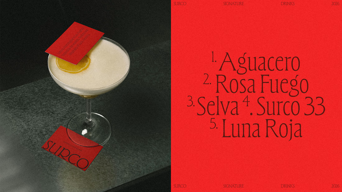
SURCO is a Latin bar and restaurant in Los Angeles where food, cocktails, vinyl and nightlife come together.
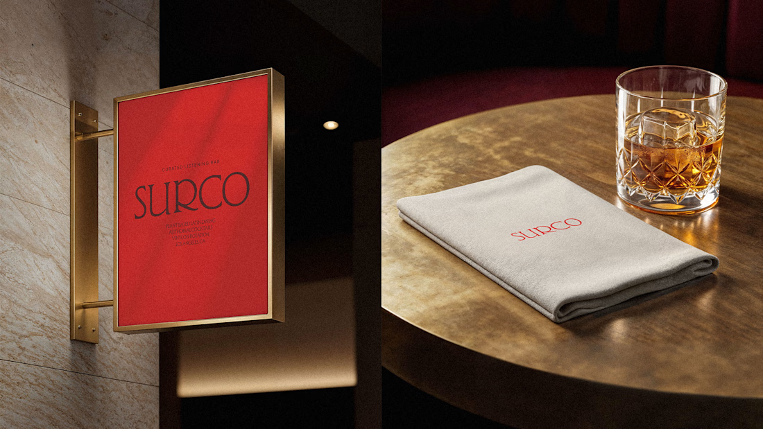
I developed a complete visual identity designed to feel warm, energetic and contemporary, without relying on the usual visual clichés associated with Latin restaurants. The system combines bold typography, a rich color palette, and art direction inspired by late nights, shared tables, music and the atmosphere of the bar.
The identity was extended across menus, signage, social media, printed materials and environmental applications, creating a flexible system that feels recognizable across every touchpoint.
Services: Brand Identity, Logo Design, Art Direction, Visual System, Graphic Design
Full project:
https://www.behance.net/gallery/255628447/Surco
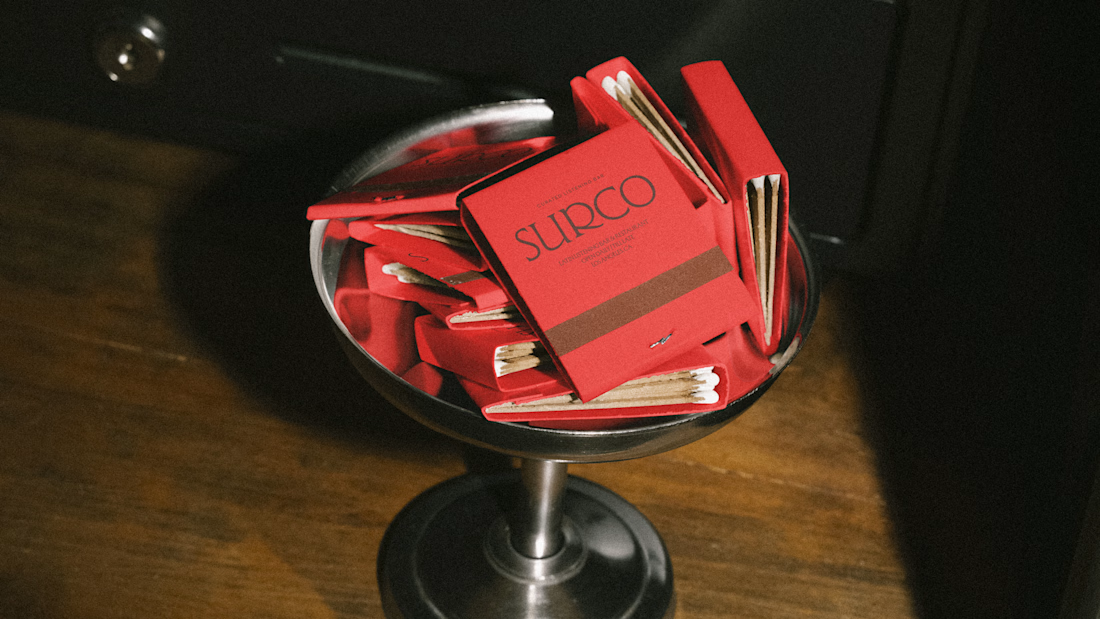
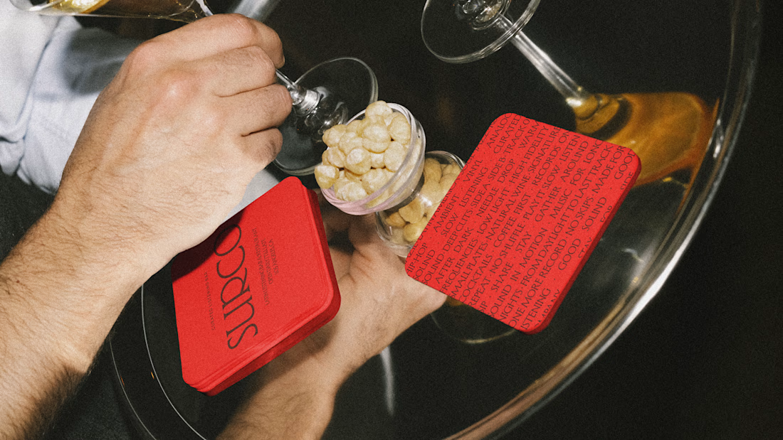
Beautiful work!

A short motion spec ad for Muji (personal project).
Design, animation and sound design by me :)
Inspired by: Kinisi, Sebastien Camden
Motion DesignmotiongraphicsAnimationAdobe After EffectsAdobe IllustratorAdobe Premiere ProIllustration


the stool tucking into the muji logo at the end got me. how long did the sound design take?