The network for creativity
Join 1.25M professional creatives like you
Connect with clients, get discovered, and run your business 100% commission-free
Creatives on Contra have earned over $150M and we are just getting started
Back to feedPost
A complete visual identity for NÉR, a contemporary bridal atelier. The project includes logo design, typography, color palette, brand guidelines, patterns, and branded applications, creating an elegant and timeless visual language.


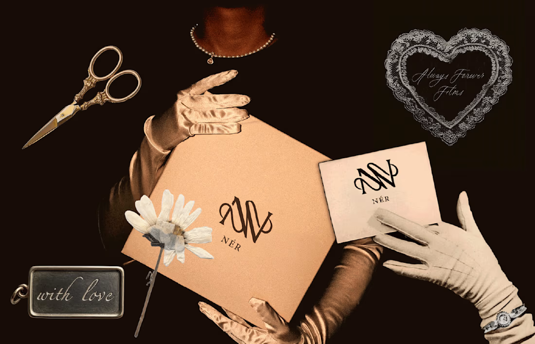

I really like how the restrained typography gives the packaging a premium feel. Was the grid established before the visual direction, or developed alongside it?

Thank you! I established the visual direction first, then developed the grid and logo alongside it.
The network for creativity
Join 1.25M professional creatives like you
Connect with clients, get discovered, and run your business 100% commission-free
Creatives on Contra have earned over $150M and we are just getting started





Related posts

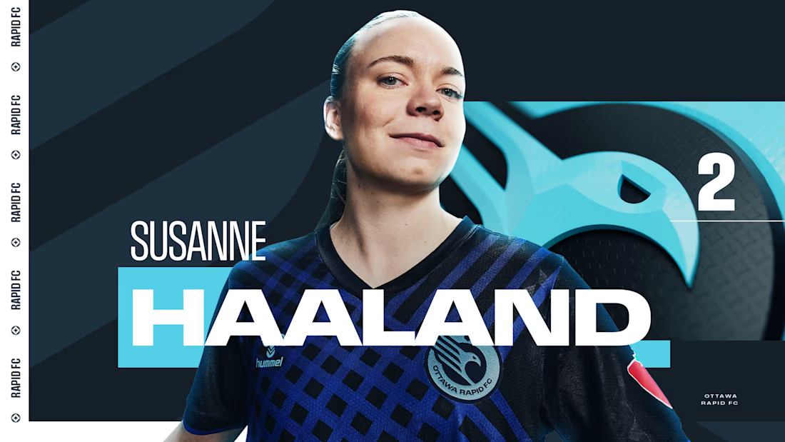
Sharing a project I'm really proud of: the 2025 broadcast design for the Northern Super League, Canada's new professional women's soccer league.
What made this one special is that the league had no visual history on TV. Every graphic viewers saw in that first season had to be created from zero, for a league that was introducing itself to the country.
The goal was a broadcast identity that feels as ambitious as the league itself: bold enough to stand out on screen, clear enough to follow at a glance, and flexible enough to carry six different clubs inside one consistent system.
The biggest lesson for me: when you design for a league that's just being born, you're not only packaging matches. You're helping define how people will remember its first season.
I'd love to hear from anyone working in sports or broadcast design: how do you approach building a visual system for a league that's launching from scratch?


Great Work demands great efforts

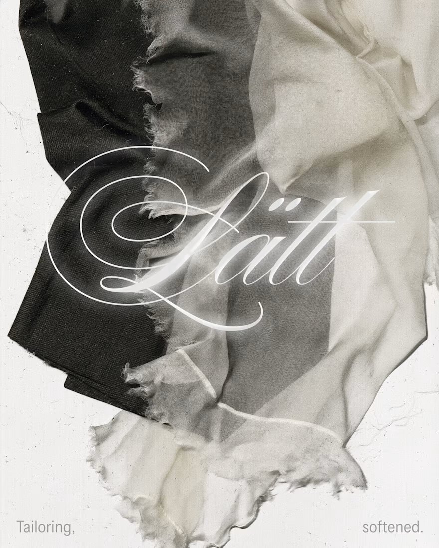
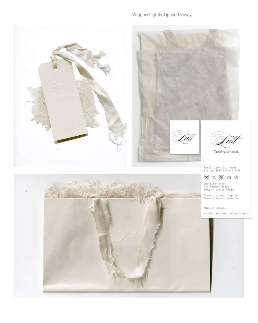
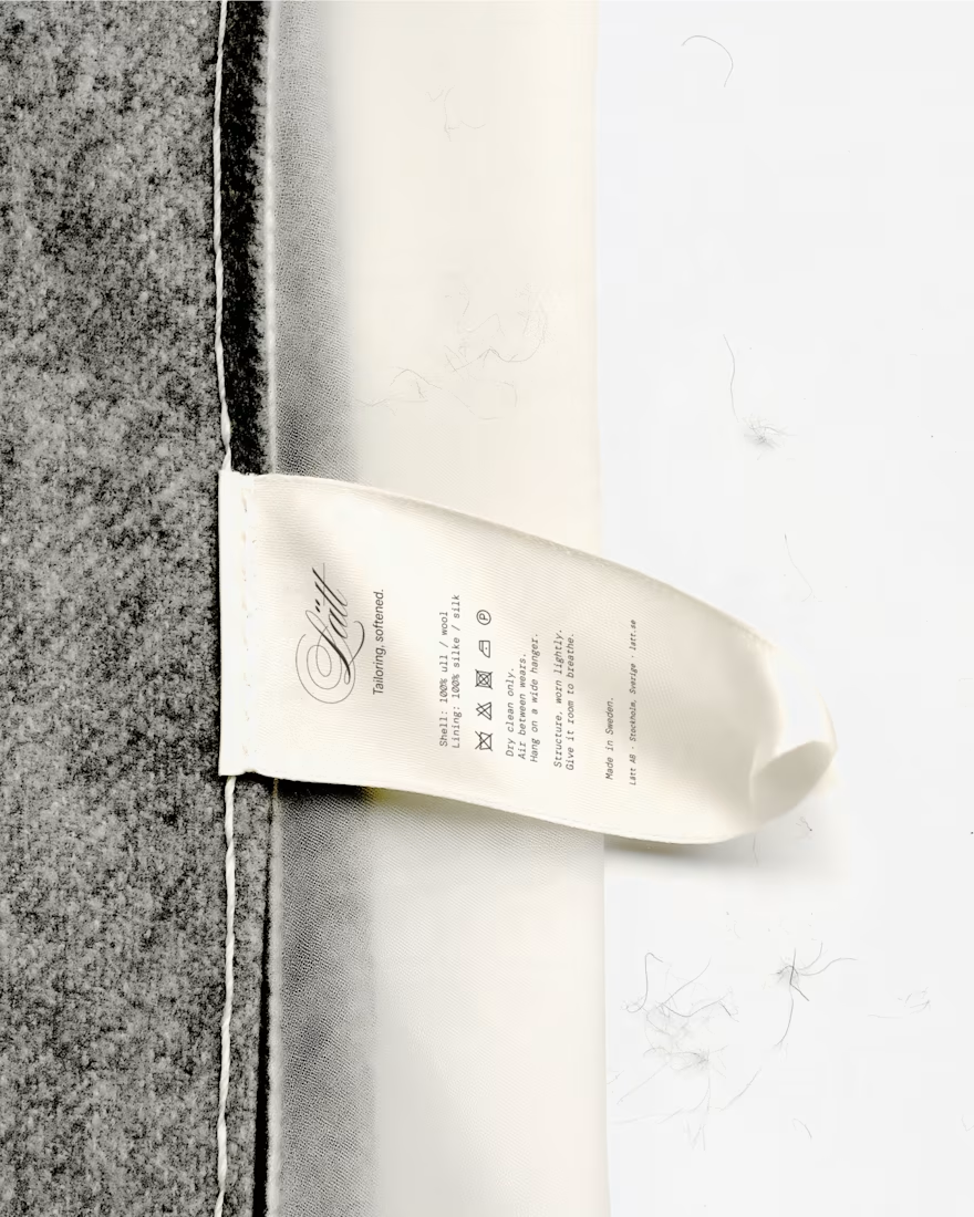
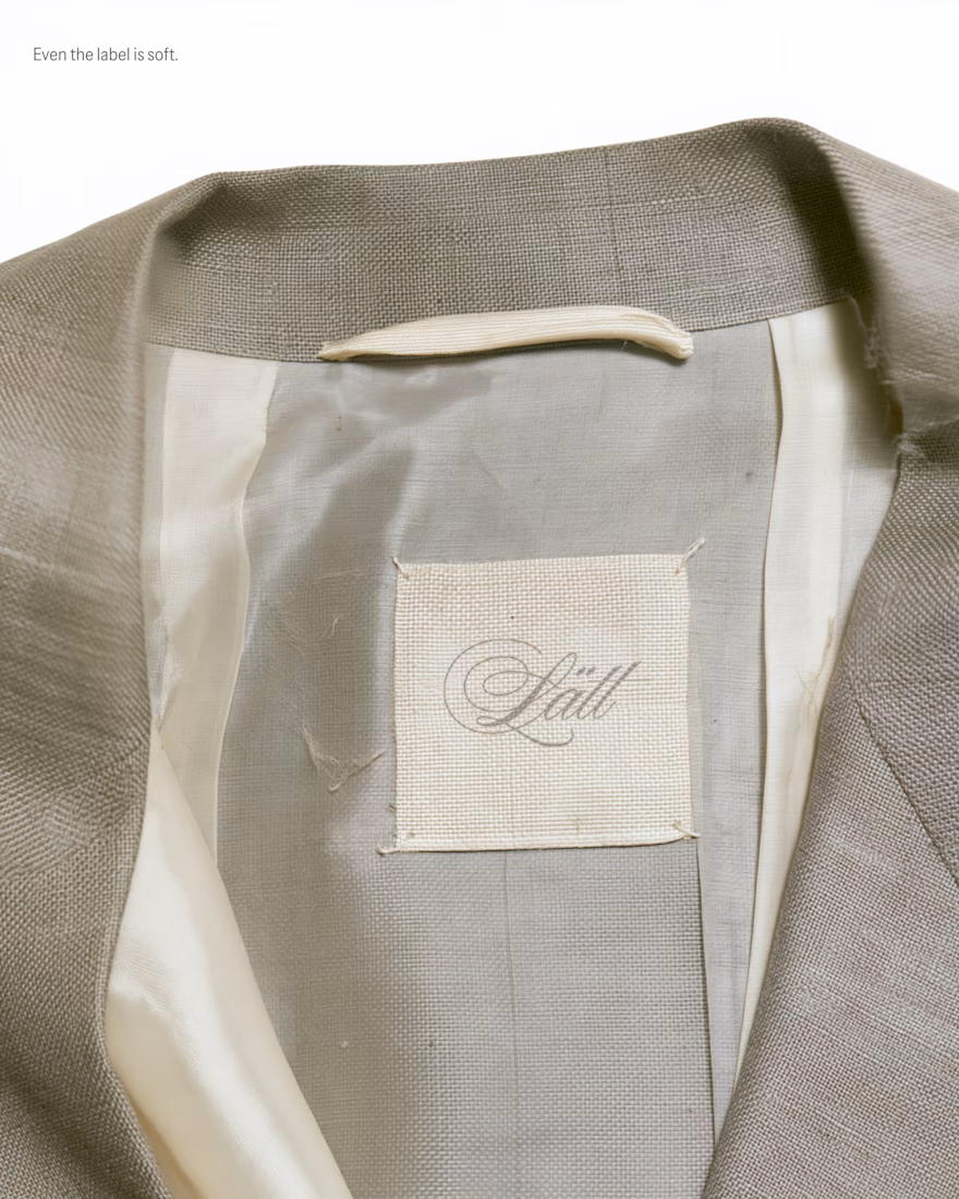
My entry for the Designer Briefs: a brand identity and label system for Lätt, a Stockholm label bringing a light, romantic touch to modern tailoring. Silk, sheer knits and suiting made to be worn lightly.
The idea is "Tailoring, softened," and it runs through every touchpoint. A script wordmark is embossed blind into the hang tag and the shopping bag. A woven neck label is sewn loosely into the lining, and a satin care tag carries bilingual Swedish/English care instructions in a typewriter-style mono. Packaging is tissue, lace and frayed silk ribbon: "Wrapped lightly. Opened slowly." The visual world is built from fabric scans and phone snapshots, so it feels tactile and real.
I loved this project so much, what do you think? I would love to hear the feedback of the community!


Love this!

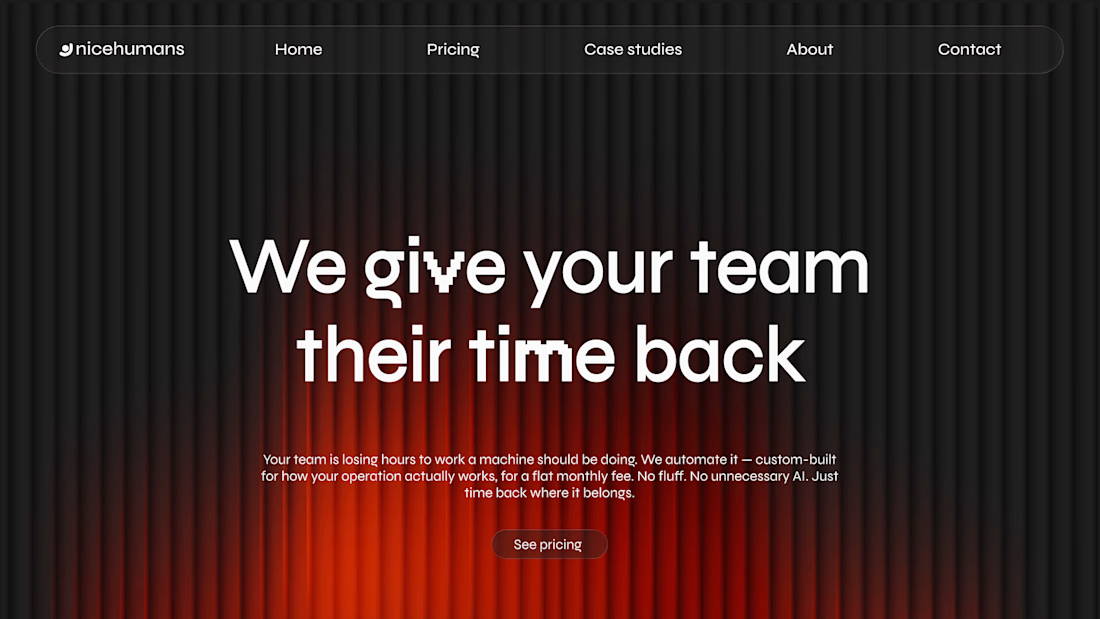
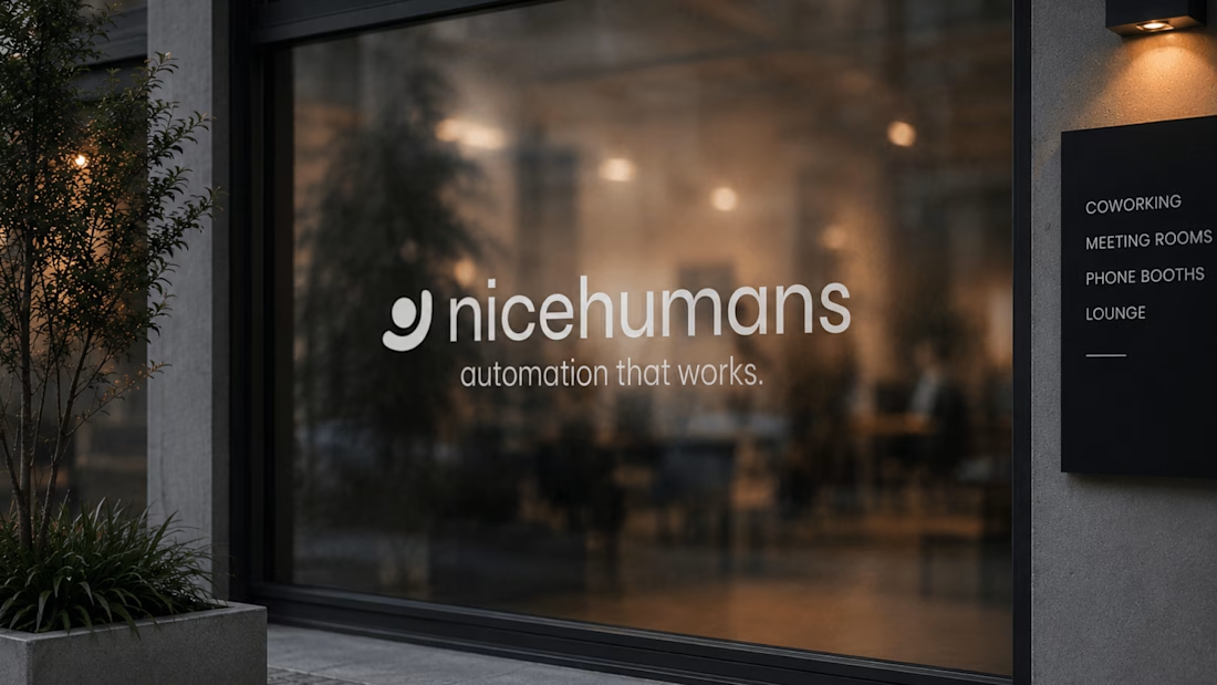
NICE HUMANS
Making automation feel human.
Context
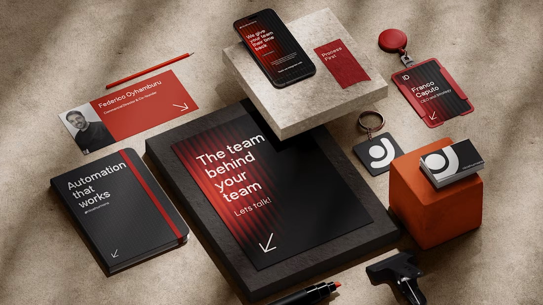
Nice Humans is a growing automation studio that helps teams streamline how they work. As they scaled, their brand no longer reflected the expertise or the people behind it.
The challenge
The automation market speaks in efficiency, systems and scale, and it often sounds interchangeable. Nice Humans needed to claim leadership in that space while standing for something competitors overlook: automation is ultimately about people.
The approach
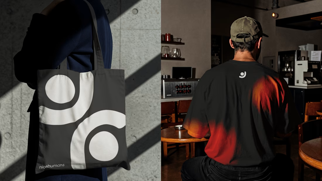
Rather than starting with a logo, we started with a positioning: a team that builds for other teams. From there we developed a complete brand strategy, including archetype, tone of voice, verbal identity and a visual language. Each one was designed to balance technical authority with human warmth.
The outcome
A cohesive brand system that sets Nice Humans apart in a crowded category and gives them a clear, consistent voice to grow with.


Great strategy and sleek execution! The visual hierarchy across web and print is spot on. 👏