The network for creativity
Join 1.25M professional creatives like you
Connect with clients, get discovered, and run your business 100% commission-free
Creatives on Contra have earned over $150M and we are just getting started
Back to feedPost
Choosing a nail color at the salon shouldn’t feel like a timed exam.
You know the moment: you’re staring at a wall of shades, the nail technician is impatiently waiting, and you can feel the pressure to just pick one. Then you spend the next two weeks wishing you’d chosen differently. The worst.
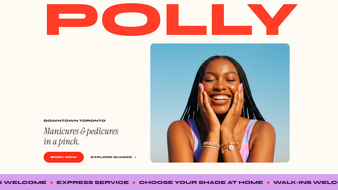
So I built Polly, an express nail studio in downtown Toronto. The problem I wanted to solve: help customers book while giving them time to choose a shade at home that they’ll actually love.
See it in action here: https://pollynails.lovable.app/
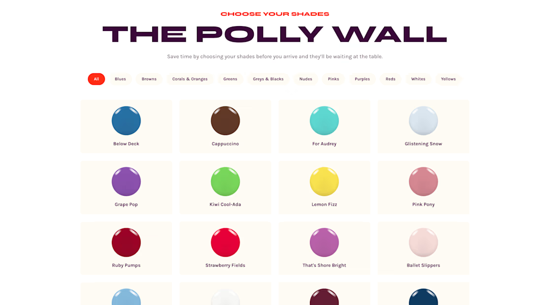
The booking flow lets customers choose their service, polish type, and up to three favourite shades. When they arrive, their shortlist is ready at their station where they can make the final call in person.
On the salon side, the team can see upcoming appointments and shade selections, manage availability, and keep the color collection up to date. It’s less decision pressure for the customer and less scrambling for the staff.
The appointment is express. The colour choice doesn’t have to be. 💅


which shade got the final vote?


As you can tell from my background choices…beige 😄

booking the shade shortlist before they sit down, that saves the awkward five minutes
Agreed! Thanks for the comment.

I love the color wall, so smart that you can have a look before you actually go to the salon! Great design.

This is really cool. My girlfriend would love that. Especially the quick checkout and the incentive to get 10% of when I create an account. Really good work.
Thanks, @Felix Weinzinger! Appreciate the comment

The Polly Wall is such a smart touchpoint, it turns the shade decision back into something tactile instead of just scrolling a color picker on a phone. Was the three-shade shortlist something customers asked for, or did you land on that number through testing?
Just experience being a woman 😂

Amazing designs visuals colors it looks modern minimalistic and that's great🎉❤️
Thanks so much!


the timed exam feeling is too real lol
I don't like that kinda pressure!

Such a great idea!
Thanks so much @Brittnie Holman!

This is such a smart example of solving the friction around the booking, not just the booking itself. The shade shortlist seems simple, but passing that context from customer to staff before the appointment is where the real value is.
Curious, did that idea come from talking to salon customers/staff or from your own experience?
Thanks so much @Francisco Lourenço! Definitely from my own experience (and frustrations!). I appreciate the comment and question.

i need this 😍 awesome idea!!
Right??
just an idea for your V2. Add some nail art designs to the mix <3


Great work👏🔥🔥
Thanks so much, @Picto Design Studio!

nice project Afton...great work
Thanks so much!

good

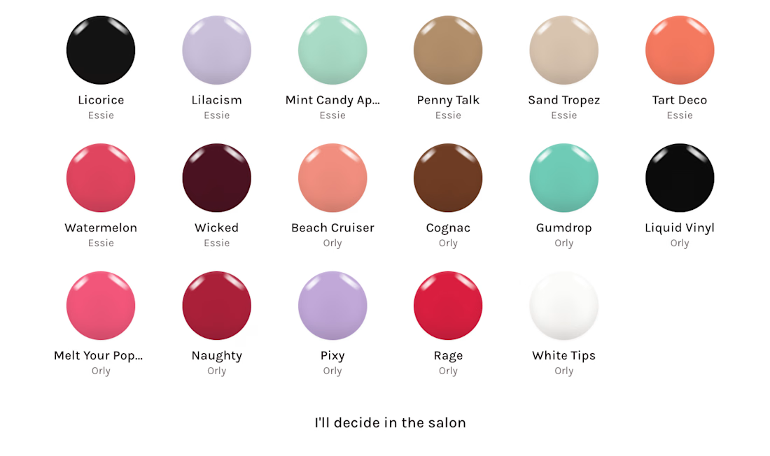
If a client can’t decide at home does the booking flow let them skip shade selection and choose entirely in person?
Yes, there's an option that says "I'll decide in the salon"! And even if they want to change their selection later at the studio, the staff can update the colors in their account so they can reference them for future bookings. Thanks for asking!

Really solid work 👏 Solving everyday decision paralysis through smart, beautiful design choices is top-tier product strategy!
Thank you, @Boluwatife Delight!

Really nice work Afton! 👏
Hey @Neerav Dobaria! Thanks so much 😊

This is a GREAT idea!
Thank you so much, @Dene Aurielle!

This actually saves tons of time, cool idea 👏🏻👏🏻
Thanks so much, @Favour Jacob!

Great! You did an amazing one. Soo good.

Very interesting

Great work
Thank you very much, @Mohd Faizan!

Great work
Thanks so much @Youssef Hussein

Sleeek

did you receive a confirmation email about the project? im not sure if my project is in place or not.
At the top of the Lovable challenge page, it will tell you if your entry has been received.

Thanks so much, @Refil kae


Love the design vision!
Thank you so much, @Maria Cristal T. ❤️

Coool project...

The nail salon pressure moment is so real. Great problem to pick, feels like something people would actually use.

Every. Damn. Time. And all those beautiful colors that look so amazing in the bottle are ugly AF on my toes 😂

THIS! The pressure is real hehe.
I love the product's personality, the fact that you can choose through hues and how helpful it could be!
The network for creativity
Join 1.25M professional creatives like you
Connect with clients, get discovered, and run your business 100% commission-free
Creatives on Contra have earned over $150M and we are just getting started











Related posts

AI Receptionist & Booking Agent for Austin's Sharpest Fades — Austin's #1 rated barbershop.
Built in Lovable to automate bookings and customer service:
Answers FAQs (services, prices, hours, location)
Recommends cuts based on face shape/hair type
Quick-reply flows: "What's the price?", "What cut suits me?", "Book 3pm"
Collects name, phone, date/time & guides to booking + payment
Ready for integrations: Calendar, Stripe Payments, CRM, WhatsApp/SMS
Stack: Lovable, Luna, HTML/CSS/JS, API workflows
Goal: Reduce no-shows, increase bookings, 24/7 AI receptionist.
Live demo available.


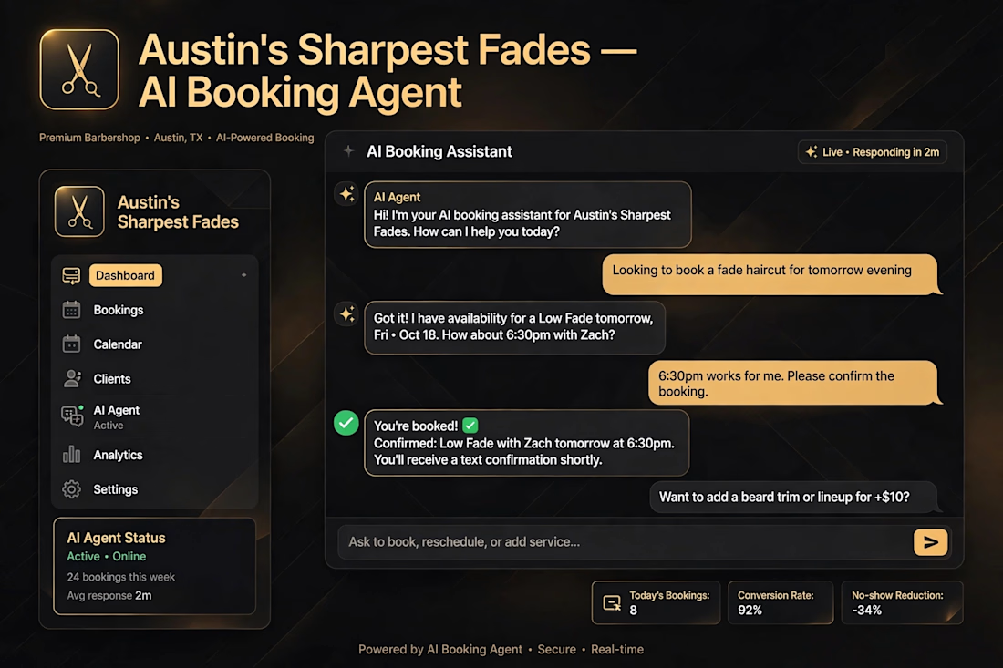

The demo flow in the screenshots reads really naturally, and recommending cuts by face shape is a clever touch that makes it feel personal rather than robotic. Have you seen it reduce no-shows in practice yet?

The Lovable Challenge is officially done! Big shoutout to everyone who participated, liked, commented, shared, and scrolled through 🙌
Congratulations to the winners:
1st place: Sergey Bertagnini
2nd place: Lubos Belak
3rd place: Alice D.
Social Media Superstar: Victoria Lishchuk


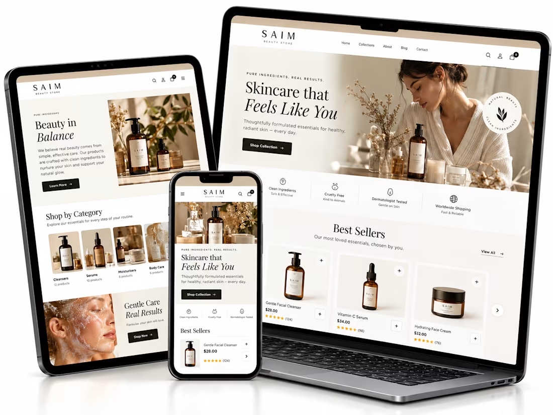
Shopify website setup project, I created a premium eCommerce homepage concept for a startup beauty brand.
Using Lovable, I developed a responsive design framework featuring elegant product showcases, intuitive navigation, clear shopping CTAs, ingredient storytelling, product benefits, customer review sections, FAQs, and email capture.
The goal was to establish a professional brand presence, simplify product discovery, and create a conversion-focused foundation for Shopify development.


The soft neutral palette suits the skincare angle really well, and the best sellers section with the star ratings reads cleanly across all three device mockups. Building the whole concept in Lovable is interesting. Did the generated layout hold up responsively out of the box, or did you rework parts of it by hand?