The network for creativity
Join 1.25M professional creatives like you
Connect with clients, get discovered, and run your business 100% commission-free
Creatives on Contra have earned over $150M and we are just getting started
Back to feedPost

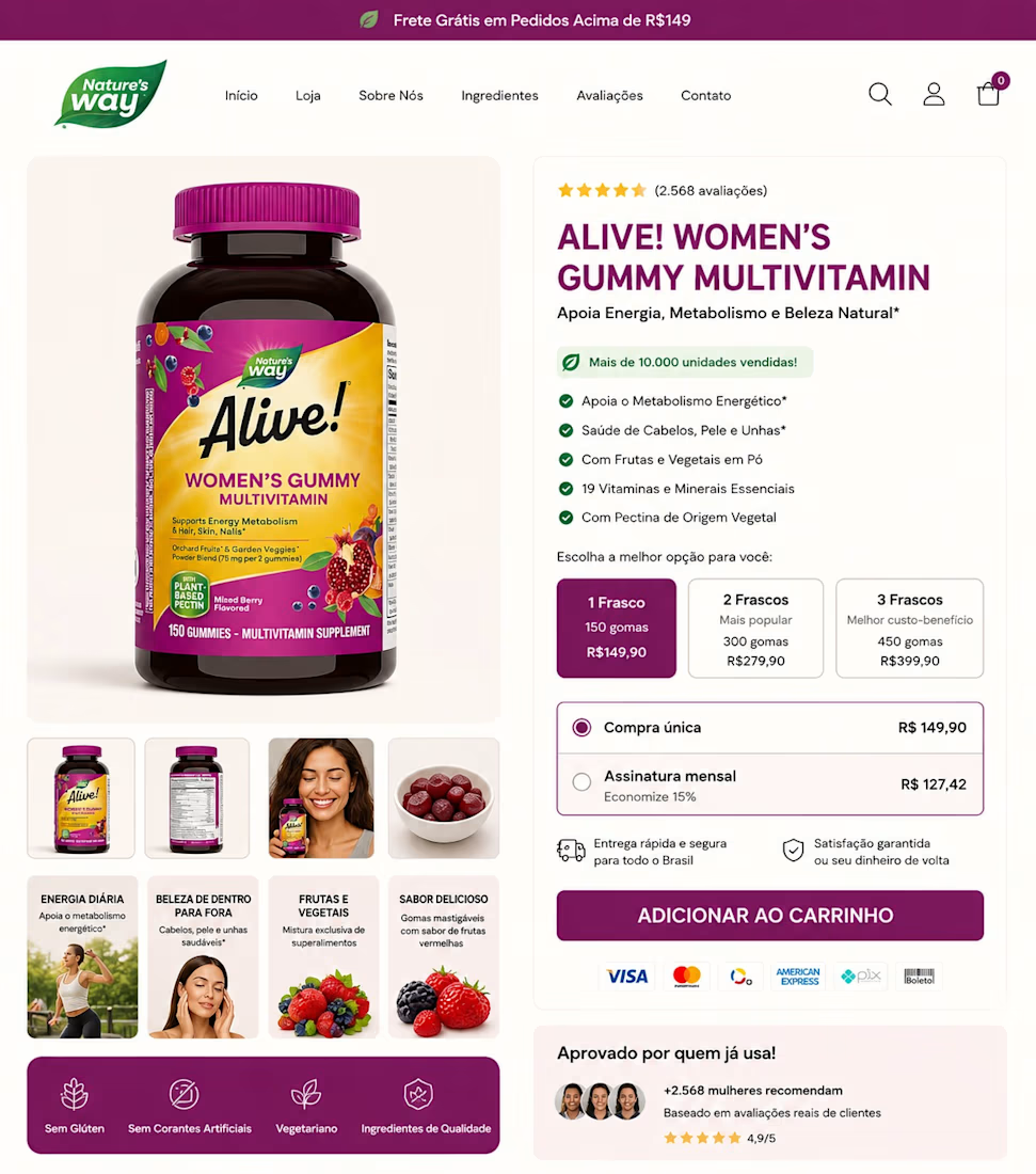
A PDP shouldn’t make shoppers “figure out” why they should buy.
It should make the buying decision feel obvious.
For this Shopify PDP, I focused on one thing: reducing uncertainty at the point of purchase.
I structured the page so the shopper gets the important answers in sequence:
Clear benefit-led product headline.
Immediate value proposition.
Benefits surface before the buyer has to search.
Visual proof showing the product in context.
Reviews placed close to the buying decision.
Quantity options with clear value positioning.
One-time vs subscription made easy to compare.
Guarantee + shipping reassurance before checkout.
Strong CTA with minimal friction.
The goal isn't to make the PDP look "premium".
It's to remove the questions that make someone hesitate.
Every section should answer one question and move the buyer closer to "yes."
What part of your PDP do you think is creating the most hesitation right now?


The network for creativity
Join 1.25M professional creatives like you
Connect with clients, get discovered, and run your business 100% commission-free
Creatives on Contra have earned over $150M and we are just getting started
Trending
retrofuturism
Share your favorite designs from the past exploring the distant future. Or your own take on the aesthetic 🚀
halftone
Dots. Texture. Grain. Let's see your designs using the halftone technique.

Midjourney
Creatives are showing off what they're making with Midjourney.
colorgrade
Video editors sound off: How do you enhance the mood of your video in color grading?





Related posts


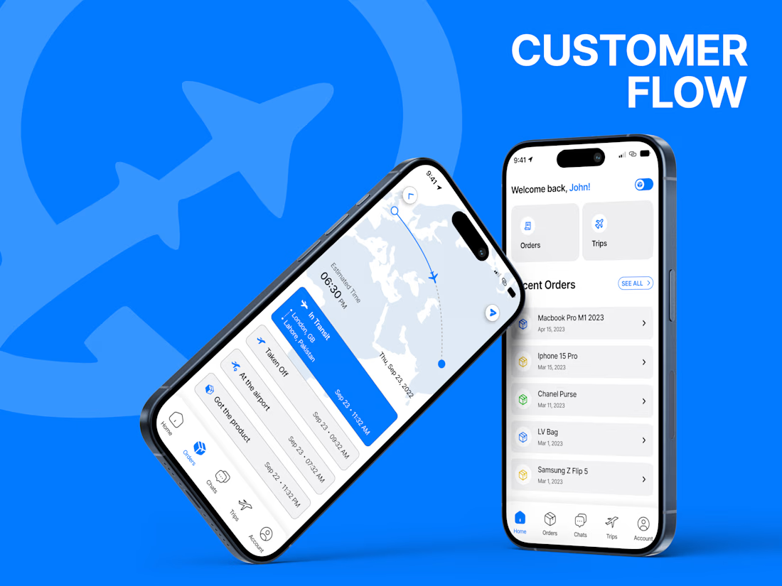
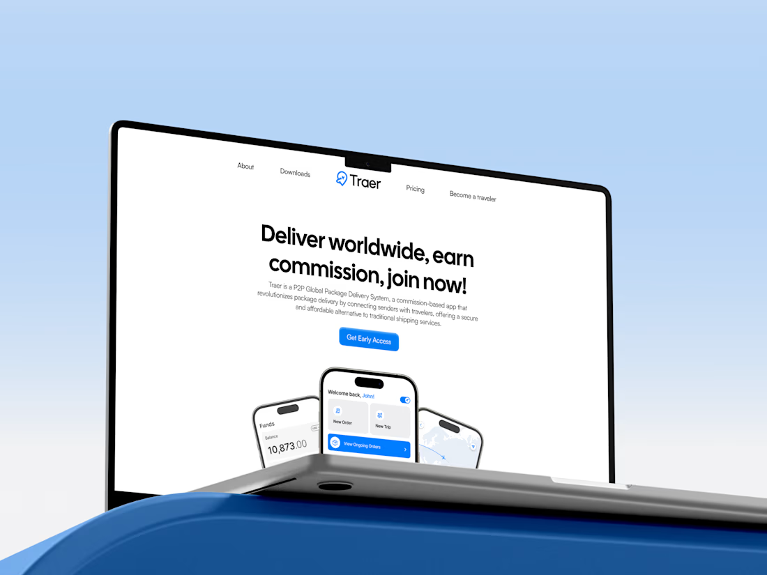
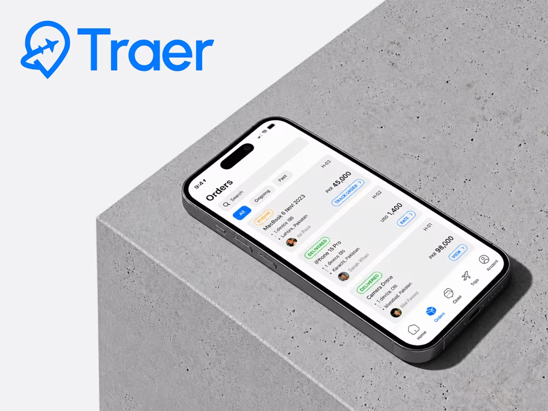
Traer Mobile App Design.
A clean and modern mobile app UI/UX design for Traer, a P2P global package delivery platform.
Designed the experience around package tracking, orders, trips, and delivery management, keeping everything simple and easy to navigate.
Also explored the visual identity, typography, colors, and responsive product experience to keep the app consistent across the brand.
Really enjoyed bringing this one together.



High-end design.

What if a gallery felt like scrolling through someone’s feed?
For Namaste Studios, I wanted the gallery section to have a bit more personality than the usual collection of neatly arranged images.
So I borrowed a visual language we already know instinctively: Instagram posts.
The cards sit around the main content and stay sticky as you scroll, creating this playful, layered composition that slowly unfolds with the page.
It makes the section feel less like “here are some photos from our studio” and more like you’re getting little glimpses into the world of Namaste.
Sometimes a familiar interaction, used in a slightly unexpected way, is all a section needs.
Built for my Namaste Studios Framer template. 🌿


Love it 🧡


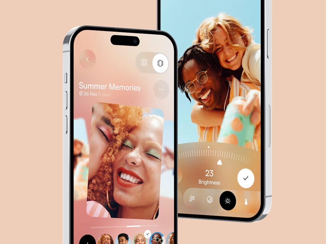
Meet a new concept for photo gallery mobile app 🖼️ Share your feedback


Looks great