The network for creativity
Join 1.25M professional creatives like you
Connect with clients, get discovered, and run your business 100% commission-free
Creatives on Contra have earned over $150M and we are just getting started
Back to feedPost
Taste Test


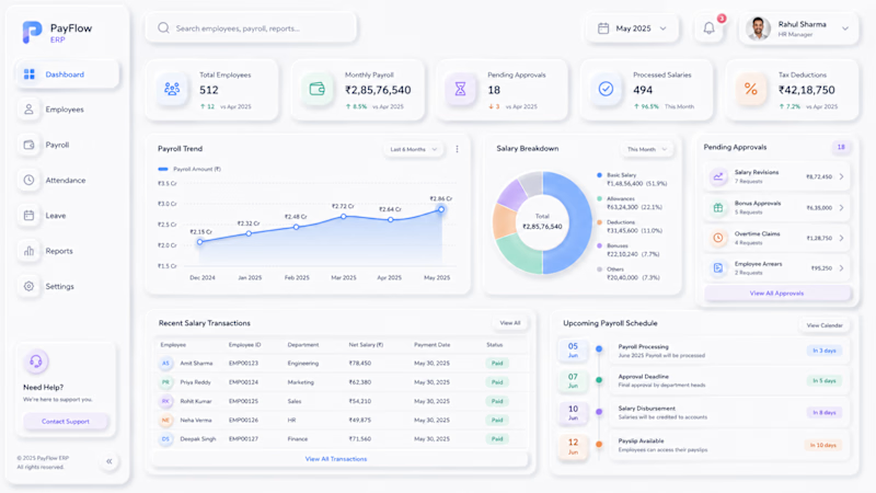
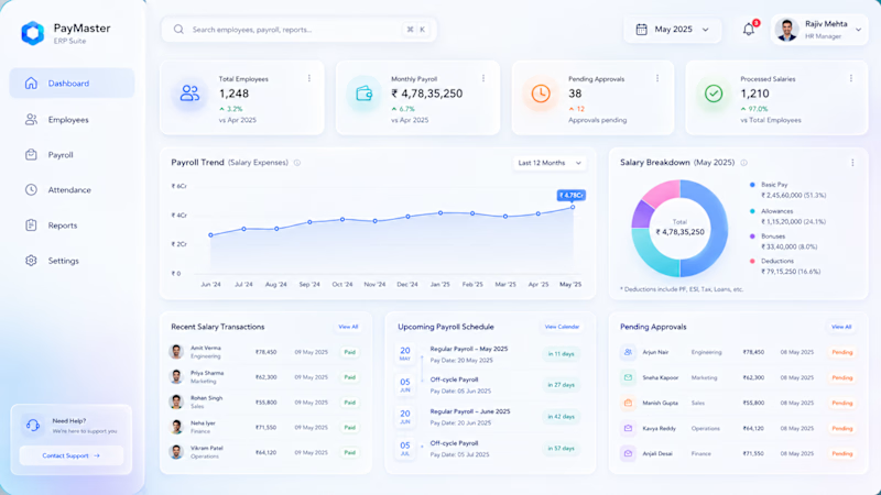
Building a Salary Management Web App and I like the neo-morphism style but at the same time I feel that Glass-morphism would feel comparatively more grounded.
What do you guys think?
1 voted
6%
16 voted
94%
17 votes
Closed

Salary management is a trust-heavy workflow, so the visual language needs to feel calm and dependable before it feels novel. The neo-morphism versus glass-morphism question is a useful product signal, not just a styling choice.
Yes exactly!

B! dont know how to explain it but that pop of color does it for me
I agree. It does look good to the eye!

Beautiful project.
Thank you!

B is giving more clarity and data
The presentation feels cleaner.

So clean and beautifully executed!
Thanks Rajesh, appreciate it. But which design feels better to you, A or B?
Thanks for the vote! B definitely seems like the better choice


I’d lean toward glassmorphism here. It feels more grounded and still gives you room to keep the UI modern.
Yes true. Thank you for your feedback 🙌

B feels more trustworthy for payroll because the blue chart gives the eye one clear place to start. I’d keep that color for important totals and actions, so people can scan faster without highlighting every card.
Yes exactly. Blue instills trust in the system visually.

B looks organised and clea.
I agree!

Thanks, appreciate your feedback very much

Creative !
Thanks Sahil

Neo-morphism's soft shadows tend to hurt legibility right where payroll needs it most — amounts, approval states. Glass-morphism keeps more contrast, and that scannability matters more than trend fit for a finance tool.
Yes agreed! Thanks for the feedback!
The network for creativity
Join 1.25M professional creatives like you
Connect with clients, get discovered, and run your business 100% commission-free
Creatives on Contra have earned over $150M and we are just getting started
Trending
retrofuturism
Share your favorite designs from the past exploring the distant future. Or your own take on the aesthetic 🚀
halftone
Dots. Texture. Grain. Let's see your designs using the halftone technique.

Midjourney
Creatives are showing off what they're making with Midjourney.
colorgrade
Video editors sound off: How do you enhance the mood of your video in color grading?



Related posts

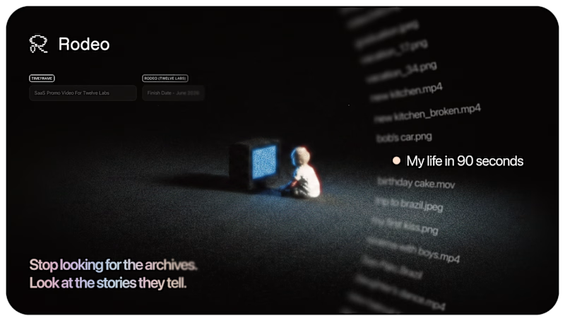
Usually it's the smallest details that make the biggest difference.
Nothing that screams for attention - but together, it makes the whole piece feel more alive.
Good motion doesn’t always need to be noticed. Sometimes you just feel that it’s better.👌
What do you think?
46 voted
90%
5 voted
10%
51 votes
Closed
Animated is good but you can make a loop to align it

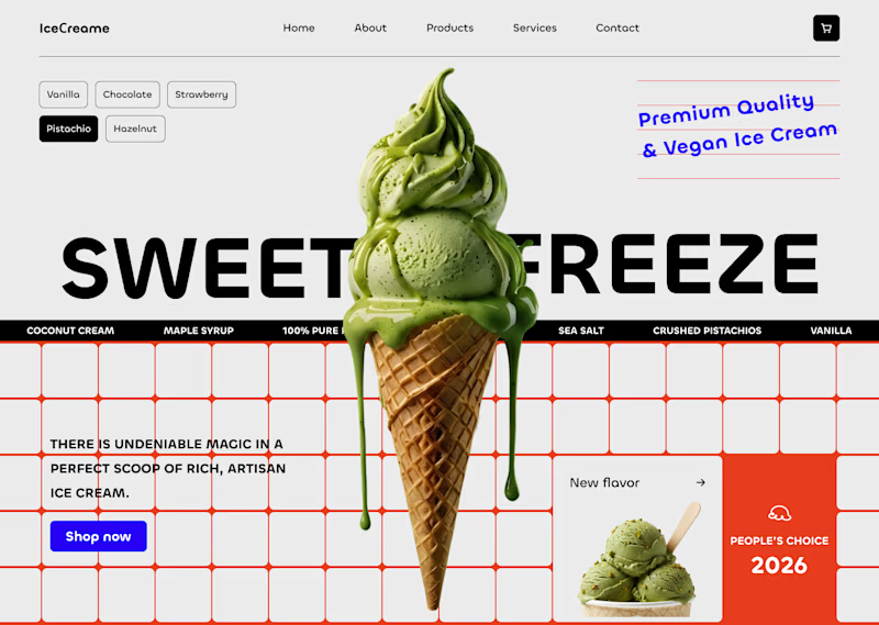
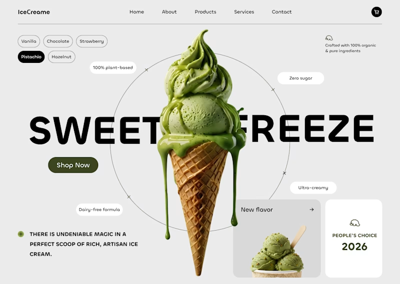


The 2nd concept is so clean 😍

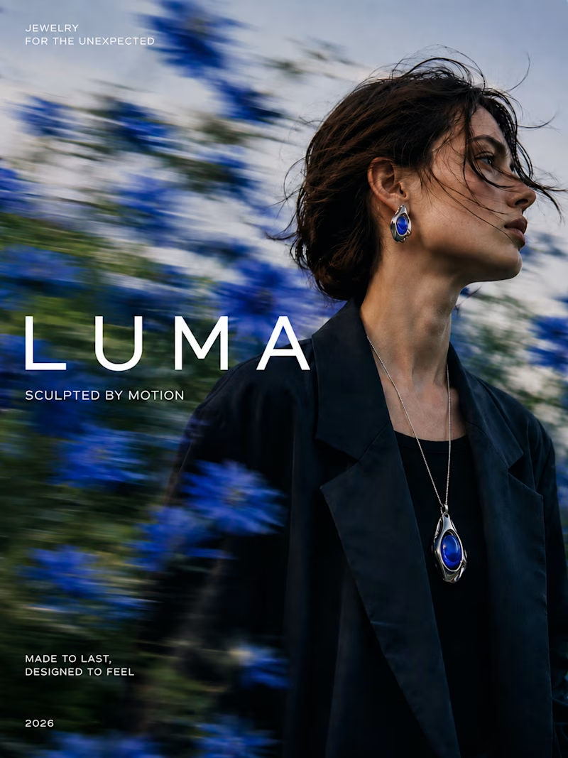
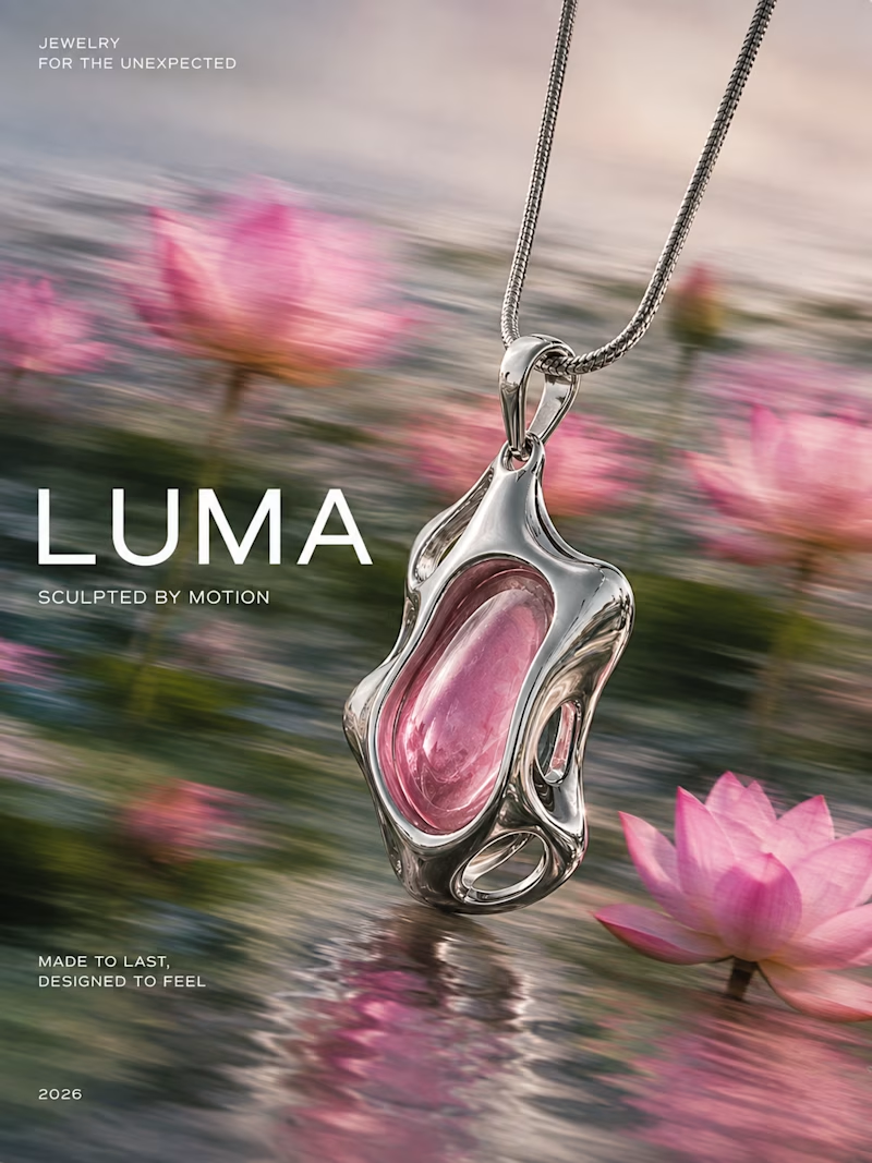
I explored a motion blur effect to add movement and energy to the jewelry campaign, so which direction works better for LUMA?
28 voted
48%
30 voted
52%
58 votes
Closed

Pendant as a hero feels insanely premium! The contrast between the sharp jewelry contours and the soft motion-blurred background really brings out the "Sculpted by Motion" concept. Beautiful execution! 💎✨