The network for creativity
Join 1.25M professional creatives like you
Connect with clients, get discovered, and run your business 100% commission-free
Creatives on Contra have earned over $150M and we are just getting started
Back to feedPost

Greetings.
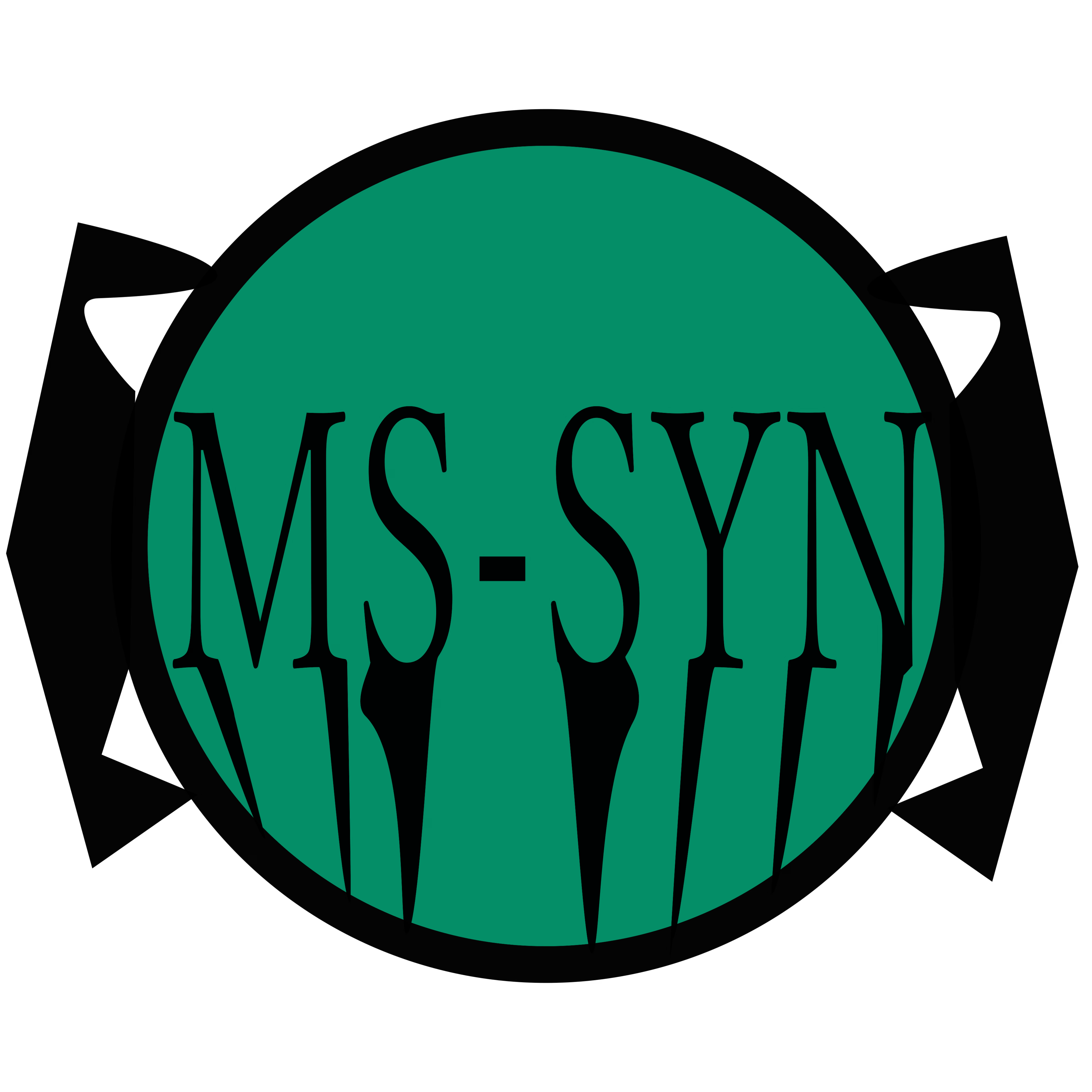
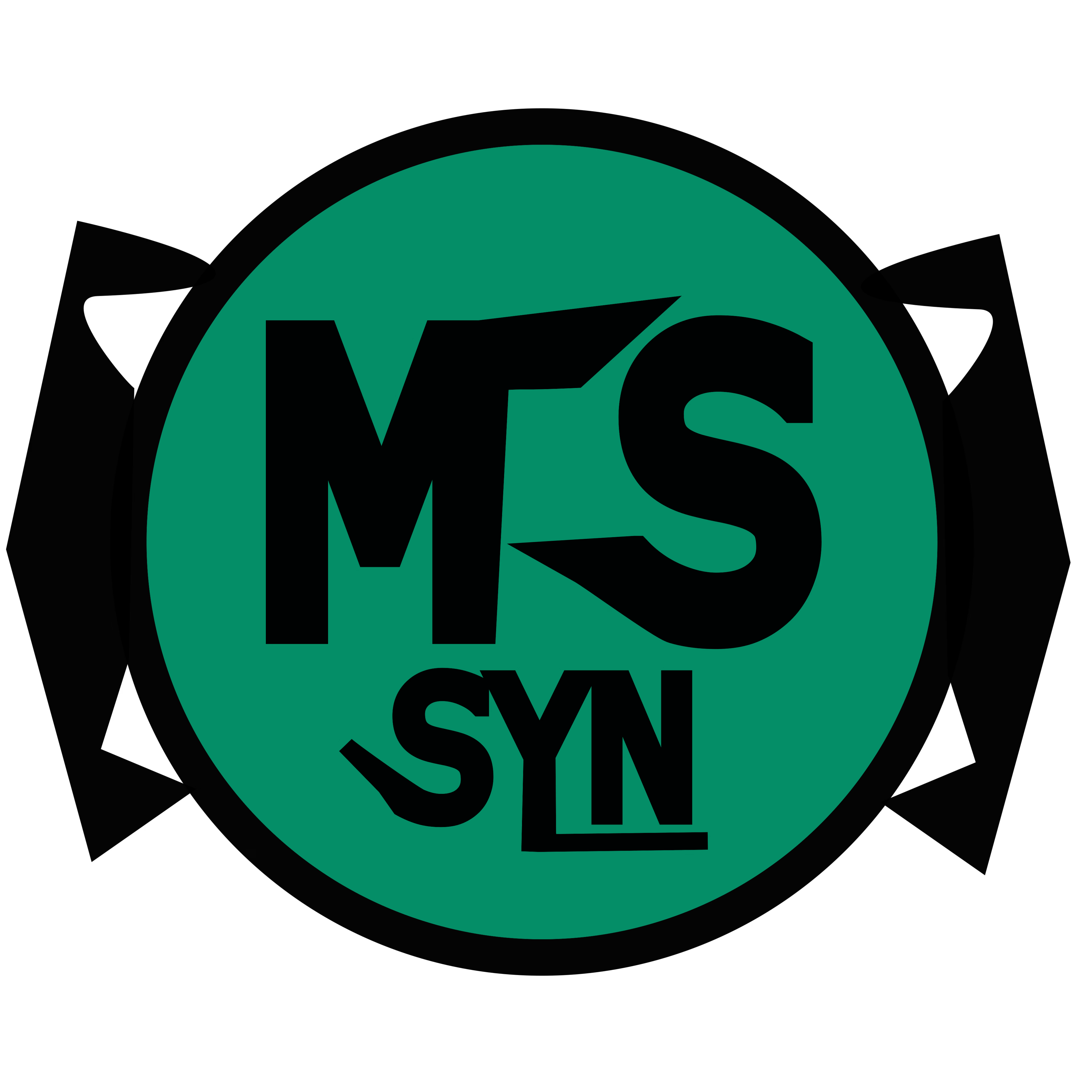
So I made an update on the Mahaasin synthetics logo, I made it more woven and thicker in typography.
This was all thanks to a critique on the previous version, shoutout to @Artur Mikhov.
By the way, more information related to the typography change in this logo, I took a bit more information and references from late 1940s logos, especially the logo of Toyota in 1949, and the letters in the bottom are merged together, this was intentional, so this isn't a contradiction to the hairline critique, so yeah if this brand concept was real and had advertisements on certified physically-sticked versions of their logos, then the merging in the letters was purely intentional and is a part of the brands image.
I will put below the 2 versions.
Left: first concept, with hairlines.
Right: second concept, aka the one with thicker typography and more design, but still with the same mint green color palette.

The network for creativity
Join 1.25M professional creatives like you
Connect with clients, get discovered, and run your business 100% commission-free
Creatives on Contra have earned over $150M and we are just getting started











Related posts

Logos from my archive.
A good logo doesn't really have to tell what you do; it's meant to tell a story. Here are some with their unique stories.
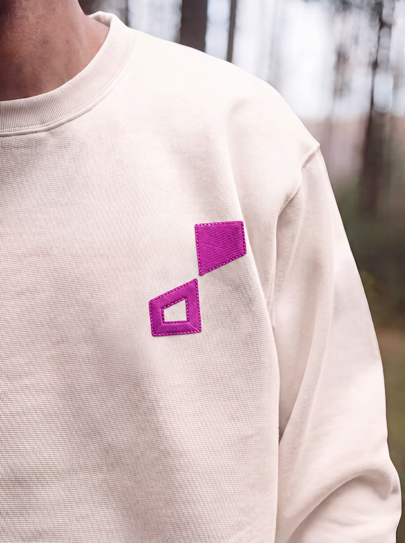
¹ Unik Mindz — inspired by Michelangelo’s 'Creation of Adam'; human creativity sparked by a higher source.
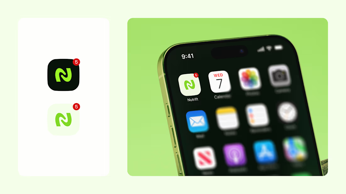
² Nutrift — reflecting the idea of weekly cycles and continuous meaningful progress.
³ Nestform — built to reflect furniture that adapts and transforms to different living spaces.
⁴ Ember & Oak — built around the truth that coffee is defined by its transformation, with the mark capturing the entire roasting journey.
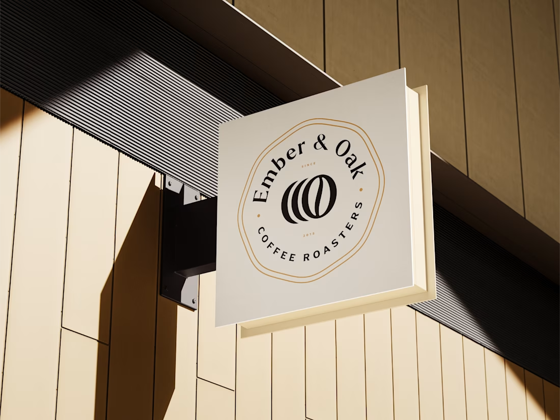

Do you usually find the story first and draw toward it, or does the story get written once the mark takes shape? The weekly-cycle idea behind Nutrift reads like it could have gone either way.


Approved logo for a mental health and daily habit app built for seafarers and offshore workers.
Can't wait to share more.

A little peek at the brand work we did for Elio Mortgage.
A warm, approachable identity full of warm vibrant colors paired with soft sun rising inspired gradients, inner glows and custom illustrations & more. Loved this direction!
Full case study coming soon, from process to final identity.
Plenty of logo explorations to share too!


That color palette takes the whole identity to a different level!! I loove it.