The network for creativity
Join 1.25M professional creatives like you
Connect with clients, get discovered, and run your business 100% commission-free
Creatives on Contra have earned over $150M and we are just getting started
Back to feedPost
Logos from my archive.
A good logo doesn't really have to tell what you do; it's meant to tell a story. Here are some with their unique stories.
¹ Unik Mindz — inspired by Michelangelo’s 'Creation of Adam'; human creativity sparked by a higher source.
² Nutrift — reflecting the idea of weekly cycles and continuous meaningful progress.
³ Nestform — built to reflect furniture that adapts and transforms to different living spaces.
⁴ Ember & Oak — built around the truth that coffee is defined by its transformation, with the mark capturing the entire roasting journey.
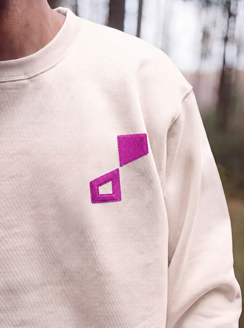
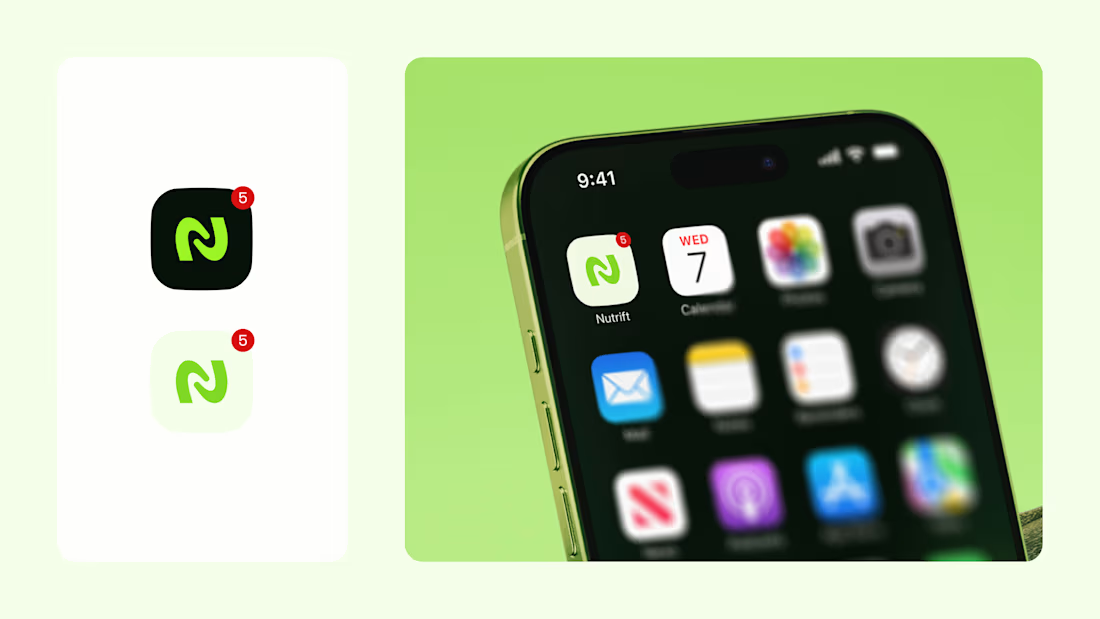
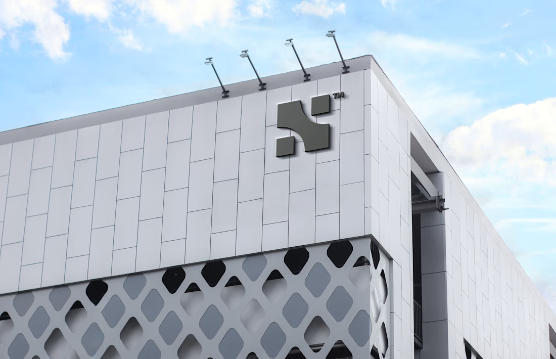
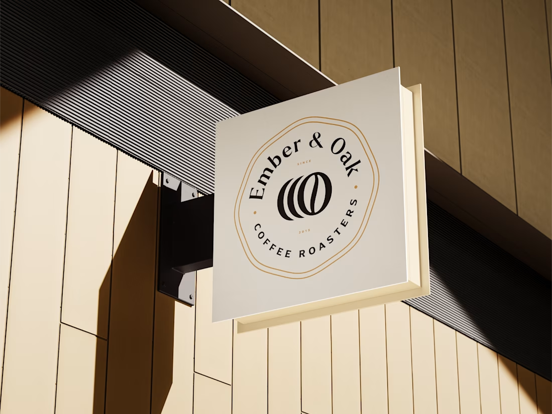

Do you usually find the story first and draw toward it, or does the story get written once the mark takes shape? The weekly-cycle idea behind Nutrift reads like it could have gone either way.

It's always the story first. Without the story, there's no objective.
I did have some back-and-forth with the client on the Nutrift logo, and its story is essentially the app's aim: to support users by guiding them through weekly nutrition improvements in a way that feels sustainable over time.
That makes sense, a story built around steady weekly progress gives you a natural rule for the mark: keep it calm and repeatable rather than loud. Did the client push back on any early direction because of that?
Yeah, most of the initial directions did not fully portray the cycle clearly.
The network for creativity
Join 1.25M professional creatives like you
Connect with clients, get discovered, and run your business 100% commission-free
Creatives on Contra have earned over $150M and we are just getting started







Related posts

Cachet brand exploration.
Exploring patterns, textures, materials and hand-drawn illustrations
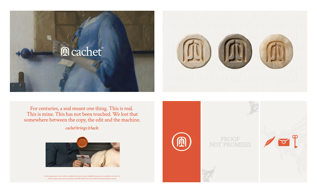

That's interesting I like it that's really unique ❤️❤️🎉🎉

Recent work on MAE - Visual identity


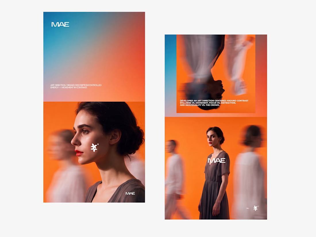
The motion blur on the figures gives the orange-to-blue gradient a reason to be there, and the small star mark stays readable on both the cheek and the shirt. Did the star come first as a standalone mark, or did it grow out of the photography direction?

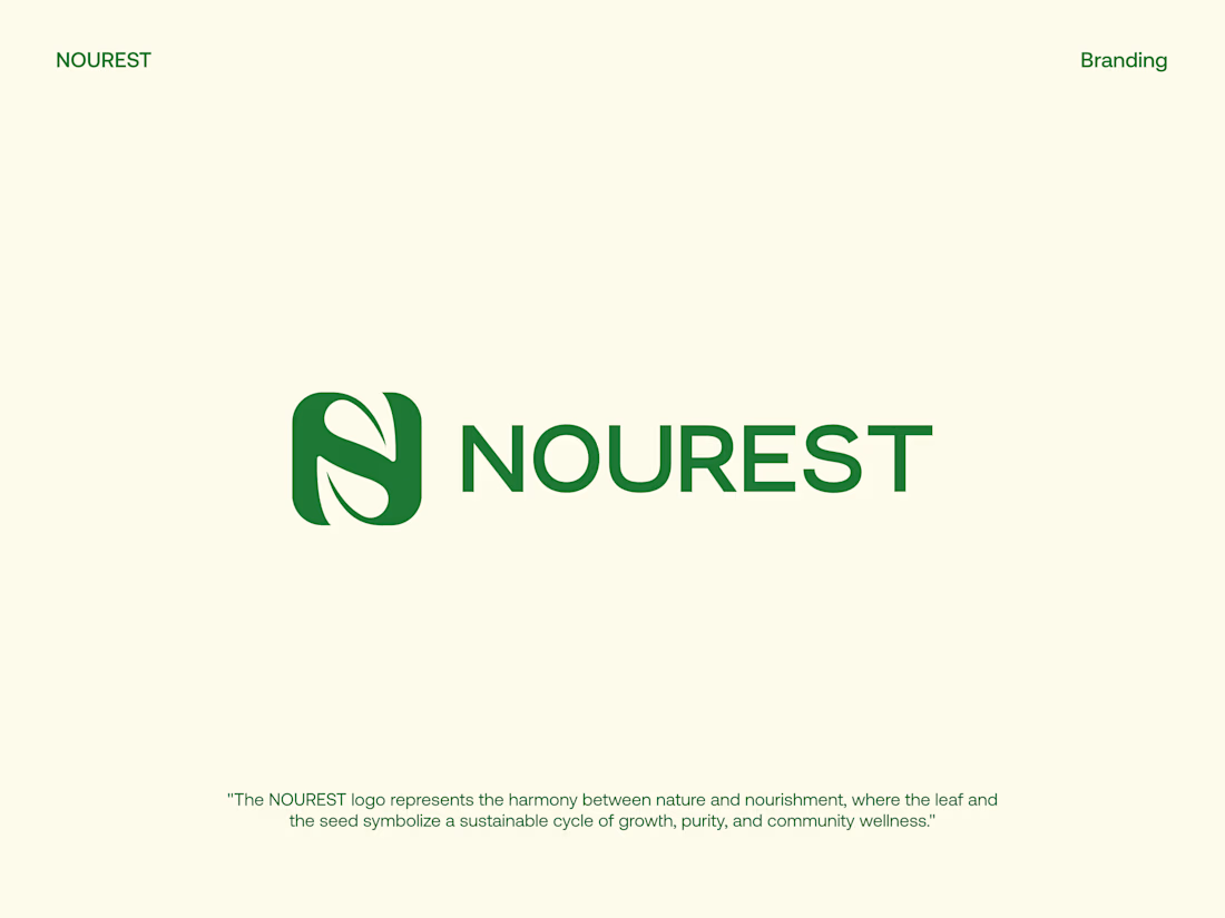
NOUREST — Nature-Led Brand Identity Design.
A brand about nature should feel natural at every touchpoint. 🌿
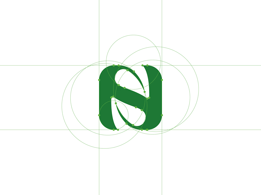
That's the idea behind NOUREST from its leaf-inspired monogram and green-led palette to packaging and brand materials.
One identity.
A consistent experience.
🏀 Full Design Showcase – Better View on Dribbble.
✅ https://dribbble.com/shots/27799268-NOUREST-Sustainable-Brand-Identity