The network for creativity
Join 1.25M professional creatives like you
Connect with clients, get discovered, and run your business 100% commission-free
Creatives on Contra have earned over $150M and we are just getting started
Back to feedPost

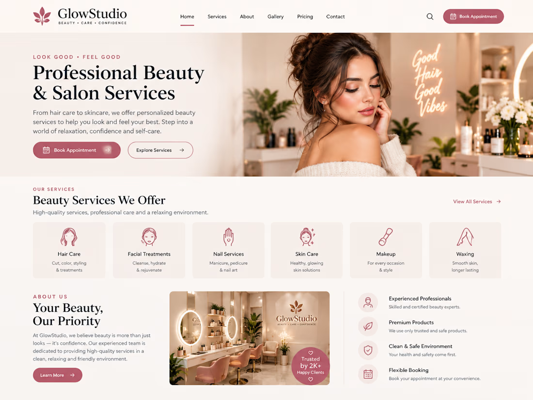
Designed a modern beauty salon website concept with an elegant layout, service sections, appointment booking calls to action, and a refined visual style to help beauty businesses present their services professionally.


The network for creativity
Join 1.25M professional creatives like you
Connect with clients, get discovered, and run your business 100% commission-free
Creatives on Contra have earned over $150M and we are just getting started








Related posts


Kajabi isn’t only for courses 👀
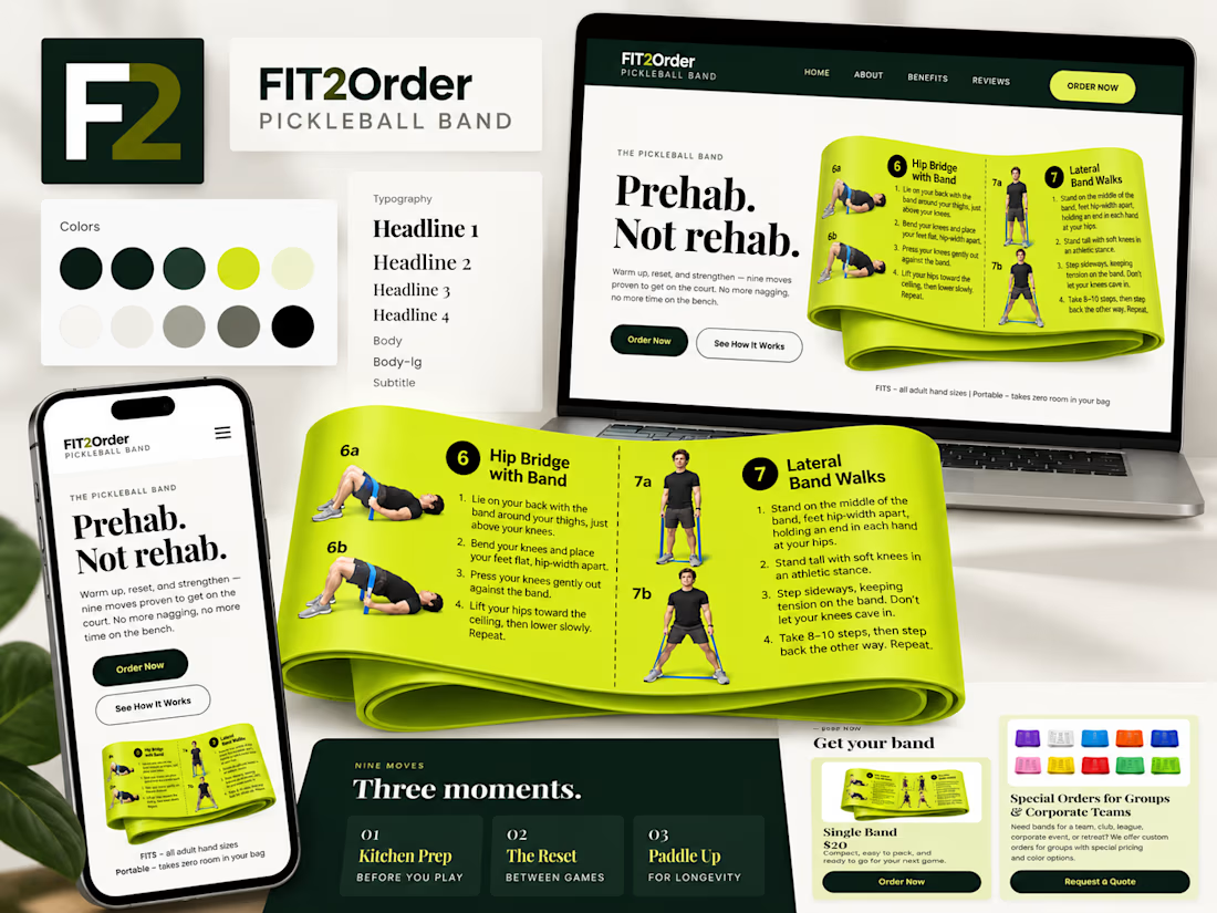
For Fit2Order’s new Pickleball Band, we created a complete product experience inside Kajabi – from the landing page and checkout to order forms, confirmations, and the post-purchase flow.
A fun one for us because it meant adapting Kajabi to work for a physical product while still keeping everything simple for the team to manage.


Prehab, Not rehab is a sharp headline for the band. The lime against deep green stays readable across all three devices.

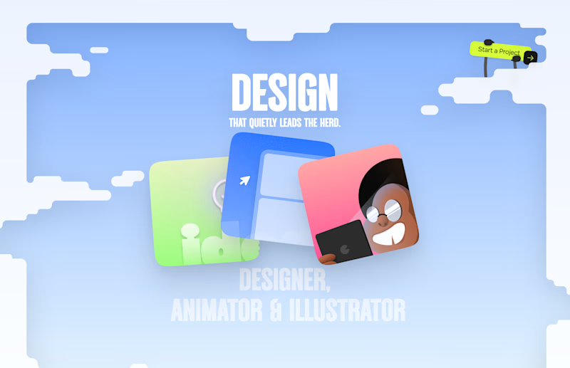
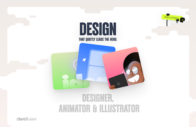
Should I go for left or right? Focusing on updating and finishing up my portfolio... and then I came across this crossroads. Another alternative is to make them switchable themes through a toggle, but I still need to decide which should be the default.
27 voted
75%
9 voted
25%
36 votes
Closed

Left is better because the text is readable, the overall blue background is not flashing to the eyes as compared to the right one.
For the top right button " Start a project ", you can add some animation so that it stands out and encourage users to click on it.

How do you give a theatre a new face without throwing away the one it already has?
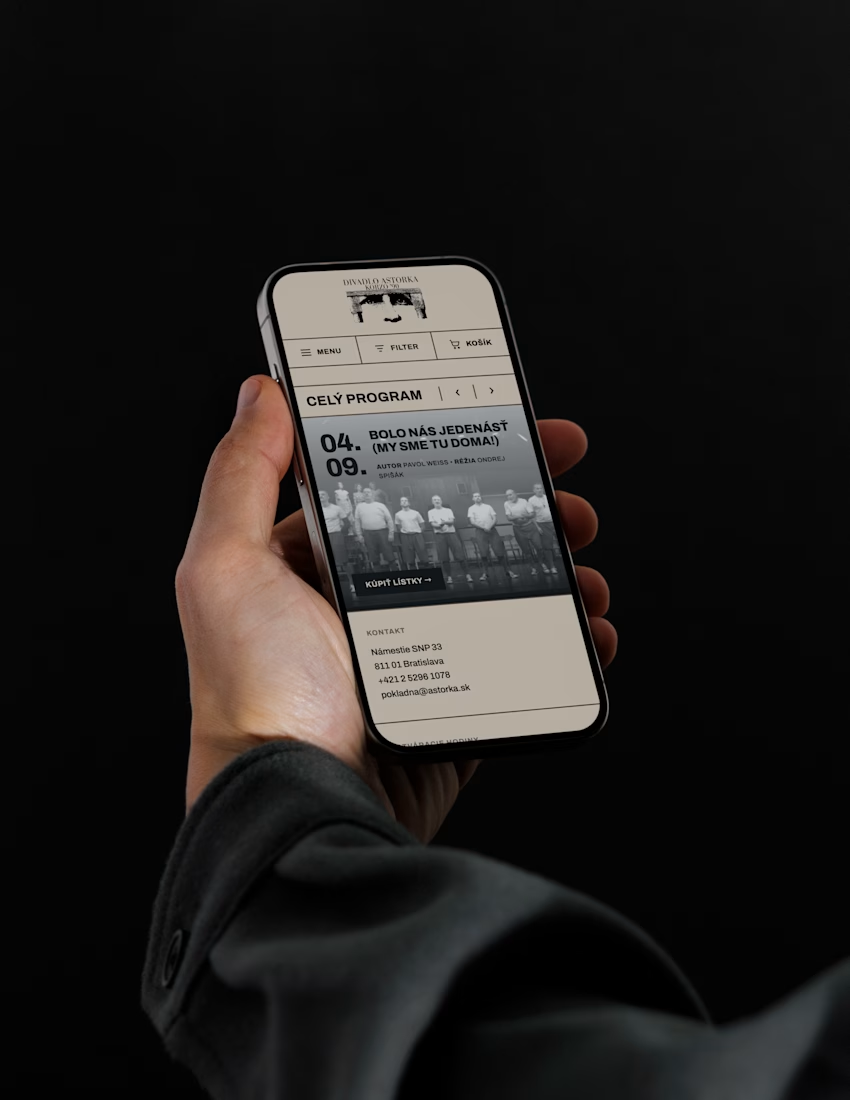
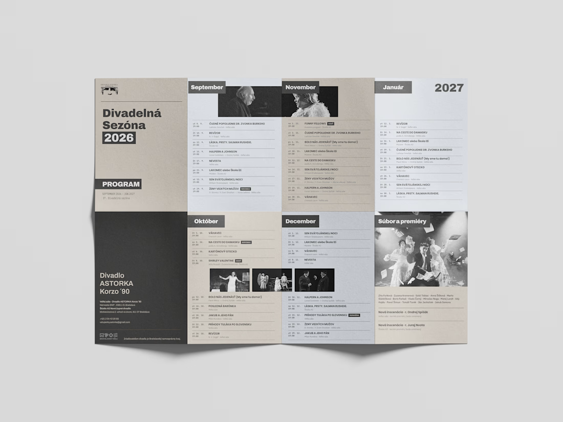
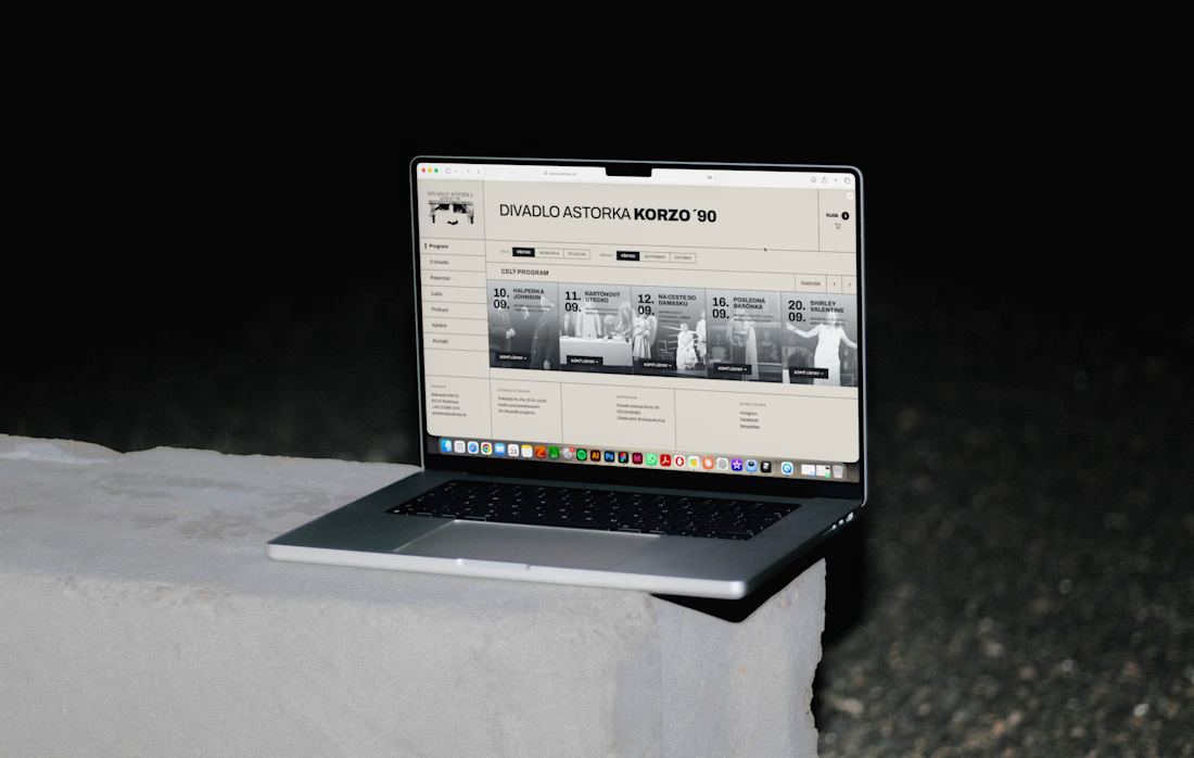
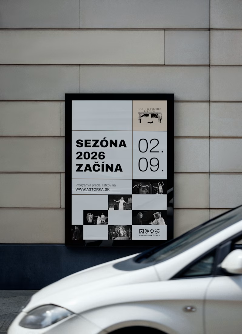
For ASTORKA Korzo '90 in Bratislava, the answer was to keep the existing logo and build a whole new world around it: a fresh system of typography, colour and imagery that gives the theatre a clear, confident presence of its own.
The identity runs on three levels:
– A redesigned website, designed in Figma and developed with an AI-assisted workflow using Claude
– printed theater plan
– Motifs for digital billboards across the city
Working with an existing logo is a real design constraint. The trick was making the new system strong enough to carry the brand while letting the logo stay recognisable. Theatres live from continuity and from change at the same time, and the identity had to hold both.
Image rights: Divadlo ASTORKA Korzo '90
Skills: Visual Identity, Art Direction, Poster Design, Web Design, Brand Identity, Typography, Cultural Branding, AI Design
Tools: Figma, Claude
What do you think about the redesign?

Keeping the old logo and building a whole new system around it is a smart call.