The network for creativity
Join 1.25M professional creatives like you
Connect with clients, get discovered, and run your business 100% commission-free
Creatives on Contra have earned over $150M and we are just getting started
Back to feedPost
How do you give a theatre a new face without throwing away the one it already has?
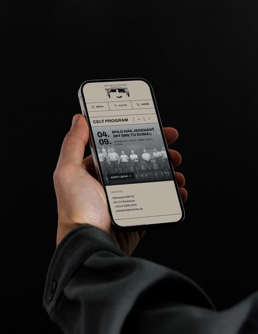
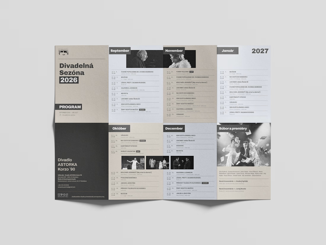
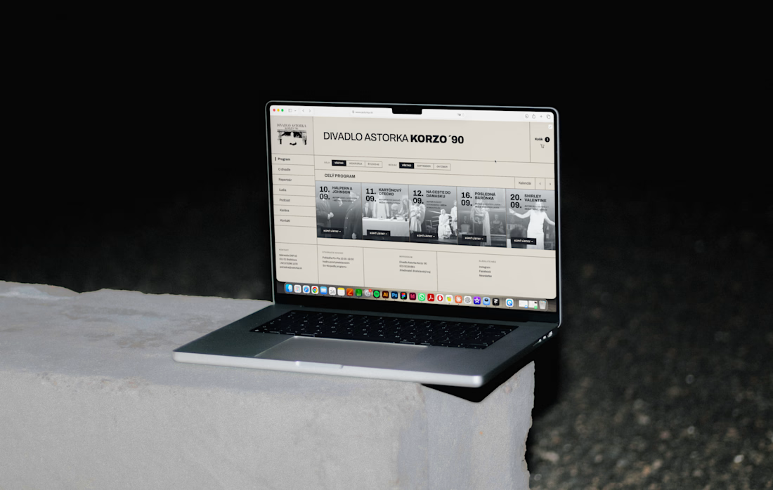
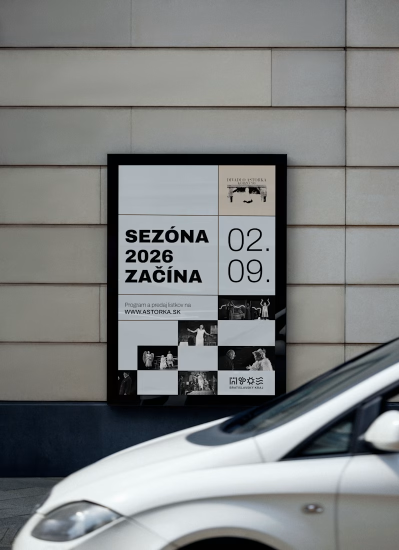
For ASTORKA Korzo '90 in Bratislava, the answer was to keep the existing logo and build a whole new world around it: a fresh system of typography, colour and imagery that gives the theatre a clear, confident presence of its own.
The identity runs on three levels:
– A redesigned website, designed in Figma and developed with an AI-assisted workflow using Claude
– printed theater plan
– Motifs for digital billboards across the city
Working with an existing logo is a real design constraint. The trick was making the new system strong enough to carry the brand while letting the logo stay recognisable. Theatres live from continuity and from change at the same time, and the identity had to hold both.
Image rights: Divadlo ASTORKA Korzo '90
Skills: Visual Identity, Art Direction, Poster Design, Web Design, Brand Identity, Typography, Cultural Branding, AI Design
Tools: Figma, Claude
What do you think about the redesign?



Keeping the old logo and building a whole new system around it is a smart call.

redesign is needed but the logo is so cool! it was self-initiated project, I send it to them and got no answer...could be such a cool project.

Keeping ASTORKA’s existing logo and rebuilding typography/color/billboards around it is the right theatre move — continuity for the audience, refresh for the city-facing presence.
thank you!

Absolutely love this 😍
thank you! 🙌
The network for creativity
Join 1.25M professional creatives like you
Connect with clients, get discovered, and run your business 100% commission-free
Creatives on Contra have earned over $150M and we are just getting started



Related posts

New case study for the brand and digital work we did for Seeper Studios.
Go Check it out


Evolving a brand with almost 30 years of history is the hard version of brand work. You have to keep what people already trust while making it feel current. Nice job balancing both.


Branding & Visual Identity for AirCon West based in London.
Designers! Present your work with motion! It breathes life into your work and conveys your ideas in a dynamic way.
Use free online motion tools to do it.
My favorites:
https://animos.app/
https://arqe.ai/
https://orelin.app/editor
https://openvid.dev/en
(Or animate it yourself, like I did here using EffectCraft!)

Nice work!!


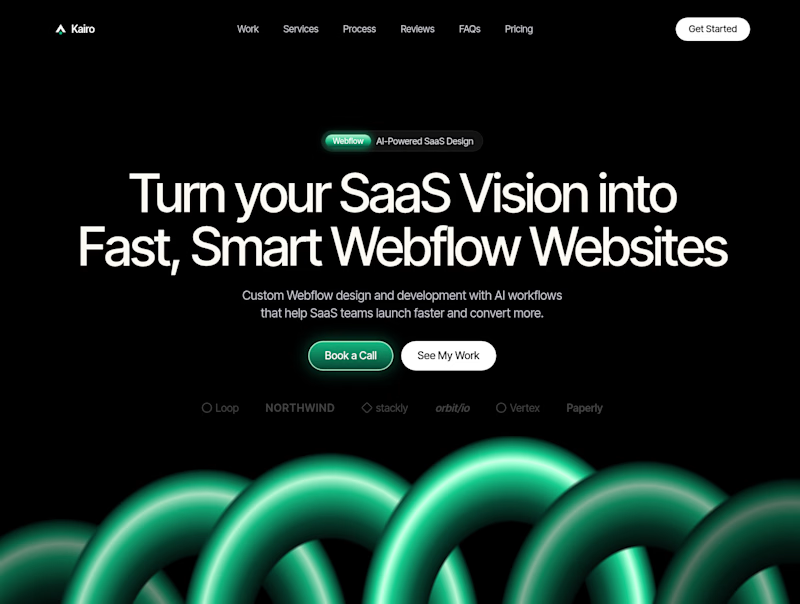
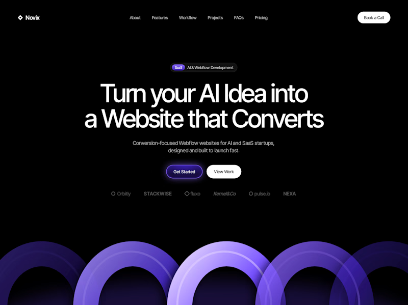

Both look great, but Violet & Black gets my vote! The purple accents give it a more modern, premium feel while keeping the design clean and focused on conversions. Amazing how a color change can create such a different brand personality. Have you tested which version performs better with visitors?


