The network for creativity
Join 1.25M professional creatives like you
Connect with clients, get discovered, and run your business 100% commission-free
Creatives on Contra have earned over $150M and we are just getting started
Back to feedPost

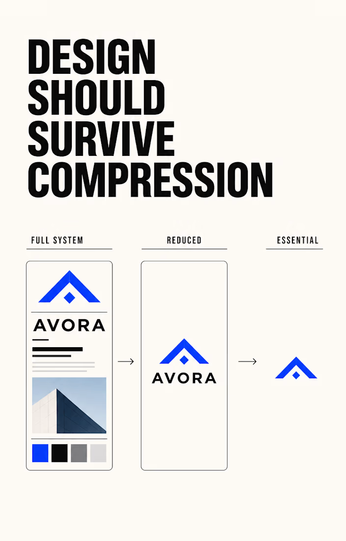
Good design should survive compression.
Most design isn’t experienced inside a perfect presentation.
A logo becomes a tiny profile image.
A visual system becomes one social post.
A landing page gets three seconds of attention.
A thumbnail competes with twenty others.
If an idea only works when every detail is visible, the idea may not be strong enough yet.
I keep returning to three questions:
• What is the first thing someone needs to understand?
• Which decision makes this unmistakably the right brand?
• What can disappear without weakening either?
That’s why I value systems over isolated assets. A clear type hierarchy, deliberate color role, and repeatable visual language can move from a website to an ad, package, or thumbnail without losing its identity.
Polish earns attention.
Consistency builds recognition.
Clarity makes both possible.
What would remain recognizable about your brand if everything unnecessary were stripped away?

100% 🙌


This is so true. If the idea only works when everything is visible, it probably needs more work. Clarity really does matter.


Good work👏🔥🔥


Good work

"Good design should survive compression" I love this way of thinking. When testing an existing brand whats your main trick to see if a logo still works when stripped down to its simplest form?

The three questions read like a design brief distilled to its studs. Which one do clients push back on hardest, probably 'what can disappear' since that's usually where scope creep gets exposed before it happens?
The network for creativity
Join 1.25M professional creatives like you
Connect with clients, get discovered, and run your business 100% commission-free
Creatives on Contra have earned over $150M and we are just getting started

Challenges
View all


Related posts

Client’s choice vs. Designer’s choice 👀
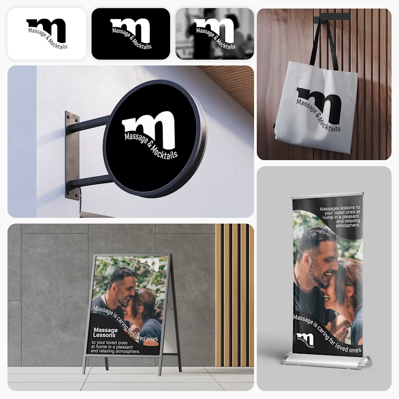
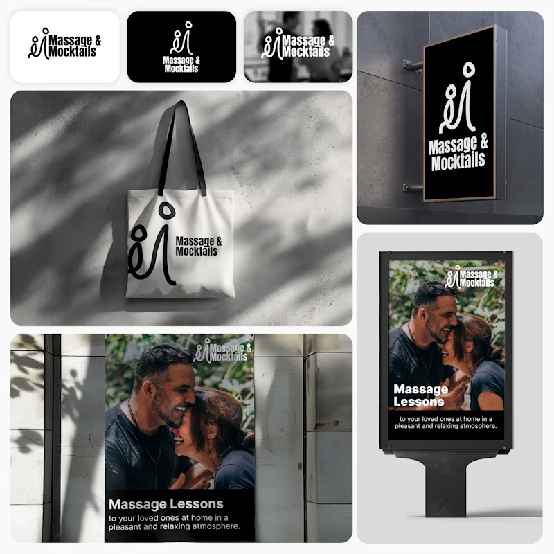
I’m currently working on a branding project for Massage & Mocktails — a concept built around couples learning massage together in a relaxed, social atmosphere.
These are two early, black & white directions from Stage 2 of my branding process, before moving into color, typography, and the full visual system.
The interesting part?
My client chose Concept 1. I chose Concept 2.
Now I’m curious what other creatives think.
Which direction would you choose — 1 or 2? And why?
Sometimes the most interesting part of branding is seeing how differently a client and a designer respond to the same brief.
21 voted
44%
27 voted
56%
48 votes
Closed

Concept 2 for me. That interlocking figure mark reads as two people meeting, which is the actual brief here, so it gives you more to build a system on. Concept 1 is the safer, more literal pick, which is usually why clients reach for it.


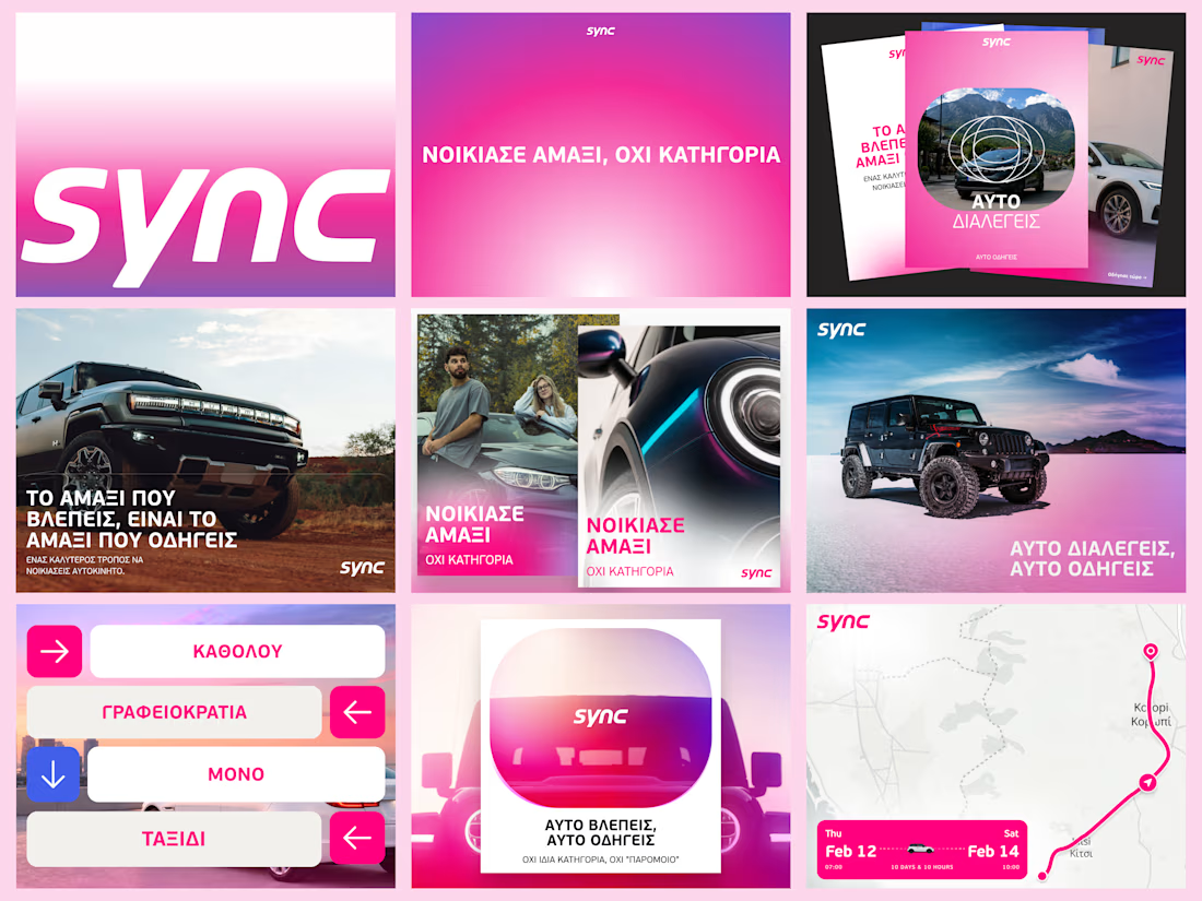
A few more pieces from my work on Sync’s identity.
The idea was to give this Greek car rental brand enough polish to sit next to the big names, with a personality of its own.
The pink was already there. I gave it more space and paired it with bold Greek typography and a frame inspired by a car’s side mirror.
Here’s a closer look at how it works across the layouts.



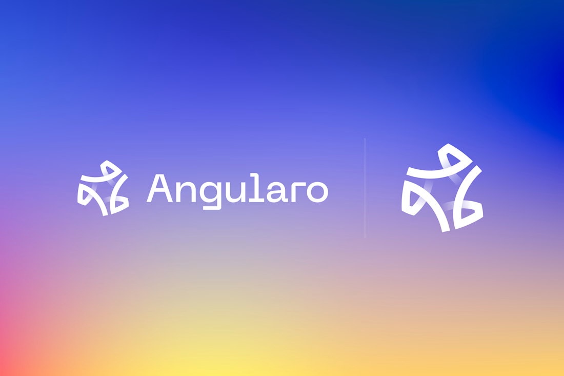
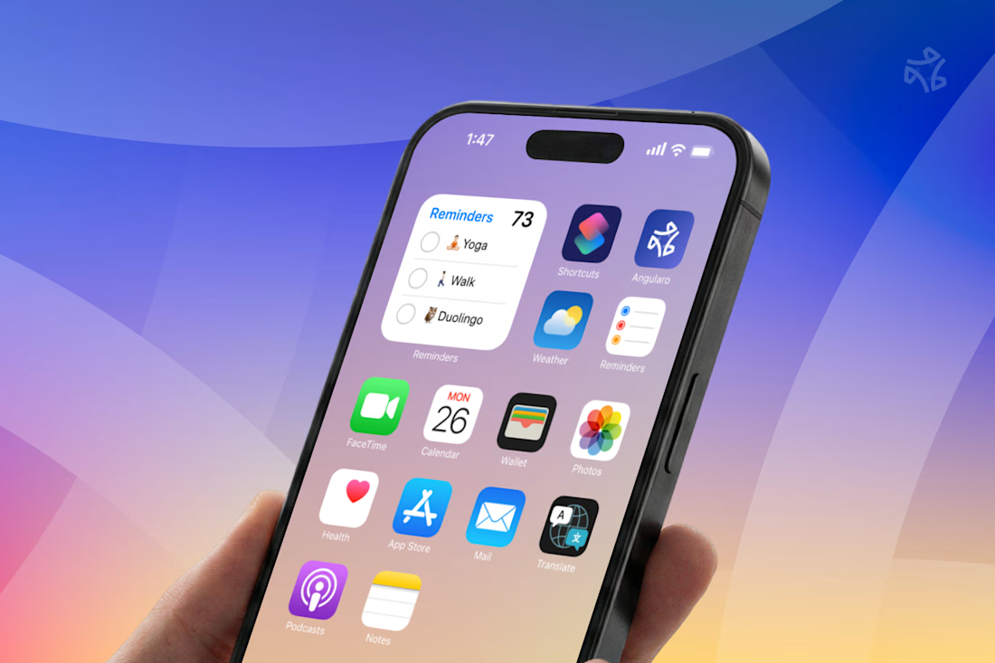
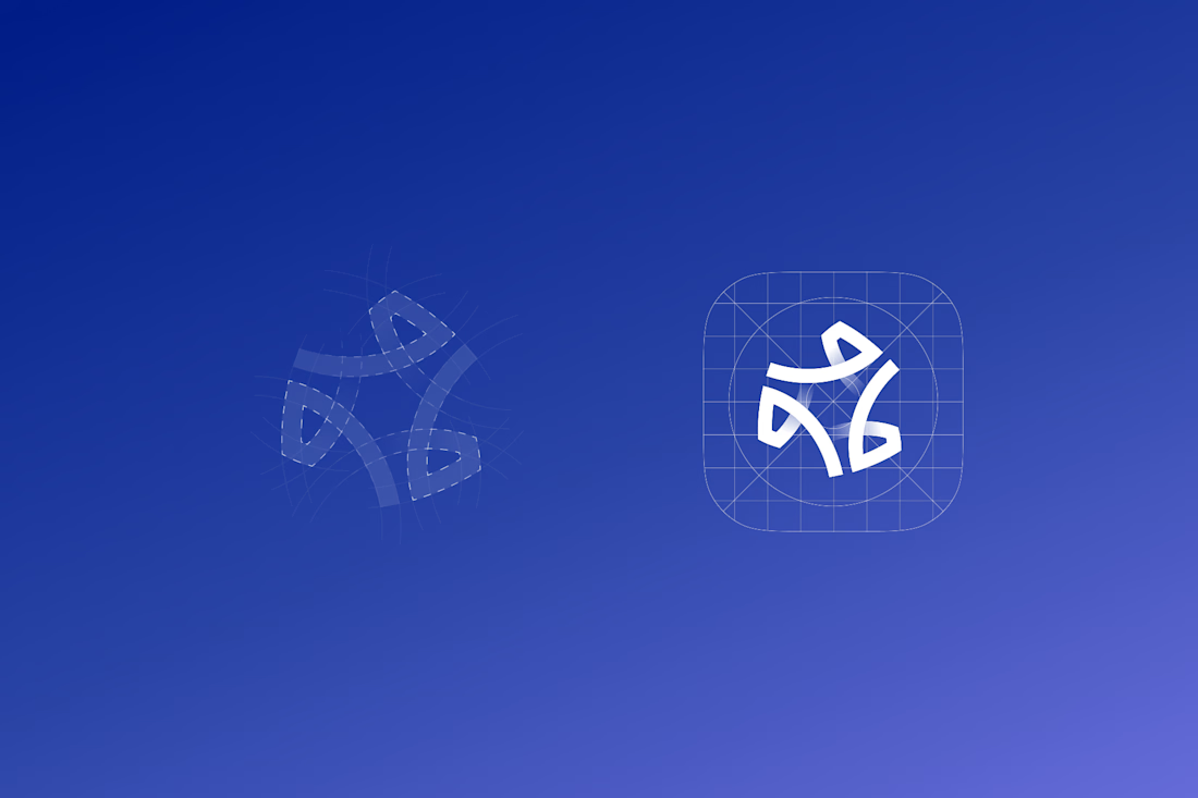

The wide counters are what let it survive the home screen — in that grid of other app icons it still reads as one shape instead of collapsing into noise, which is the real test for a CRM mark. Is the gradient locked to the logo, or does it shift across the product surfaces?