The network for creativity
Join 1.25M professional creatives like you
Connect with clients, get discovered, and run your business 100% commission-free
Creatives on Contra have earned over $150M and we are just getting started
Back to feedPost

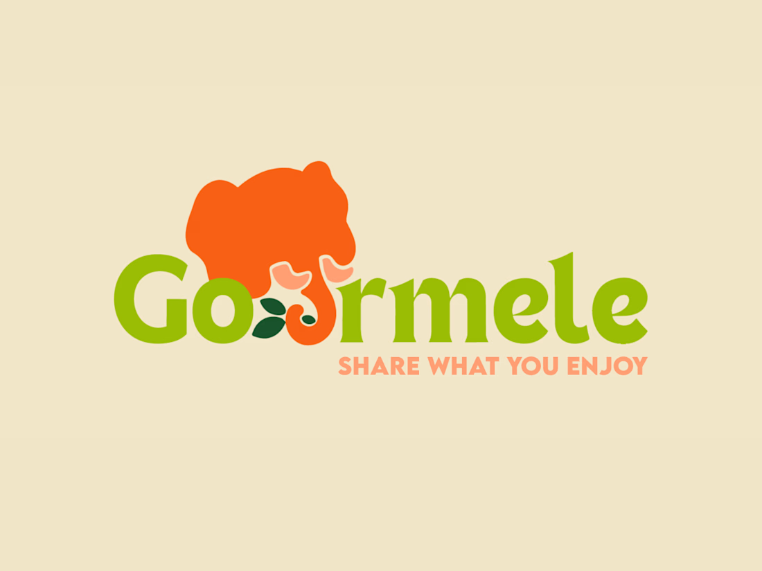
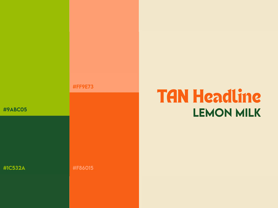
Visual Identity // Gourmele APP - Vegan Foodie Community


The network for creativity
Join 1.25M professional creatives like you
Connect with clients, get discovered, and run your business 100% commission-free
Creatives on Contra have earned over $150M and we are just getting started



Related posts

Brand work for HauntChain
I'm loving building this brand and the results so far
A deFi platform with some gamification


That's cute ❤️

Behind the wall: a homepage concept for Studio Cesare
I’m testing a new landing page for my studio, made with Brik.
A pixel-brick grid covers the screen. Move through it and the bricks fall away to reveal the person behind the work, mid-coffee, slightly off balance. Then the wall closes again.
It’s a small metaphor for how I approach next-generation branding: a strong system on the surface, with a real person and a real point of view underneath.
Exploring this for the studio site launch. Open to feedback, and to new projects 🤝🏼

This is amazing!!

One sportswear identity, carried from the product into the campaign.
My Pulsix brand identity showreel brings together the logo, apparel, packaging and outdoor graphics. The angular X has a jagged pulse cut through its center, while vivid pink and chartreuse connect the different applications.
Watch how the symbol stands on its own, then joins the wordmark and campaign typography as the layout changes.
Explore the full identity and its applications:
https://contra.com/p/XvP3ccE3-pulsix-sportswear-brand-identity-and-motion-design
