The network for creativity
Join 1.25M professional creatives like you
Connect with clients, get discovered, and run your business 100% commission-free
Creatives on Contra have earned over $150M and we are just getting started
Back to feedPost

I studied 10+ leading ecommerce checkouts. They don’t all look the same but the best ones share a few important principles.
Checkout is where money is won or lost. One unexpected fee. One unnecessary field. One confusing error. And the customer can be gone.
Here are 9 patterns I look for when evaluating a checkout
1️⃣ Make express payment easy to find: Apple Pay, PayPal, Shop Pay and other express options can remove a huge amount of friction, especially for returning and mobile customers.
Don’t bury them.
2️⃣ Keep the journey simple and scannable: One-page checkout isn’t automatically better than multi-step.
What matters is that customers always understand:
→ Where they are
→ What they’ve completed
→ What’s next
→ How to edit their information
3️⃣ Keep the total and CTA visible: Customers shouldn’t have to hunt for the final price or the next action.
Make the order total, delivery cost and primary CTA easy to find throughout the experience.
4️⃣ Remove price surprises
Show the important costs clearly:
Subtotal
Shipping
Taxes/fees
= Total
If something can’t be calculated yet, explain why.
Transparency builds trust.
5️⃣ Use free-shipping nudges thoughtfully
“74AED away from free shipping” can encourage customers to add another item.
It’s not a checkout requirement, it’s a useful conversion and AOV tactic when it makes business sense.
6️⃣ Always offer guest checkout: Don’t make account creation a barrier to purchase.
Let customers complete their order first.
Then offer benefits like: “Create an account to track orders and check out faster next time.”
7️⃣ Build trust where the decision happens
Payment is the moment customers need confidence.
Make payment options, security information, returns and important policies easy to access.
And when something goes wrong, explain exactly how to fix it.
8️⃣ Offer relevant payment options: Cards, wallets, BNPL and local payment methods can all matter but the right mix depends on your market and customers.
Don’t add payment methods just because competitors have them. Design for your actual users.
9️⃣ Close the loop after purchase: The checkout experience doesn’t end when someone taps “Place Order.”
A good confirmation should answer:
✅ Did my order go through?
✅ What’s my order number?
✅ When will it arrive?
✅ Where can I track it?
✅ What happens next?
The best checkout isn’t necessarily the shortest one. It’s the one that makes the customer feel:
“I know exactly what’s happening.”
So if I had to summarize great checkout UX in one sentence: Reduce effort. Remove uncertainty. Build confidence.
If you need to improve the conversion rate of your online store, I am here to help
Wish you all the best
The network for creativity
Join 1.25M professional creatives like you
Connect with clients, get discovered, and run your business 100% commission-free
Creatives on Contra have earned over $150M and we are just getting started











Related posts

AI Automation SaaS Website Design
AUTONIX is a modern AI automation SaaS website concept designed to help businesses streamline workflows, automate repetitive tasks, and manage AI agents more efficiently.
The design combines a clean, minimal interface with bold typography, futuristic visuals, interactive UI elements, and a seamless user experience. From AI-powered task automation to real-time productivity insights, every section is designed to communicate the value of intelligent automation in a clear and engaging way.
This project explores how thoughtful UI/UX design can make complex AI technology feel intuitive, accessible, and easy to use for modern businesses.
Services: SaaS Website Design, UI/UX Design, Landing Page Design, AI Product Design.


A clean and modern food delivery app concept designed with a focus on simple navigation, clear layouts, and a smooth user experience.
Designed in Figma.
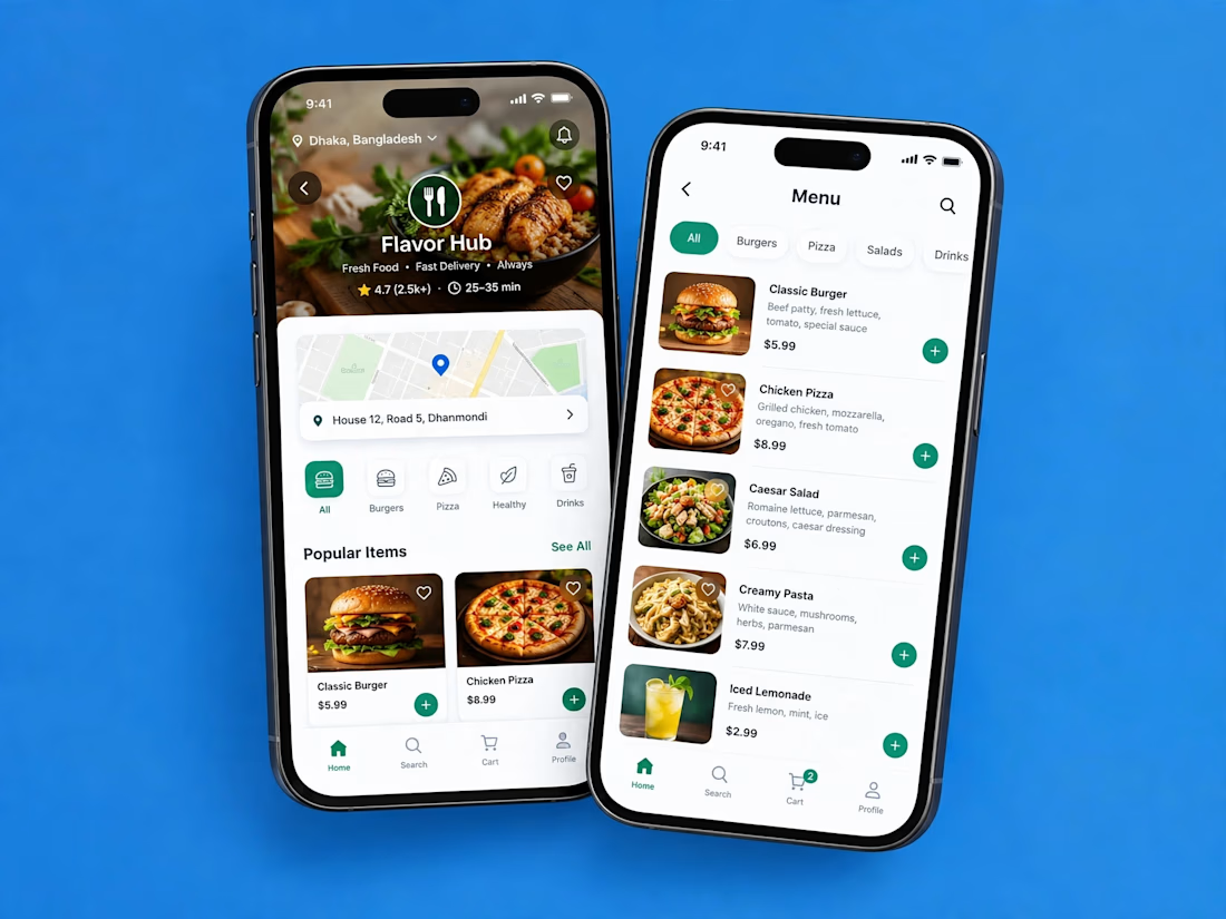

Love how clean and intuitive this feels, the navigation looks super smooth and the layout is really well balanced


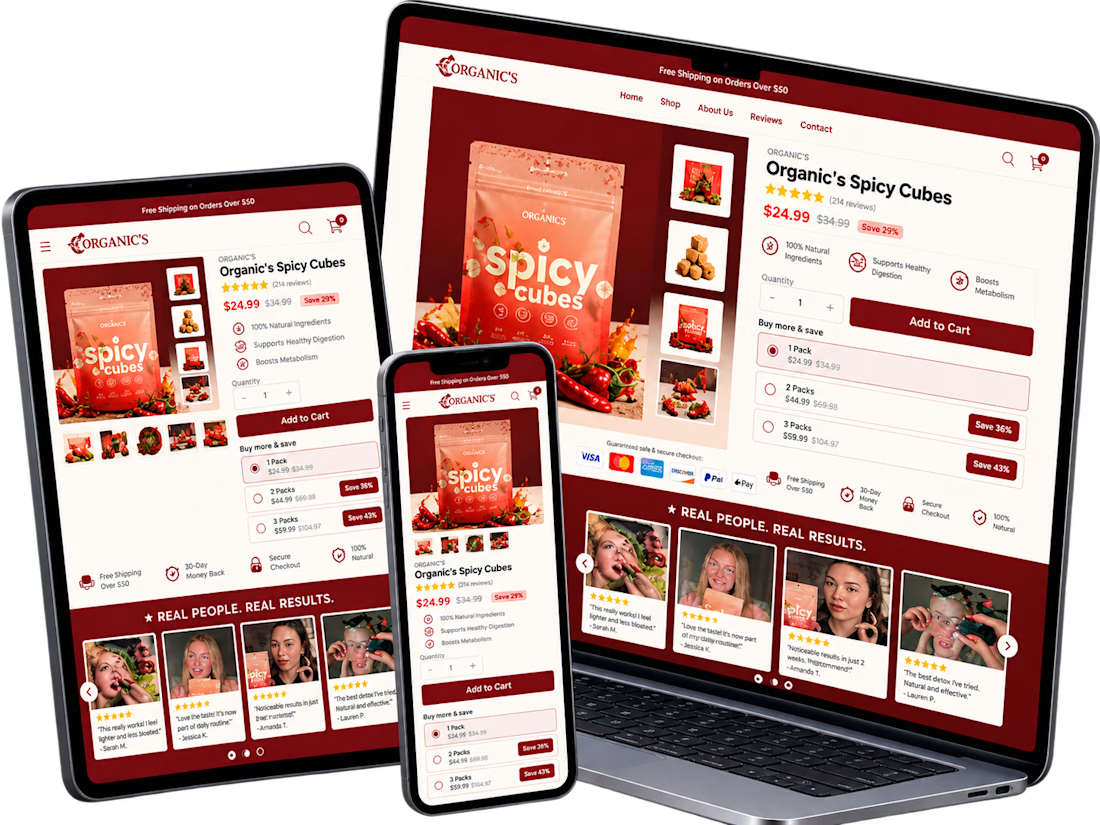
A conversion-focused Shopify product page featuring a clean, modern layout and an intuitive shopping experience.
The page brings together an engaging product gallery, bundle selection, clear Add to Cart actions, customer testimonials, product education, comparison tables, and FAQs.
The design emphasizes visual hierarchy, product discovery, purchase clarity, and trust-building elements to help shoppers make informed decisions.
Focus: Shopify UI/UX, product page design, and conversion rate optimization.


Clean layout. Keeping the bundle options, comparison table and FAQs on the same page really helps buyers decide without extra clicks. Great work on the product page structure.