The network for creativity
Join 1.25M professional creatives like you
Connect with clients, get discovered, and run your business 100% commission-free
Creatives on Contra have earned over $150M and we are just getting started
Back to feedPost
Taste Test
I’m experimenting with two different approaches to bento-style dashboards. Which one would you choose for the UI & animations? 👀
.......
A — CSS Animations → minimal purple UI
B — Framer Motion → purple + pink gradient
Which feels better for a real product — A or B?
Curious to hear your thoughts on both the UI style and animation.
6 voted
60%
4 voted
40%
10 votes
Closed


the purple UI looks sharp. A or B?

it's A
You can vote which one you prefer. I would improve my design accordingly.


A, for a real product. The gradient version is the better screenshot, but the chart is competing with the background — pink bars on a pink glow means the eye has to work out which pixels are data. A keeps the colour on the bars, where the meaning lives, and that gap is what...
Thanks for your feedback 🙌. Yes, it is not about the Framer vs CSS I just wanted to mention that I used different approaches in styling. I would improvise it.
Understood — then the styling comparison is the interesting half. If you post a v2, try the gradient version with the bars pulled to one flat colour and the glow kept only behind the empty space. You'd get the same poster energy without the chart paying for it.
That's a really good point. I’ll try that direction for v2 and see how it balances the visual energy with chart readability. Thanks for the suggestion!

Professional and impressive design work ! Good job
Thanks for the feedback 🙌

A for UI, B for motion. A's cleaner palette wins for readability but framer motion gives B that premium fluid touch.
Thanks for feedback🙌

Sorry, I mistakenly tapped the gradient one. Purple UI for me. It feels more balanced and easier to use for a real product. The other has more visual punch but the gradients pull a lot of attention.
Got it 👍! I was mainly experimenting with how far I could push the visual style without hurting usability. Thank you for your valuable feedback🙌.
🙌
I also posted an A/B poll, would love to see which one you'd pick 😊
Sure 👍

I’d go with the purple UI. It feels more focused and easier to use.
Thanks for your feedback 🙌. Yes most of th people liked it.
The network for creativity
Join 1.25M professional creatives like you
Connect with clients, get discovered, and run your business 100% commission-free
Creatives on Contra have earned over $150M and we are just getting started











Related posts

15 seconds of smooth UI, editorial layouts, and micro-interactions.
Kept the micro-interactions snappy, typography expressive, and transitions buttery smooth.
Rate this UI animation from 1 to 10 in the comments, or tell me what you’d improve! 😉


Solid 10/10 bro! 🔥 Micro-interactions are super snappy and transitions are buttery smooth indeed. Editorial layout game is strong. Keep it up!


Lovely cohesive work, Alex. The motion is spot on!

Hey everyone! 👋
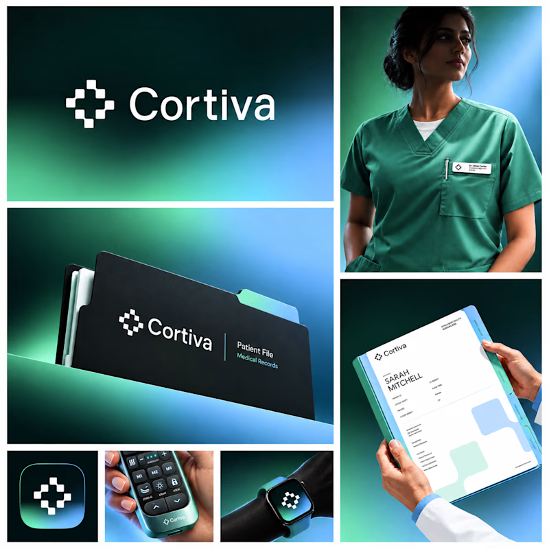
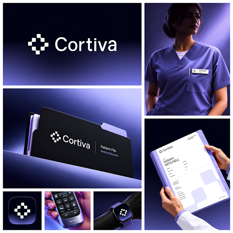
Working on Cortiva, an AI-first hospital branding project.
I've already finalized the color direction, but I thought it would be fun to explore two different moods.
Option 01💚 or Option 02? 💜
Both have their own personality, and I'm curious to see which one you prefer!
Let's see which one wins! 👀
5 voted
33%
10 voted
67%
15 votes
Closed

Option 01 for me. Green gets to "care" faster in a hospital setting, while the violet pulls the whole system toward a tech product. Since the identity is AI-first, I'd be curious whether you want patients to read it as clinical or as friendly first.