The network for creativity
Join 1.25M professional creatives like you
Connect with clients, get discovered, and run your business 100% commission-free
Creatives on Contra have earned over $150M and we are just getting started
Back to feedPost

AI-generated logos fell into a legal gray zone. New guidance this year says they may not be copyrightable at all, and their look tends to shift every time you regenerate it — which is the opposite of what branding is meant to do.
A logo isn't just an image. It's a claim of ownership, consistency, and a decision someone stood behind. That's the part a prompt can't produce, no matter how many iterations you run.
A logo I designed recently for a bookstore brand started as pencil sketches, went through a few rounds of critique with other visual artists, and got built out in Illustrator — shape by shape, choice by choice. It's slower. It's also yours, and exactly the same style it was the day it was finished.
If your logo can't represent "who made this, and why does it look this way," that's worth a second look before it goes on everything you own.

The network for creativity
Join 1.25M professional creatives like you
Connect with clients, get discovered, and run your business 100% commission-free
Creatives on Contra have earned over $150M and we are just getting started


Related posts


How far can you take a logo beyond the first draft?
I started with Recraft's Logo Maker and a fictional idea: Bibu's Paws, a cosy little dog rescue and adoption shelter.
I wanted the identity to feel warm, homely and full of character, so I explored a few logo directions before settling on the little dog tucked inside a house.
From there, I took the idea further, building out the visual identity with an earthy colour palette, typography, illustrations and a few real-world applications: the shelter space, dog merchandise and an adoption welcome kit.
I enjoyed seeing how a small starting point could grow into a brand with its own personality and world.
Now I'm curious: if you were building a brand around this logo, what would you create next?






It turned out so cozy, you did great

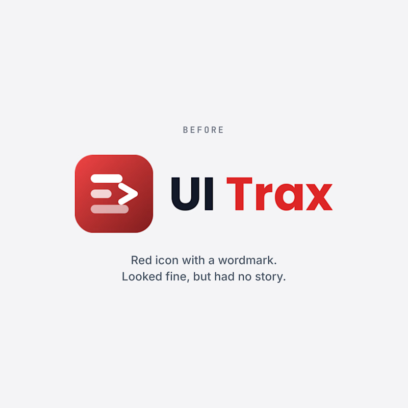
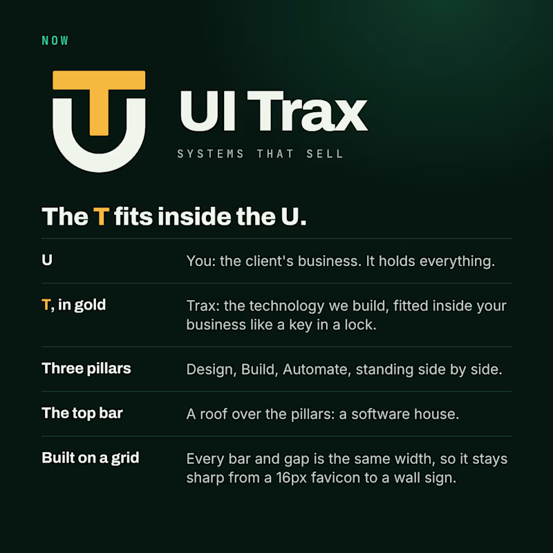
We redesigned the UI Trax logo, and this time every part has a meaning.
The U is you, the client's business. The gold T is Trax, the technology we fit inside it like a key in a lock. The three pillars are Design, Build and Automate. The top bar is a roof over them: a software house.
The old logo was a red icon with a wordmark. It looked fine, but it had no story.
Which one would you trust with your project? Vote, and tell me why in the comments.
#Branding #BeforeAndAfter #UITrax
0 voted
0%
3 voted
100%
3 votes
Closed

Now — the UT badge tells the story better.

Had some fun with this one.
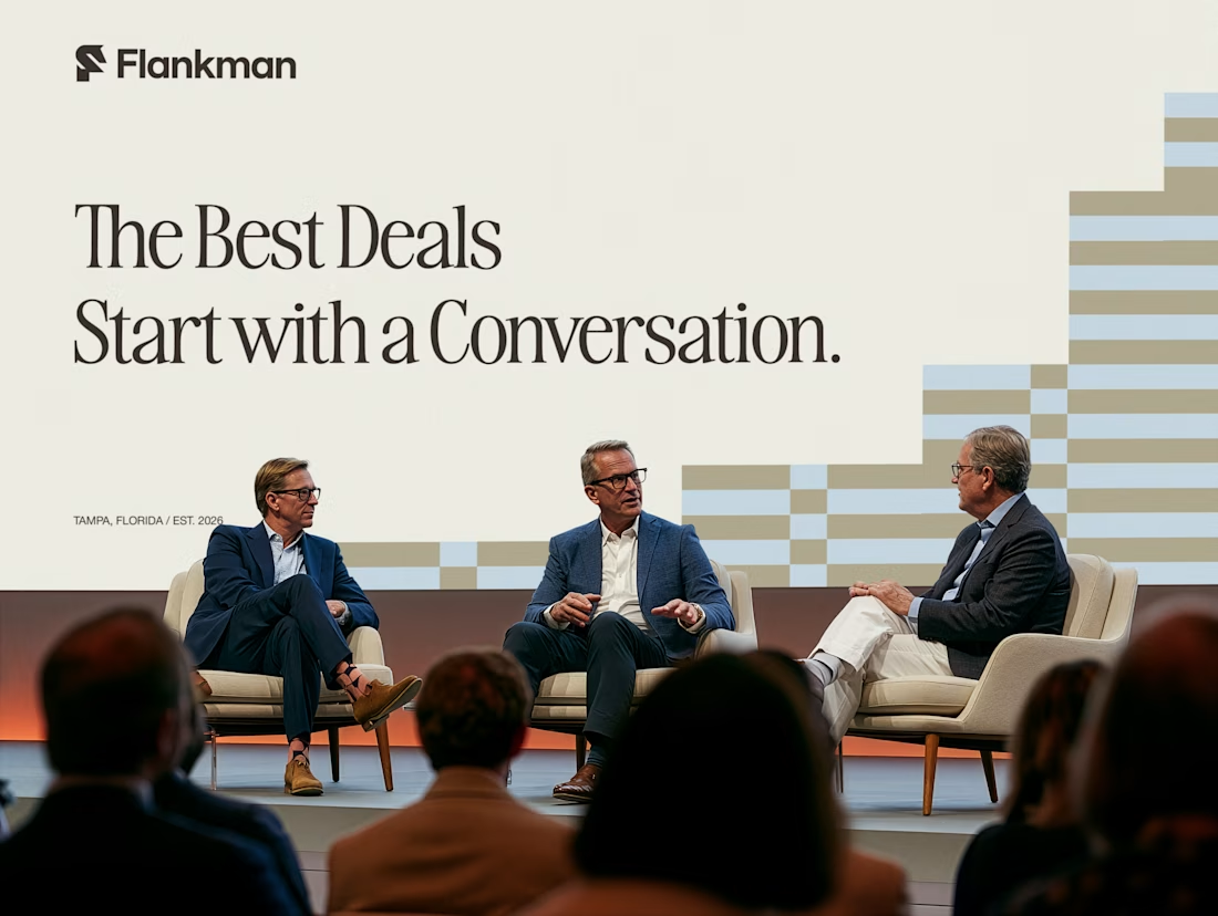
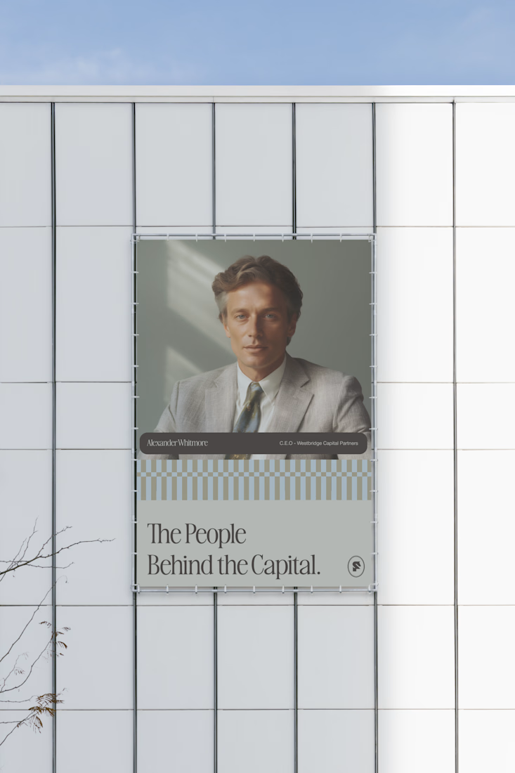
Exploring how typography, colour, and a few unexpected details can give a brand its own personality.
Meet Flankman. Full case study is live! ↓





clean