The network for creativity
Join 1.25M professional creatives like you
Connect with clients, get discovered, and run your business 100% commission-free
Creatives on Contra have earned over $150M and we are just getting started
Back to feedPost

Matcha Mori is a fictional premium matcha brand identity rooted in Japanese tea culture and shaped by a calm, minimal aesthetic.
The goal was to avoid the generic "wellness brand" look and create something that feels authentic, premium, and modern at the same time. I designed a torii gate mark paired with a refined serif wordmark and the tagline "Pure. Calm. Elevated." A deep green and cream palette, with soft cherry blossom accents, balances tradition with elegance.
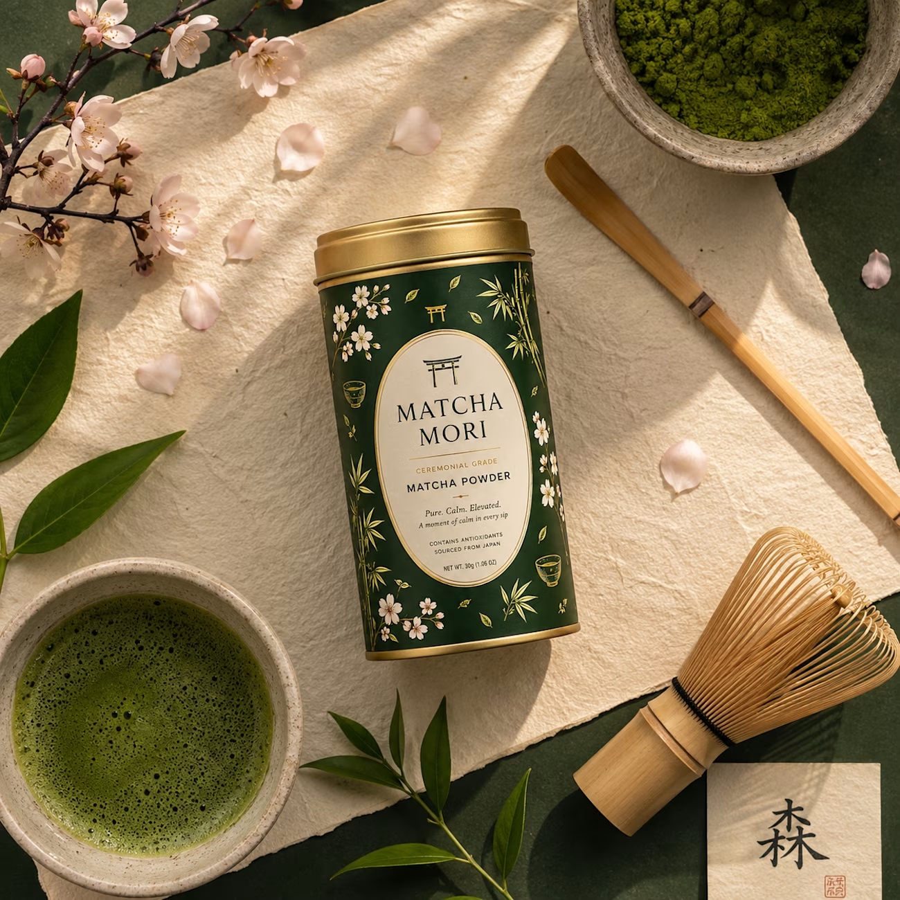
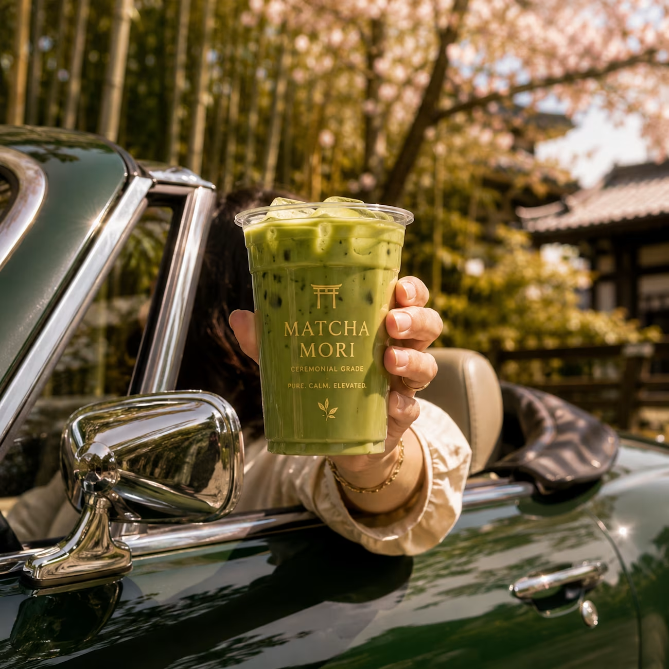
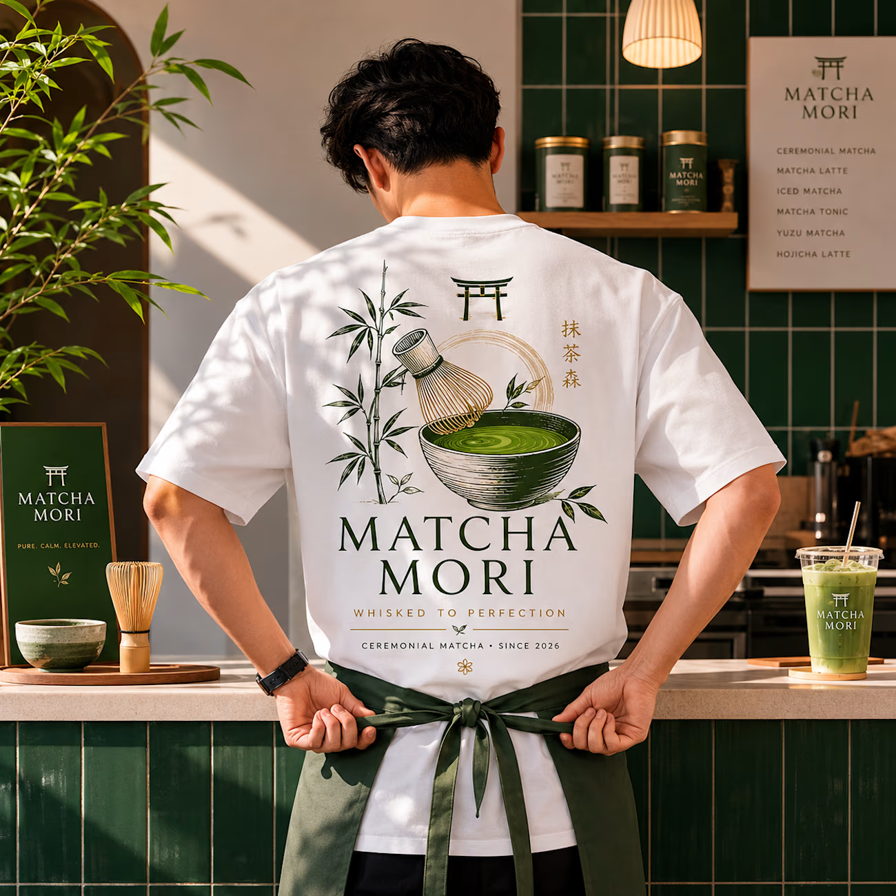
The identity was then extended across a packaging tin, styled flat-lay shots, and lifestyle and apparel applications, all unified by the same mark, palette, and quiet editorial tone.
The result is a cohesive brand system that works equally well on a product tin, in a lifestyle shot, or on a staff uniform.
Scope: Brand Identity · Logo Design · Packaging · Lifestyle Branding-


The network for creativity
Join 1.25M professional creatives like you
Connect with clients, get discovered, and run your business 100% commission-free
Creatives on Contra have earned over $150M and we are just getting started





Related posts

Done with the branding work for Yuzu! 🙌
This was so much more fun than I ever expected, I'm definitely going to be doing more beverage brands in the future.🙌


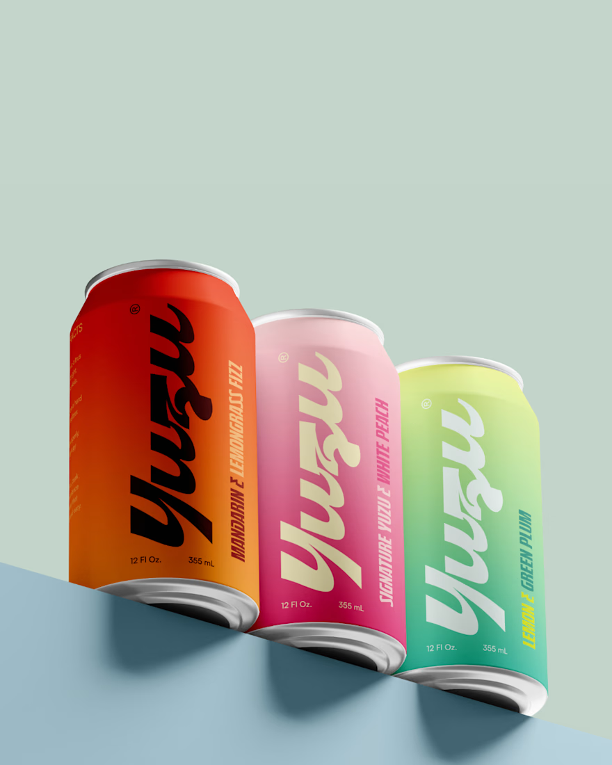
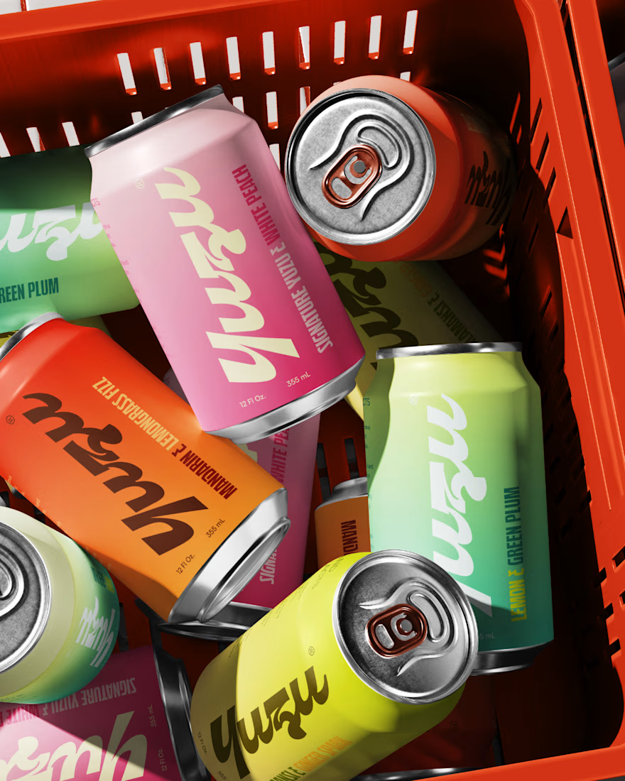
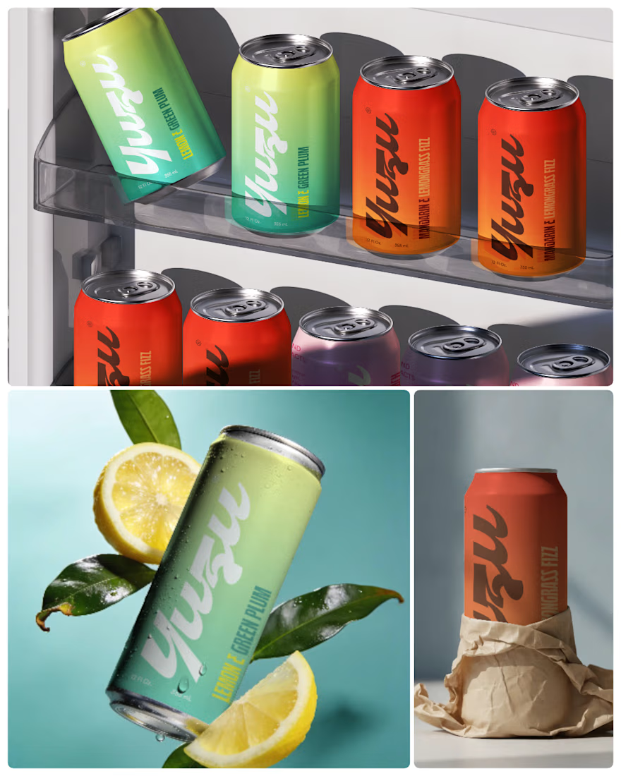

Amazing work! Love your design style, very creative and clean 👌

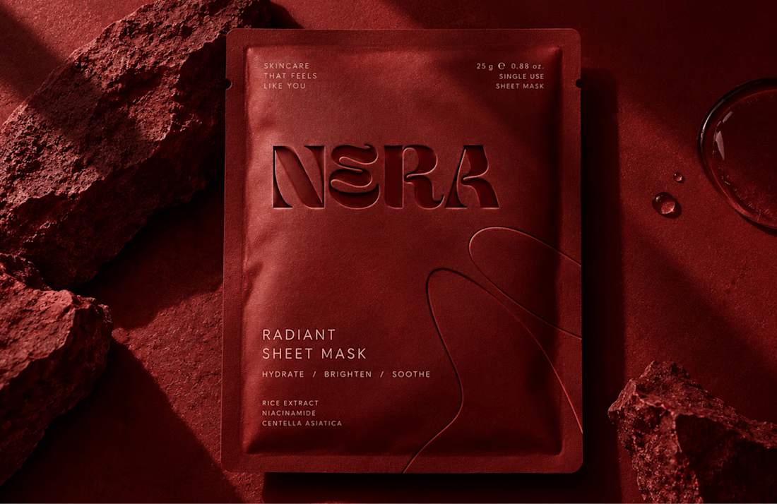
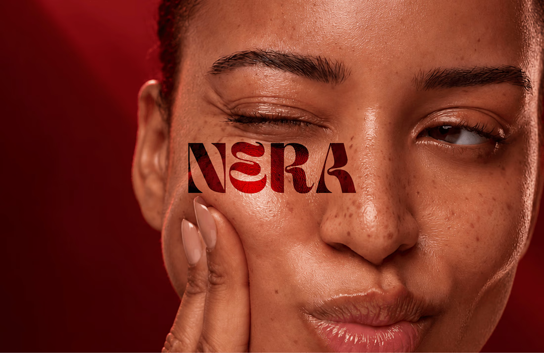
Built a skincare identity around one brief: intimate, confident, luxe, without looking like every other minimal beauty brand.
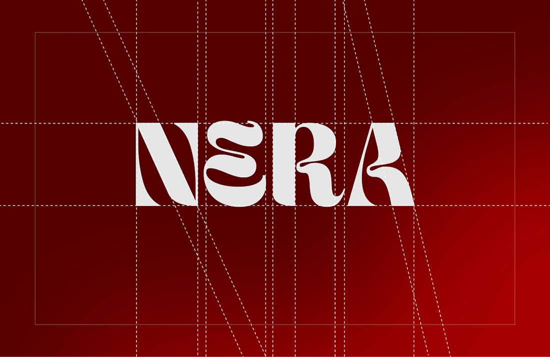
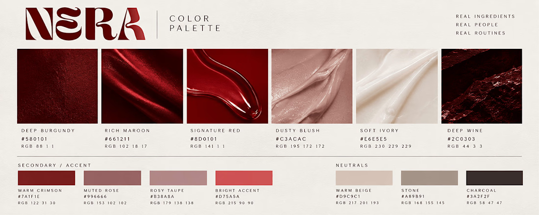
NERA got a custom wordmark, a deep maroon palette instead of the usual beige, packaging, and web + retail touchpoints so it holds together everywhere.
Full case study on my profile. Which touchpoint would you change first?
Amazing work! Love your design style, very creative and clean 👌

Long Shot, brand identity case study drops soon.
Dice, cash, and a bar light that never quite turns off.
We built a spirits brand out of the moment right before you find out if you won.
Case study coming this week. 🎲