The network for creativity
Join 1.25M professional creatives like you
Connect with clients, get discovered, and run your business 100% commission-free
Creatives on Contra have earned over $150M and we are just getting started
Back to feedPost
Taste Test

Quick design vote 🐾
I’m working on the visual direction for Stormi & co., a pet + human accessories brand, and I’m curious:
Which direction would you choose?
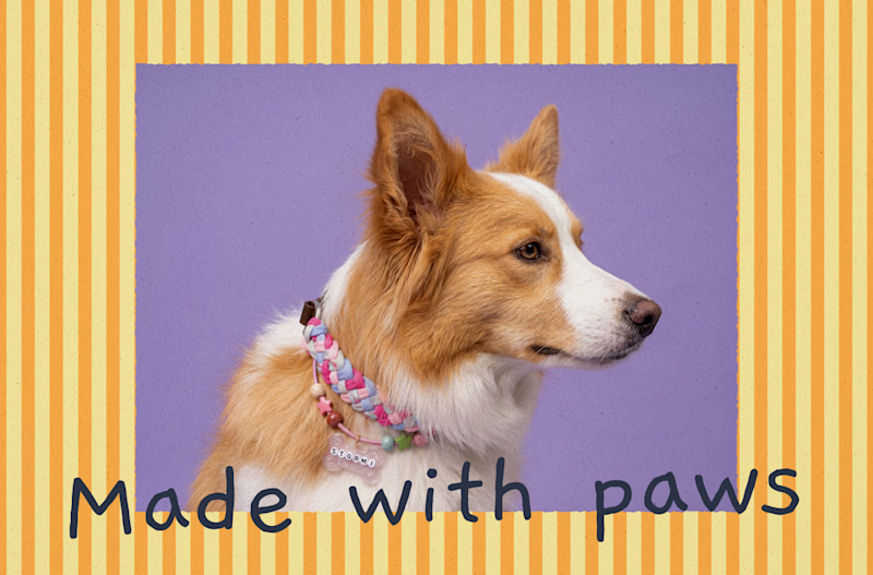
🐶 A: Playful & handmade
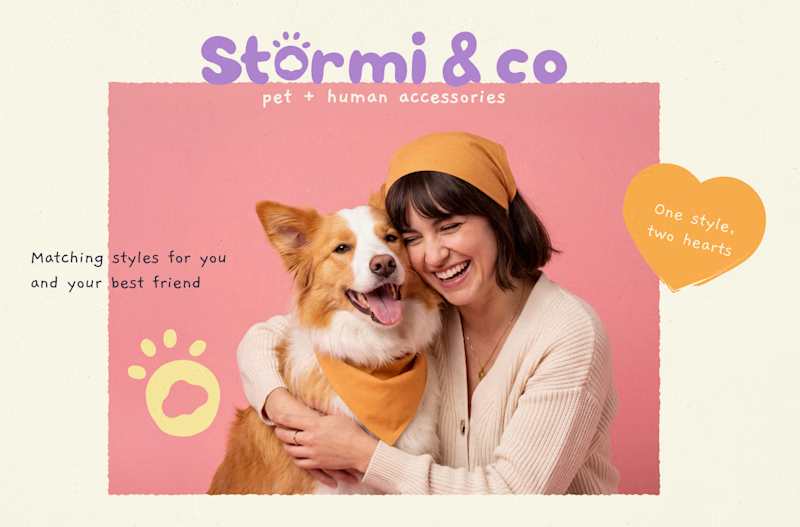
💗 B: Warm & lifestyle-focused
Both are part of the same brand world, but they tell a slightly different story.
Which one feels stronger to you? 👇
You can see the full project here:
Stormi & co. — Brand Identity & Packaging


5 voted
24%
16 voted
76%
21 votes
Closed

B, on one specific ground: the human is in the frame, so "pet + human accessories" reads in a glance instead of looking like a pet brand that happens to sell to people too. A is charming but it only tells half the proposition. If it were mine I'd run B's photography as the...
That makes a lot of sense. I agree that having the human in the frame makes the “pet + human” proposition much clearer at first glance. A has a softer charm, but B communicates the full idea more immediately. I’d probably go with B too, especially for the main brand photography.

Team warm & lifestyle!!
Absolutely! Warm & lifestyle is definitely the direction I’m leaning toward too 🤍


Definetely the warm one! Bold and engaging approach looks really cool
Yesss, I’m glad you agree! 😊 I was definitely feeling the warm one too. It has so much more personality 🫶🏻

thanks a lot! I think I’ll go with both 🥹

Totally agree! The warm one has such a nice vibe ✨
Thank youu 🥹🤍 I had so much fun creating that little angel! I also worked on some similar packaging designs for Stormi & co you can check out the full project if you’re curious ✨

Warm
Thank you✨

Warm🔥
Team warm! 🔥🥹
The network for creativity
Join 1.25M professional creatives like you
Connect with clients, get discovered, and run your business 100% commission-free
Creatives on Contra have earned over $150M and we are just getting started











Related posts

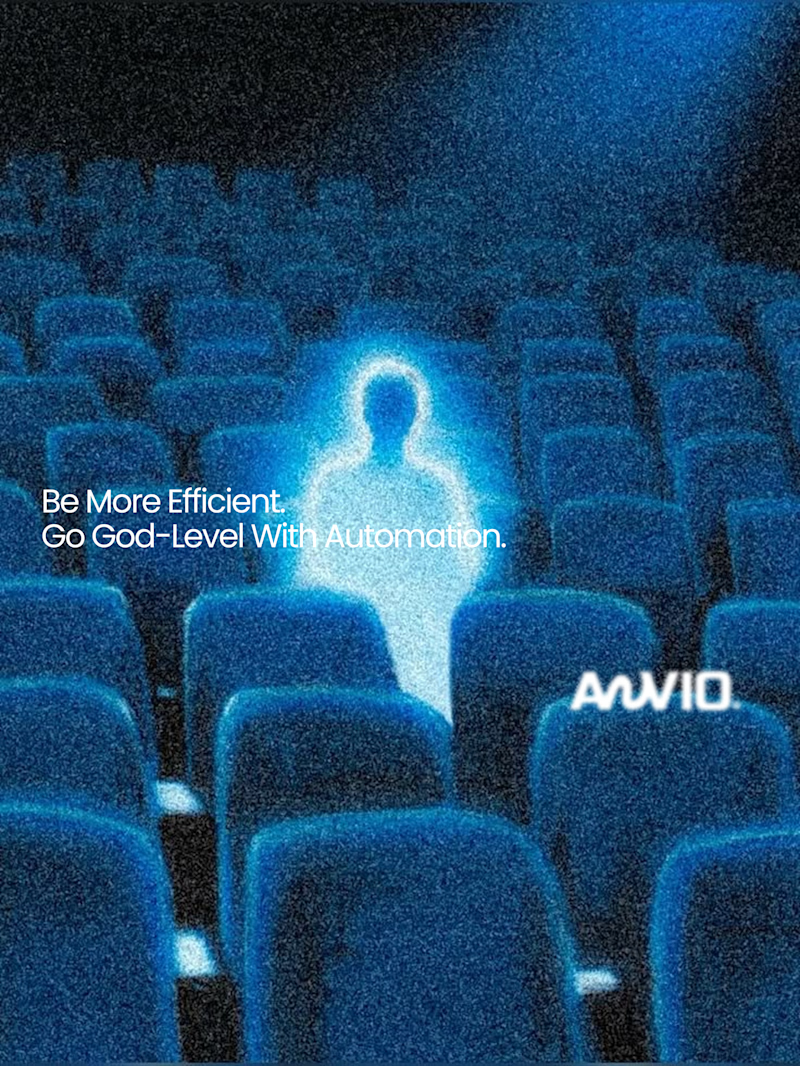
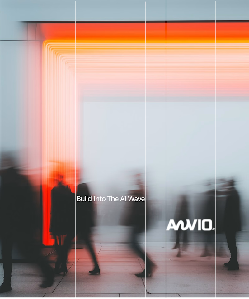
Which creative direction better communicates a Tech-Forward AI Brand Identity for anvio.online ?
25 voted
44%
32 voted
56%
57 votes
Closed

Fast vibrant energy gets my vote. The warm glow feels more human, which is nice for an AI brand.

Same content, different experience. A few thoughtful design choices can completely change how a presentation feels, flows, and communicates. Which version would you choose?

11 voted
31%
24 voted
69%
35 votes
Closed

Verde Vista 1 is more modern and futuristic specially with blue colors and robotic hand❤️
Great job Rasid🎉🎉🔥🔥


