The network for creativity
Join 1.25M professional creatives like you
Connect with clients, get discovered, and run your business 100% commission-free
Creatives on Contra have earned over $150M and we are just getting started
Back to feedPost

AI Marketing Agency Website | Minimal Webflow Design | Worqshop
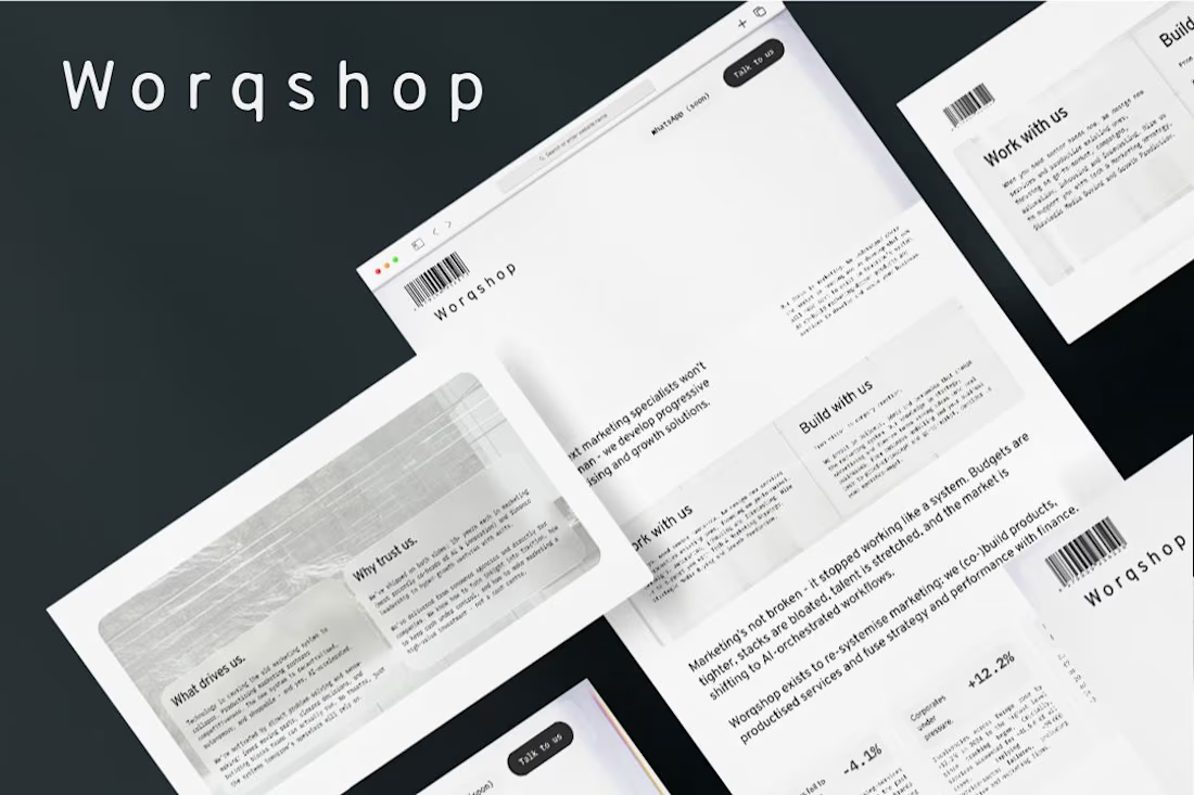
Berlin-based agency pioneering AI-driven marketing and growth solutions. They wanted a site as forward-thinking as their services - no typical agency fluff.
We went ultra-minimal. Clean typography, generous whitespace, editorial feel. The design lets sharp copy do the talking.
What we did:
Figma design with strong typographic system
Minimalist, content-first layout
Distinctive barcode brand elements
Fast-loading, distraction-free build
Full responsive optimization
Result: A site that positions them as the thinking person's agency.
LIVE: worqshop.io


The network for creativity
Join 1.25M professional creatives like you
Connect with clients, get discovered, and run your business 100% commission-free
Creatives on Contra have earned over $150M and we are just getting started
Related posts

New on Contra, not new to design.
I draw logos by hand, then build everything around them: the brand, the website, the store. Lately I also make product films and ads with AI.
Recent work: an RY monogram and site for a Koreatown law firm, a winged W for a defense firm, and my family's golf eyewear brand, from the mascot to Shopify.
Starting a brand, or have one that doesn't feel like you yet? Show me what you're building.

The logo-led system reads tight because the wordmark sits clean in the negative space instead of fighting the emblem — when a brand has that kind of restraint, the Shopify store usually carries the same hierarchy into the product grid and checkout without inventing new rules....


I felt something was off with my own website.
Too plain. Not how I envisioned the brand.
So I added more creative touches and built a real story into it. Now everything makes sense.
It finally feels like Outredge 🚀
https://outredge.com/


That big bold wordmark with the corner brackets gives it so much more character. "A marketing site as good as your product" is a strong line too, says exactly what you do.

Brand Expressions -- Merdes




love this