The network for creativity
Join 1.25M professional creatives like you
Connect with clients, get discovered, and run your business 100% commission-free
Creatives on Contra have earned over $150M and we are just getting started
Back to feedPost

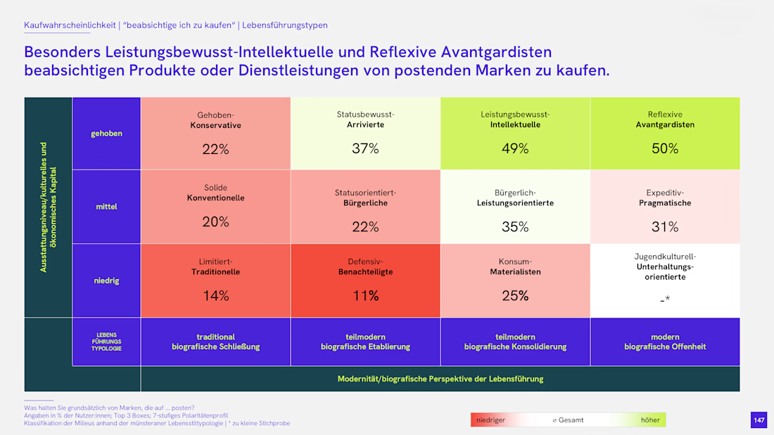
Dense research data made scannable in one look. A segment-by-segment purchase intent breakdown from a German market study, color-coded so the story reads itself.
The network for creativity
Join 1.25M professional creatives like you
Connect with clients, get discovered, and run your business 100% commission-free
Creatives on Contra have earned over $150M and we are just getting started






Related posts

For anyone doing market research or sales dashboards: the slow part is rarely the chart, it is figuring out which tools a prospect already runs. We built https://stackshortlist.dev to make that shortlist step faster so you can spend the time on the actual analysis. Curious how others handle the research step today, manual checks or a script?

Title: Data Formatting & Cleaning in Excel
Description: I turn messy spreadsheet exports into clean, consistent, analysis-ready data. I remove duplicates and extra spaces, standardize names, dates and currency, and flag missing values for review instead of guessing.
Tags: Data Cleaning, Excel, Data Formatting, Data Entry, Spreadsheets, Virtual Assistant


Working with AI startups usually comes down to solving one major visual problem.
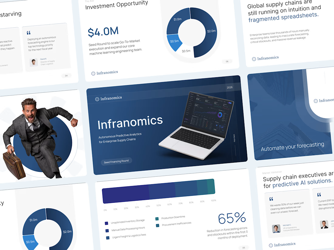
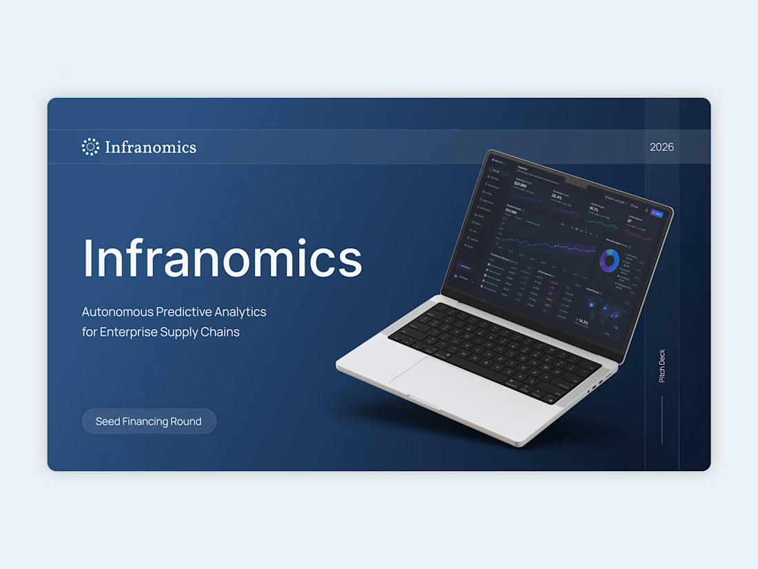
For this Infranomics project, the founders had built an incredibly powerful machine learning tool for supply chain analytics. The challenge was that their original materials looked like a dense technical manual rather than a compelling business narrative for venture capital funds. We needed to translate that heavy data into a clear and persuasive story.
The solution was to cut the noise and focus on pure clarity.
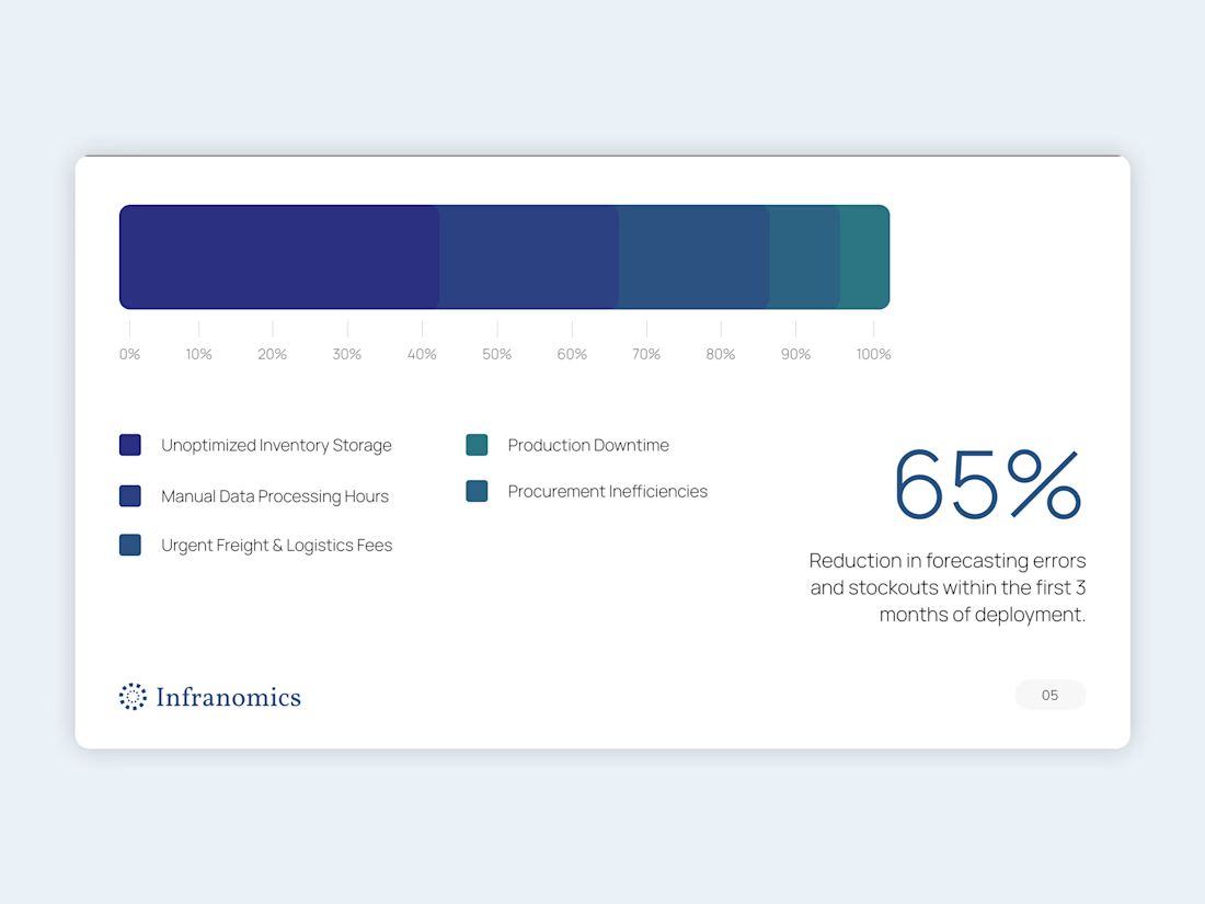
I moved the entire workflow into Figma to architect a highly customized design system from scratch. By using a minimalist aesthetic, clean typography, and very intentional custom data visualization, we managed to take their complex metrics and make them instantly understandable. Once the layouts were perfectly polished, everything was carefully rebuilt as a fully editable native PowerPoint file so the team could easily update numbers in the future.
The final result completely changed how their pitch was received.
Instead of forcing investors to suffer through cognitive overload and confusing charts, the new presentation gave the data room to breathe. It built institutional trust right from the first slide and ultimately helped the founders successfully secure their seed capital.
Sometimes the most advanced technology requires the simplest design.




Rebuilding the Figma layouts as a native, editable PowerPoint is the step that usually gets skipped, and it decides whether the deck survives the next round of number updates. Did you keep the custom data visuals as live charts, or as shapes the team adjusts by hand?