The network for creativity
Join 1.25M professional creatives like you
Connect with clients, get discovered, and run your business 100% commission-free
Creatives on Contra have earned over $150M and we are just getting started
Back to feedPost
Taste Test

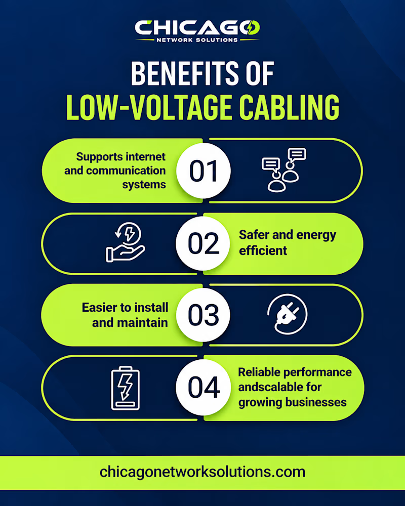
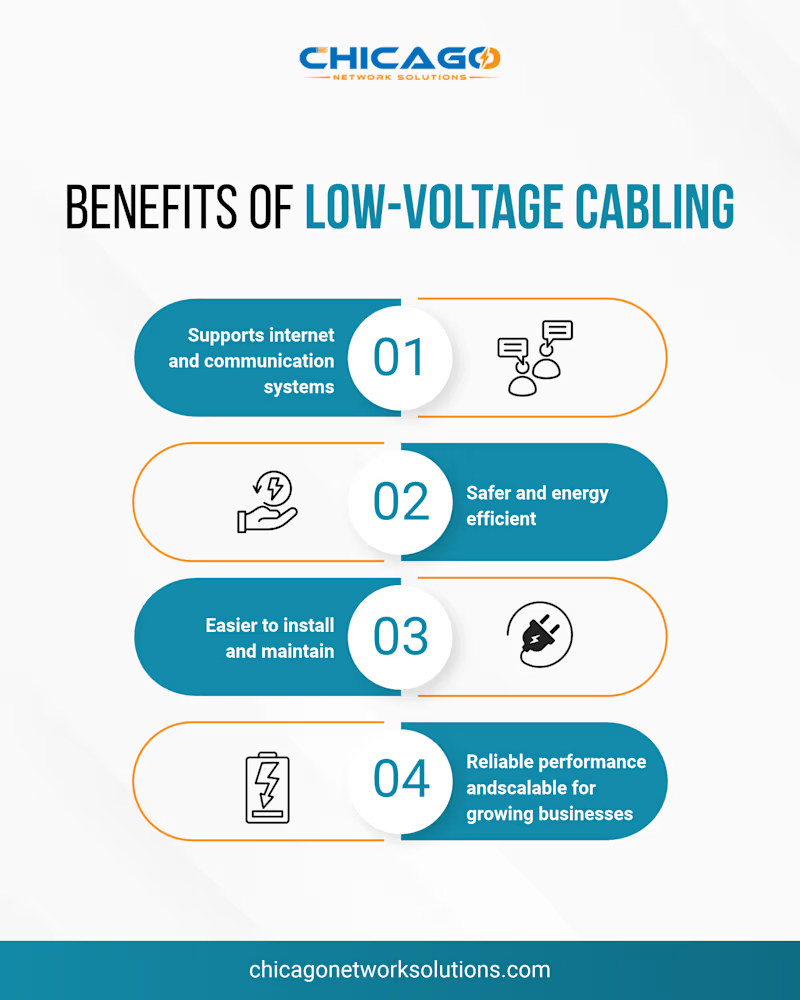
I worked on this infographic for Chicago Network Solutions to highlight the key benefits of low-voltage cabling in a clear and engaging way.
I explored two visual directions using different colour combinations while keeping the layout, information, and overall message consistent.
Option A: Clean, bright and professional with teal and orange.
Option B: Bold, modern and eye-catching with navy and lime green.
Both have their own personality, but I'm curious to know which direction works better for this type of technical content.
Which one would you choose, A or B?
2 votes
Ends in 5h

option A looks clean!
The network for creativity
Join 1.25M professional creatives like you
Connect with clients, get discovered, and run your business 100% commission-free
Creatives on Contra have earned over $150M and we are just getting started


Related posts

Exploring a few different hero directions for Frame 18.
Which one would you go with, A or B, and why?
Would love to hear your thoughts before I finalize the design!
#webdesign #uiux #framer #websitedesign #designfeedback
9 voted
50%
9 voted
50%
18 votes
Closed

A for me. The portrait grid shows the range of work right away, though B has the stronger first impression.

One template. Two completely different personalities. 👀
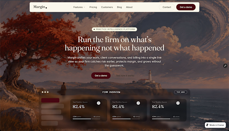
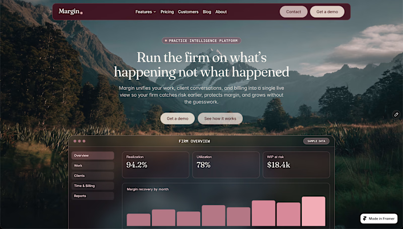
Experimenting with visual directions for a new Framer template.
🍂 1 — Warm, cinematic & editorial
🏔️ 2 — Dark, moody & premium
Both are still works in progress.
Which one would make you stop scrolling 1 or 2?
2 voted
67%
1 voted
33%
3 votes
Closed
Voted 1. The sunset and lighthouse make the page feel like a real brand. Is the dark one meant for a different audience?

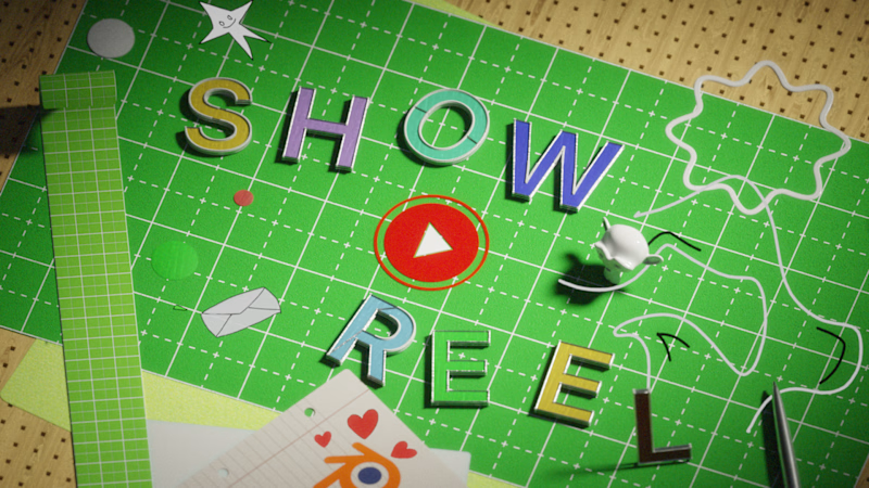
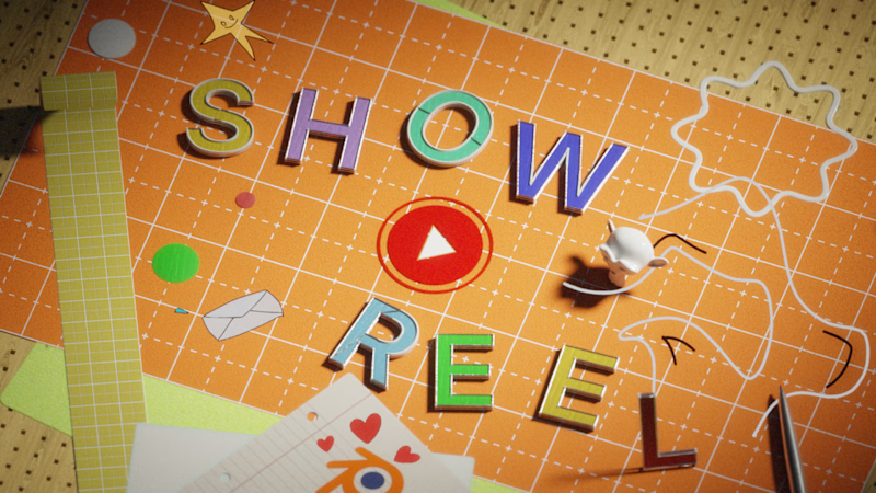
Same frame
Same scene,
Two different takes on color.
Which one looks better? Your call.
No AI used.
1 voted
25%
3 voted
75%
4 votes
Closed


orange feels warmer to me