The network for creativity
Join 1.25M professional creatives like you
Connect with clients, get discovered, and run your business 100% commission-free
Creatives on Contra have earned over $150M and we are just getting started
Back to feedPost

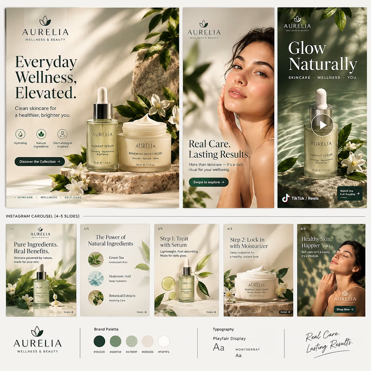
Everyday Wellness, Elevated. 🌿
A premium social media campaign combining elegant product visuals, clean typography and a calming wellness aesthetic across multiple platforms.

The network for creativity
Join 1.25M professional creatives like you
Connect with clients, get discovered, and run your business 100% commission-free
Creatives on Contra have earned over $150M and we are just getting started






Related posts

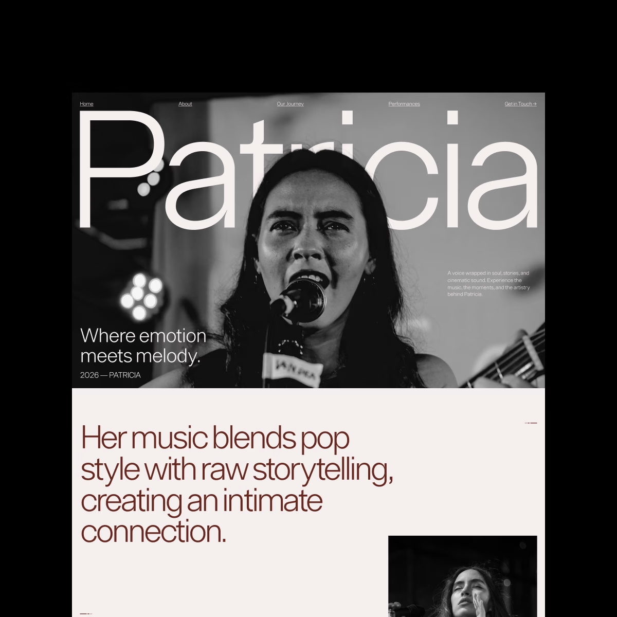
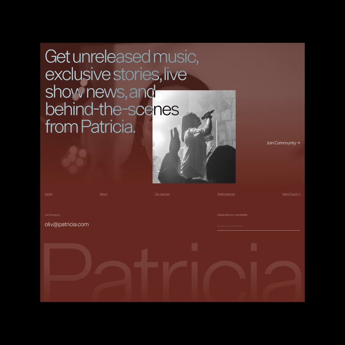
Patricia — Personal Singer Website. Bold, personal, and a little dramatic.
I played with oversized typography, monochrome photography, and an editorial layout to create a space where the artist’s personality feels just as important as the music.

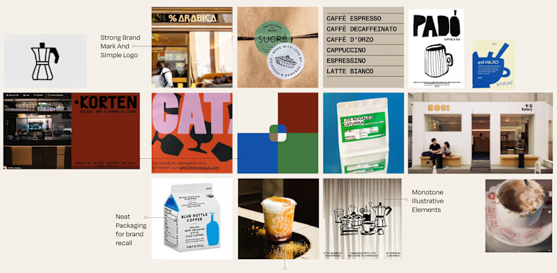
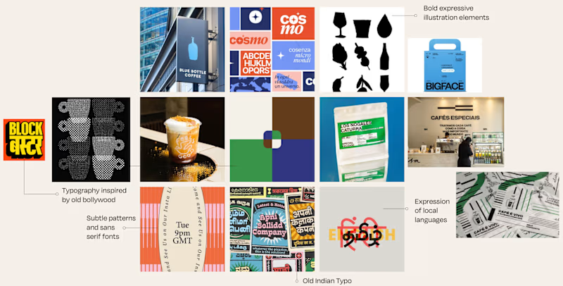
Is it Mood-board 01 or Mood-board 02!
Which mood-board do you think the client selected?


13 voted
76%
4 voted
24%
17 votes
Closed

Going with 01, it feels tighter and more intentional while 02 reads a little busy. Clients usually pick the one that looks safe to sign off on, and 01 has that calm confidence. Curious to hear which one won.

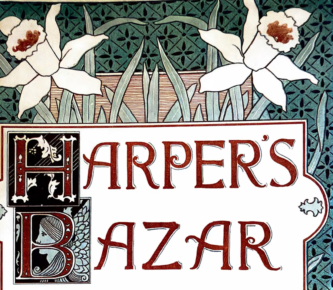
What did ads look like before typograhy was a file you could have in your computer and replicate multiple times?
Another little tour through The History of Design 1890–1959, this time looking specifically at how designers were treating type as an image rather than simply information. Previous post here.
Eugène Grasset, 1893 — beautifully controlled lettering and organic forms.
Toulouse-Lautrec, 1903 — expressive lettering becoming part of the energy of the poster.
Ernst Klimt, 1892 — decorative type working alongside illustration.
Louis Rhead, Harper's Bazar, 1892 — type, image, and ornament interacting as one visual system.
What I love about these references is that the type is part of the image.
Show me one historical typographic composition you’d steal inspiration from today. 👀
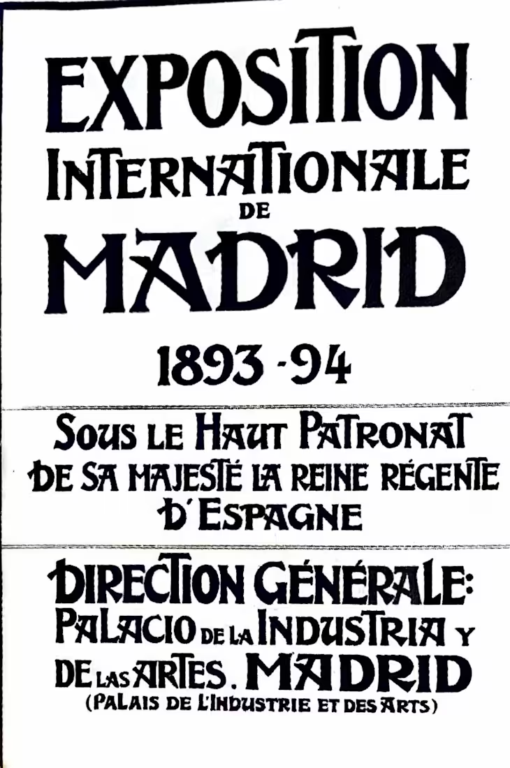
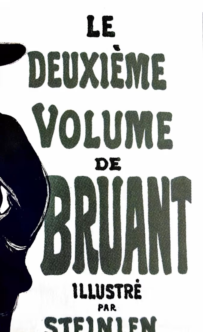
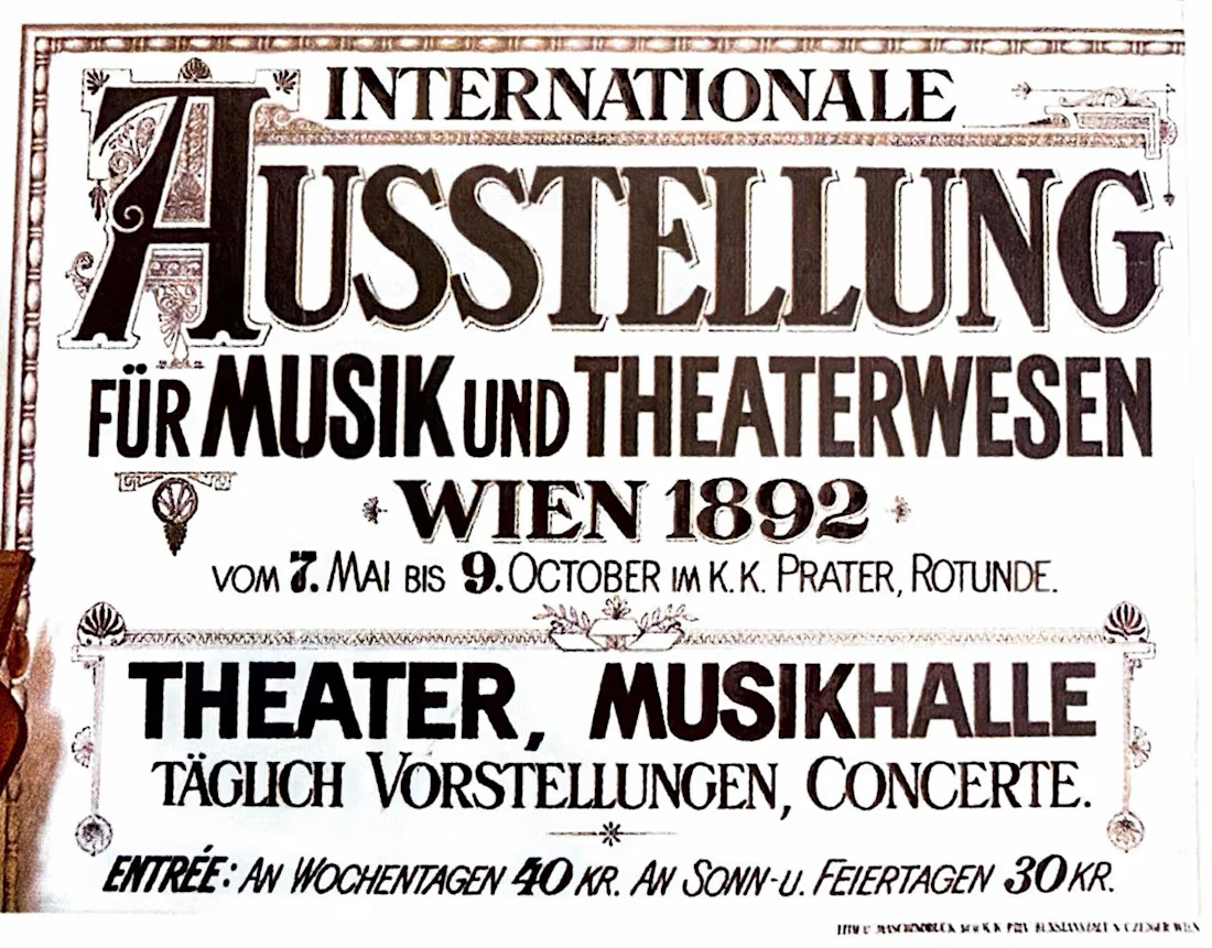

The Beggarstaffs' cut-paper posters from the late 1890s — the lettering sits in the gaps the shapes leave rather than on top of them. I still think about that when a wordmark has to live inside a busy pack layout: let the silhouette decide where the type goes instead of the grid.