The network for creativity
Join 1.25M professional creatives like you
Connect with clients, get discovered, and run your business 100% commission-free
Creatives on Contra have earned over $150M and we are just getting started
Back to feedPost

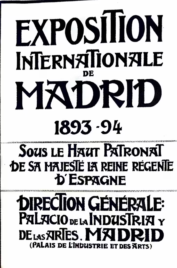
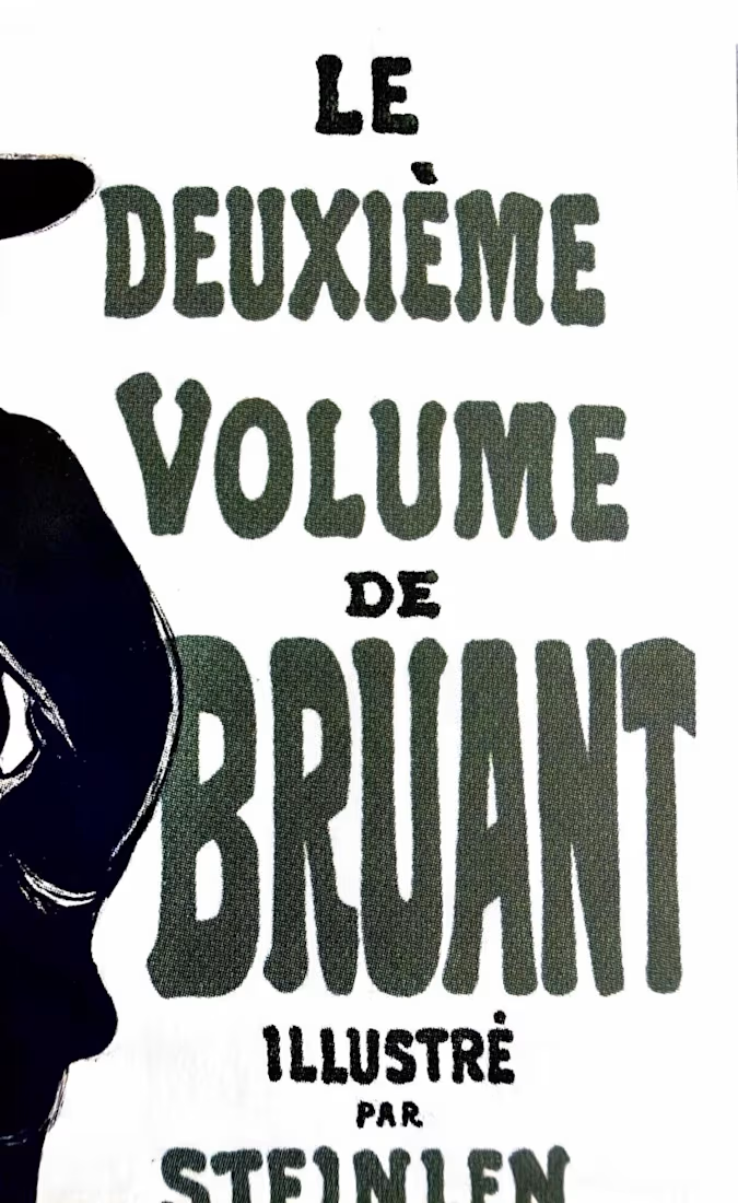
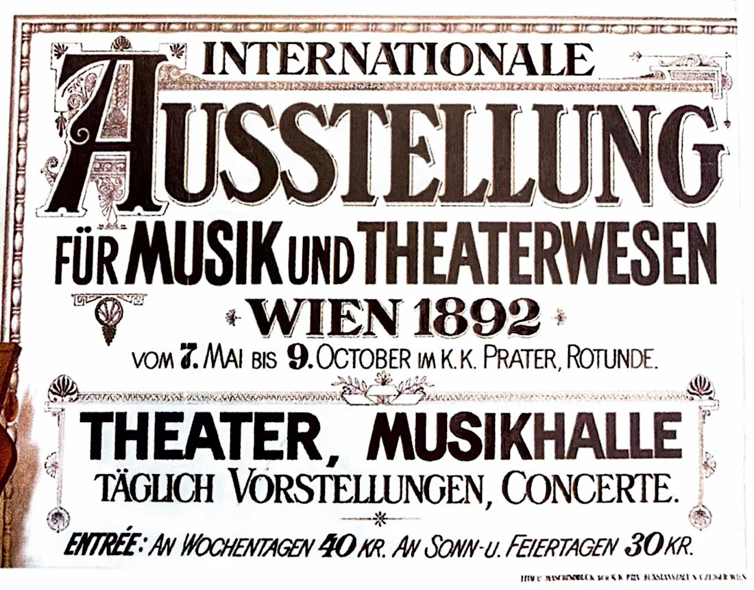
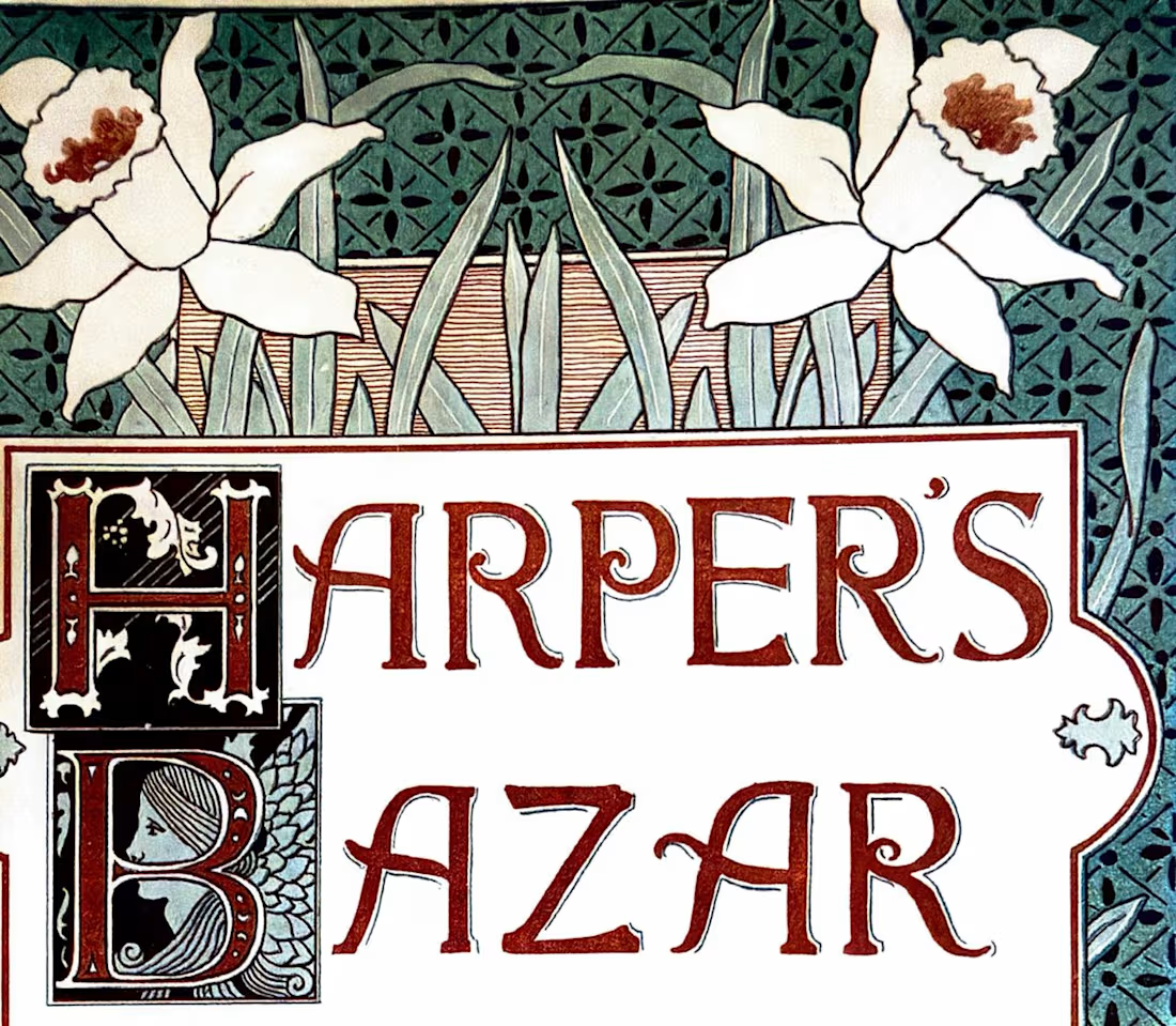
What did ads look like before typograhy was a file you could have in your computer and replicate multiple times?
Another little tour through The History of Design 1890–1959, this time looking specifically at how designers were treating type as an image rather than simply information. Previous post here.
Eugène Grasset, 1893 — beautifully controlled lettering and organic forms.
Toulouse-Lautrec, 1903 — expressive lettering becoming part of the energy of the poster.
Ernst Klimt, 1892 — decorative type working alongside illustration.
Louis Rhead, Harper's Bazar, 1892 — type, image, and ornament interacting as one visual system.
What I love about these references is that the type is part of the image.
Show me one historical typographic composition you’d steal inspiration from today. 👀

You nailed the overall mood here. The details just reinforce it nicely.

The Beggarstaffs' cut-paper posters from the late 1890s — the lettering sits in the gaps the shapes leave rather than on top of them. I still think about that when a wordmark has to live inside a busy pack layout: let the silhouette decide where the type goes instead of the grid.
The network for creativity
Join 1.25M professional creatives like you
Connect with clients, get discovered, and run your business 100% commission-free
Creatives on Contra have earned over $150M and we are just getting started




Related posts

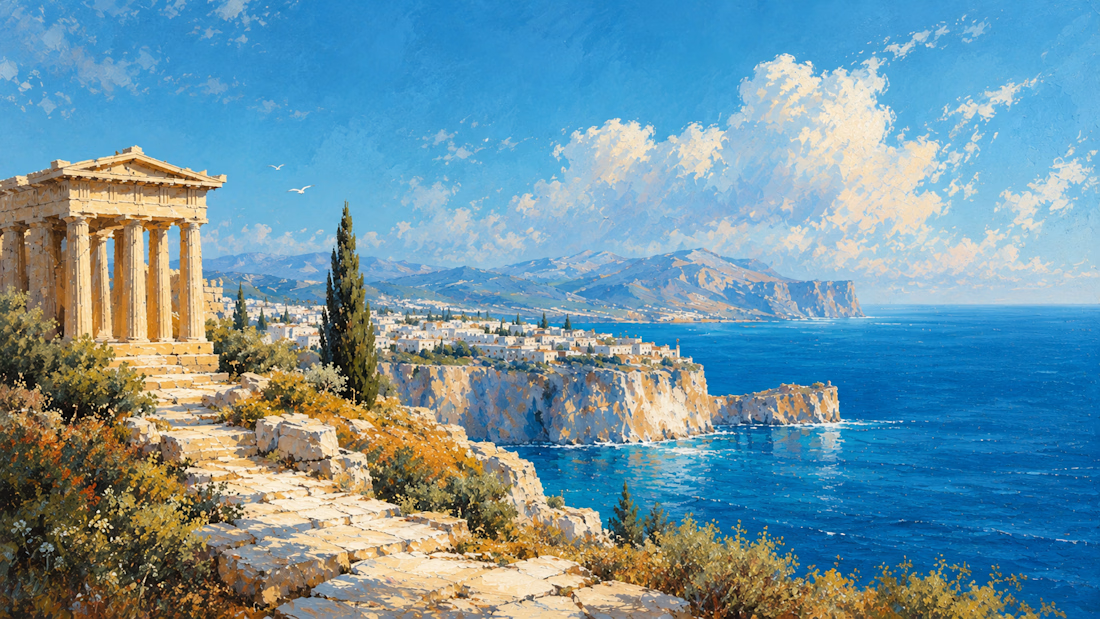
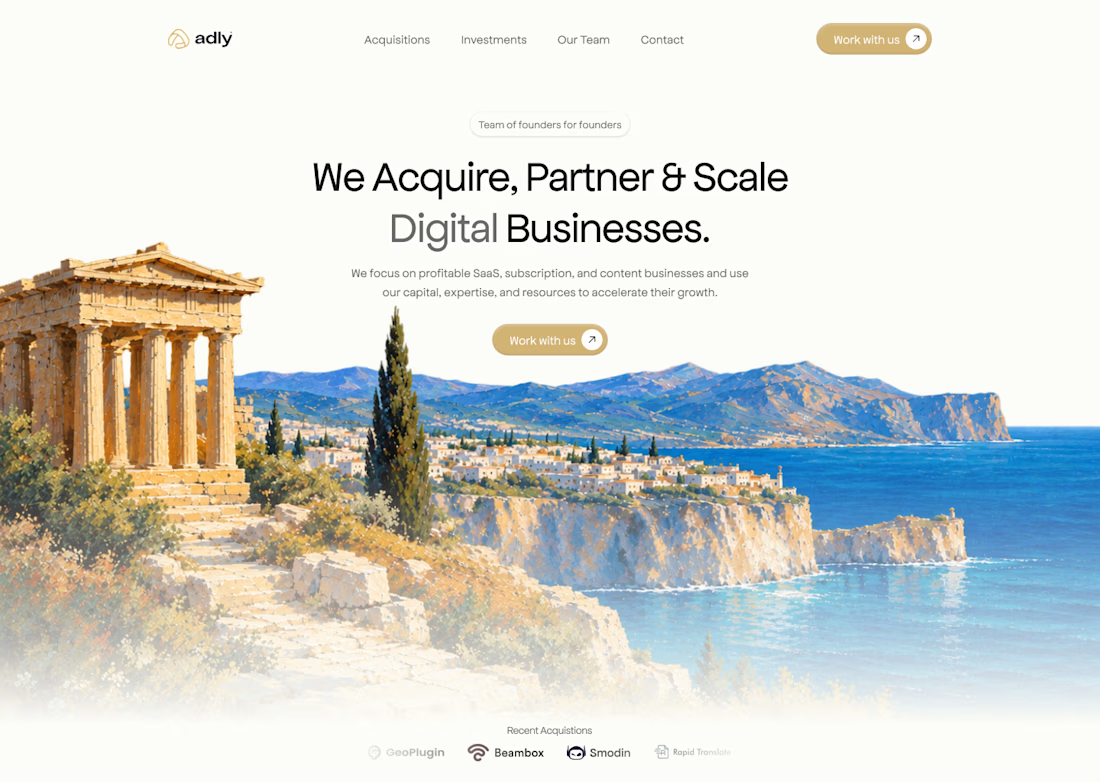

I really like how the visual identity carries from the artwork into the website. The landscape makes the whole page feel distinctive without overwhelming the message.


Some logos try to say everything.
The best ones say just enough.
Tricore was built around a simple visual concept:
three connected elements working together as one system.
No unnecessary details.
No visual noise.
Just a clean identity designed to be memorable across screens, products, and future brand applications.
A strong logo should still be recognizable when:
• Scaled down
• Viewed quickly
• Seen from a distance
That's the standard I try to design for.
What's your first impression of this identity?
👇 One word only.


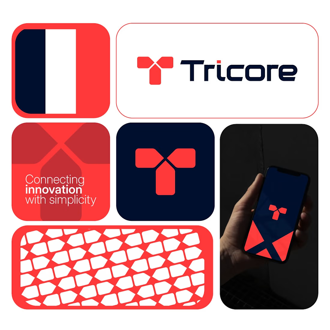

Cohesive.

A bold graphic design exploration for 1286 CRAFT, built around expressive typography, editorial layouts, poster design, and experimental visual composition.
The project combines strong typographic hierarchy, layered textures, geometric elements, and high-contrast graphics to create a distinctive campaign system. Each composition was designed to work as part of one cohesive visual language while maintaining its own energy and character.
Graphic Design • Typography • Poster Design • Editorial Design • Art Direction
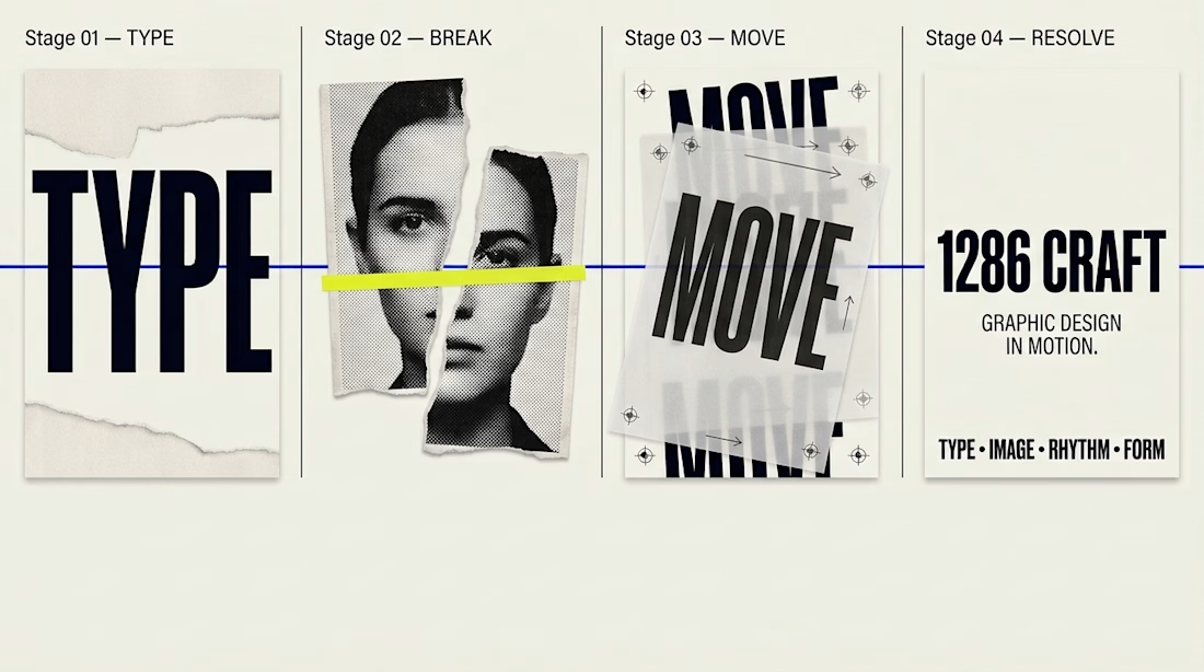

The yellow crop line through the portrait makes the editorial cut feel deliberate. Huge TYPE sitting against the torn MOVE poster is the contrast that holds the system.