The network for creativity
Join 1.25M professional creatives like you
Connect with clients, get discovered, and run your business 100% commission-free
Creatives on Contra have earned over $150M and we are just getting started
Back to feedPost

Data is useless if you can’t read the story. 📖
Most Power BI reports are cluttered "data dumps." For my latest project—an Olympic Games performance analysis—I took 120+ years of chaotic data and turned it into a clean, intuitive decision-making tool.
I don't just build dashboards; I build visual narratives that help stakeholders spot trends in seconds, not hours.
🚀 Power BI World Championship Entry
💼 Open for new analytics projects
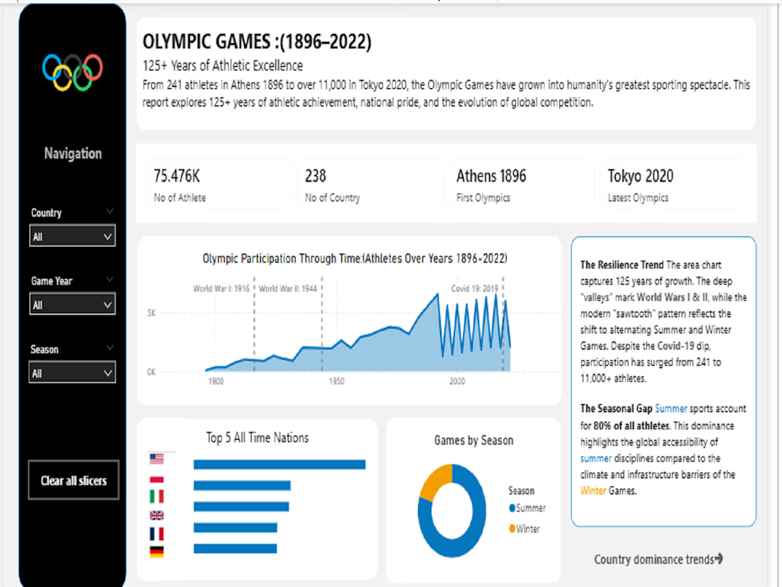


Data is very useless if read the story and clean it.
The network for creativity
Join 1.25M professional creatives like you
Connect with clients, get discovered, and run your business 100% commission-free
Creatives on Contra have earned over $150M and we are just getting started





Related posts

Oetux – SaaS Revenue Analytics Dashboard
The client had a lot of data, but the real problem was making sense of it.
MRR, revenue, churn, active customers, growth, customer performance, goals. Every metric was important, but when everything gets the same attention, users don’t know where to look first.
The existing experience made users spend too much time switching between information and trying to connect the numbers.
So we focused on how SaaS teams actually read their business data. We structured Oetux around the questions that matter most.
How is revenue performing?
Are we growing?
Are customers staying?
Where are we losing revenue?
What needs attention right now?
Then we organized KPIs, revenue trends, customer performance, churn insights, goals, and AI powered insights into one clear experience.
The goal wasn’t to remove data.
It was to organize the data so users could understand it faster.
That’s what we solved with Oetux.
Turning a data heavy SaaS dashboard into an experience that helps teams see their business clearly and make better decisions.


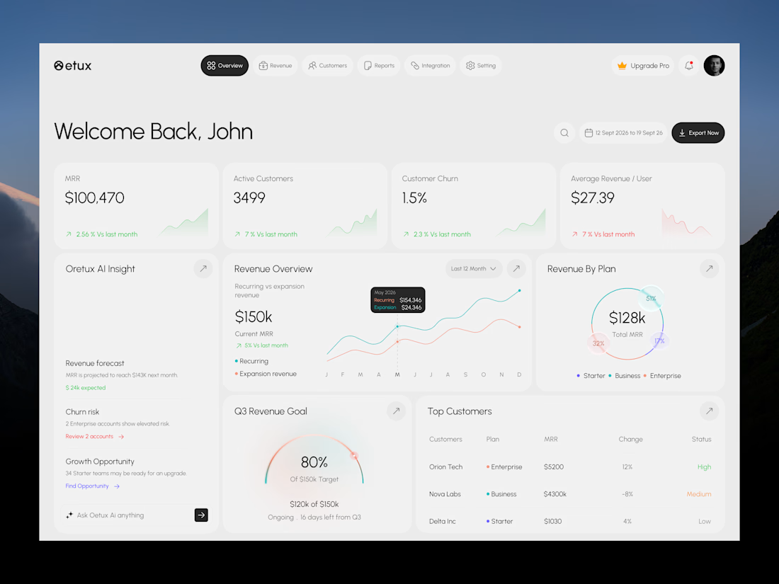

Love the clean layout.

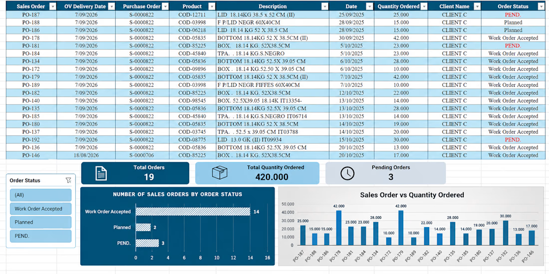
Developed an Excel dashboard for tracking sales orders, organizing order data, monitoring order status, and analyzing requested quantities. The project included data organization, filters, KPI summaries, and visual charts to improve data comprehension and support informed decision-making.


AI Business Analytics Platform — UI & Motion Design
Concept design for a futuristic AI-powered business platform. I created the interface, dashboard elements, data visualizations and motion design, including a 3D animated globe to represent global connectivity and real-time analytics.


