The network for creativity
Join 1.25M professional creatives like you
Connect with clients, get discovered, and run your business 100% commission-free
Creatives on Contra have earned over $150M and we are just getting started
Back to feedPost


A strong brand isn't built on trends.
It's built on recognition.
WindCore was designed for a brand that represents clean energy, innovation, and forward-thinking solutions. The circular mark draws inspiration from the continuous motion of wind turbines, symbolizing power, sustainability, and progress.
The bold color palette keeps the identity confident, while the minimal structure ensures the logo remains memorable across every application—from digital platforms to large-scale branding.
Simple shapes.
Purposeful design.
Timeless identity.
💬 What industry comes to your mind the moment you see this logo?
If you're looking for a logo that gives your business a professional and lasting identity, let's create something unforgettable.
#logodesign #branding #brandidentity #graphicdesign #visualidentity #renewableenergy #cleanenergy #modernlogo #minimalbranding #branddesigner #identitydesign #creativebranding #logoideas #designsburner #logopresentation


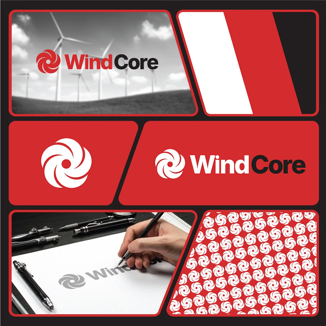

The circular mark carries the wind theme without leaning on a literal turbine icon, and the restrained geometry keeps it memorable. The confident palette feels right for a clean-energy brand that wants to signal momentum.
The network for creativity
Join 1.25M professional creatives like you
Connect with clients, get discovered, and run your business 100% commission-free
Creatives on Contra have earned over $150M and we are just getting started
Trending
retrofuturism
Share your favorite designs from the past exploring the distant future. Or your own take on the aesthetic 🚀
halftone
Dots. Texture. Grain. Let's see your designs using the halftone technique.

Midjourney
Creatives are showing off what they're making with Midjourney.
colorgrade
Video editors sound off: How do you enhance the mood of your video in color grading?
Related posts

Logofolio for agency, startup, and companies by Me.

Sick 🔥

A visual identity rooted in Indian craft, reimagined for a contemporary audience.
Zarira is a fashion brand concept exploring the balance between traditional Indian aesthetics and a more modern, understated visual language.
For the identity, I wanted to move away from the overly ornate visual language often associated with Indian fashion brands and create something that felt refined, expressive and distinctly Indian without being literal.
I explored:
— Art direction
— Visual identity
— Typography
— Packaging
— Brand applications
The result is a brand world that feels rooted in tradition, but designed for the present.
Would love to hear what you think ↓
#BrandIdentity #BrandDesign #FashionBrand #VisualIdentity


MARKS & FORMS — a journey in marks, forms, and recognition.
What started in 2025 with the first edition of MARKS & FORMS has grown into an ongoing exploration of identity, symbolism, and visual systems.
From its first launch and first feature, through every new edition and recognition along the way, the collection has continued to evolve — becoming not only a personal archive of work, but a visual record of how my approach to identity design keeps moving forward.
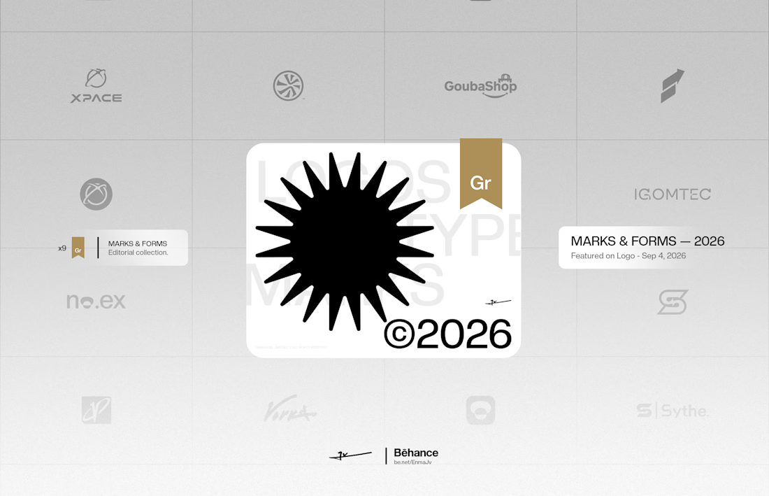
Now, in the 2026 edition, MARKS & FORMS has reached another milestone: its latest feature, bringing the collection to what I believe is its 9th badge of recognition.
Nine moments of being seen.
One collection that keeps growing.
MARKS & FORMS is an ongoing study of the marks we create, the forms we shape, and the ideas behind them.
Explore the full collection on Behance and discover the work behind every mark.
And if you're looking for a designer to build a distinctive identity for your next project, let's work together.
→ Explore MARKS & FORMS
→ Interested in working together — Start your project here


Congratulations, Emanuel 🎉