The network for creativity
Join 1.25M professional creatives like you
Connect with clients, get discovered, and run your business 100% commission-free
Creatives on Contra have earned over $150M and we are just getting started
Back to feedPost


The network for creativity
Join 1.25M professional creatives like you
Connect with clients, get discovered, and run your business 100% commission-free
Creatives on Contra have earned over $150M and we are just getting started






Related posts

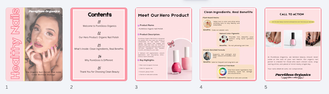
Cachet brand exploration.
Exploring patterns, textures, materials and hand-drawn illustrations

That's interesting I like it that's really unique ❤️❤️🎉🎉


Beautiful work. The details really make this stand out.

The Concept
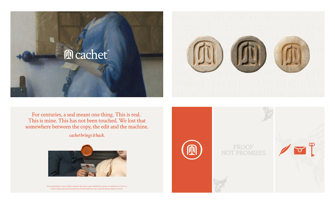
This piece is a visual exploration of modern consumer culture, transforming an everyday pop-culture staple like Diet Coke into a high-impact editorial poster.
The Meaning
I wanted to blend commercial imagery with a raw, editorial aesthetic—exploring how everyday icons, nostalgic branding, and bold typography interact to evoke a specific mood and visual language.
The Process
I built this design from scratch by combining curated product imagery with custom typographic layouts, gritty paper textures, and deliberate composition choices to give it an authentic, high-concept feel on Canva.
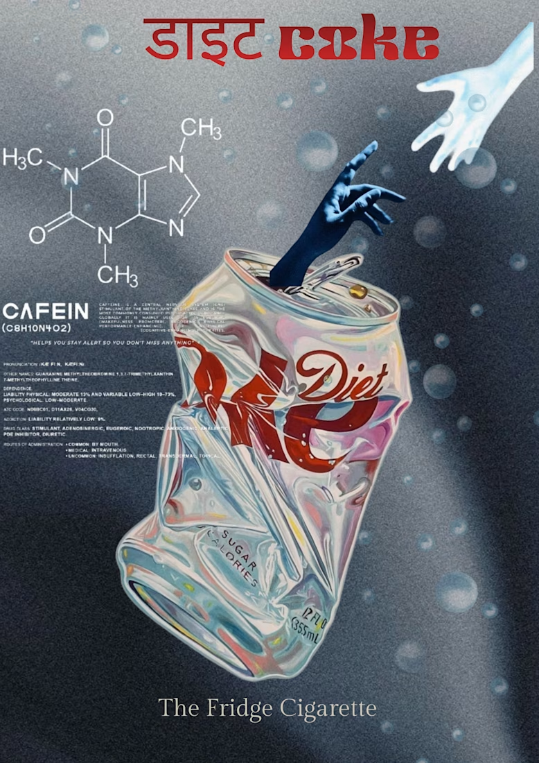

The quiet serif tagline under that loud red headline gives the poster a dry, editorial tone. Is the Devanagari "डाइट" a separate typeface from the Latin "coke", or did you adjust one to sit with the other?