The network for creativity
Join 1.25M professional creatives like you
Connect with clients, get discovered, and run your business 100% commission-free
Creatives on Contra have earned over $150M and we are just getting started
Back to feedPost
Taste Test

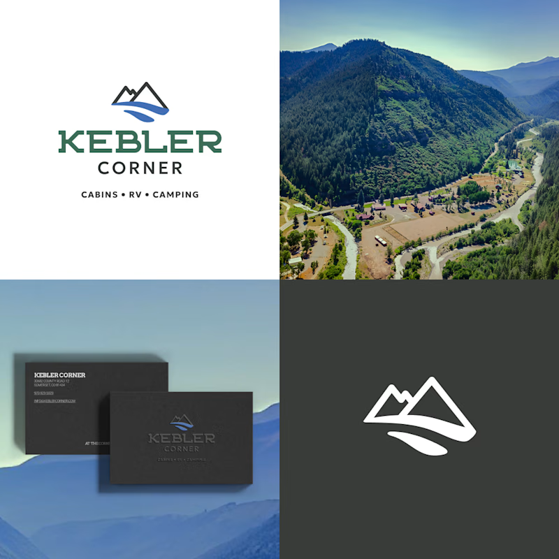
Before or after? 🌲
Kebler Corner is a mountain campground with cabins, RV spots and camping. The old logo was beautiful but heavy. The new one keeps the mountain and the river and turns them into a mark you can recognize in one second, even on a small business card.
A or B? Tell me in the comments 👇
0 voted
0%

8 voted
100%
8 votes
Closed

After is professional

After, for me. The mountain and river still read in the one-color version on the dark card, which is exactly where the old mark's detail would start to clog. Did any of the olive green survive into the new system?


Definitely 'After'! 🌲 Simplifying the mountain and river into a single clean line mark makes it so much more versatile for small applications like business cards and signage. Great update, Anna!
The network for creativity
Join 1.25M professional creatives like you
Connect with clients, get discovered, and run your business 100% commission-free
Creatives on Contra have earned over $150M and we are just getting started
Related posts

New on Contra, not new to design.
I draw logos by hand, then build everything around them: the brand, the website, the store. Lately I also make product films and ads with AI.
Recent work: an RY monogram and site for a Koreatown law firm, a winged W for a defense firm, and my family's golf eyewear brand, from the mascot to Shopify.
Starting a brand, or have one that doesn't feel like you yet? Show me what you're building.

The logo-led system reads tight because the wordmark sits clean in the negative space instead of fighting the emblem — when a brand has that kind of restraint, the Shopify store usually carries the same hierarchy into the product grid and checkout without inventing new rules....


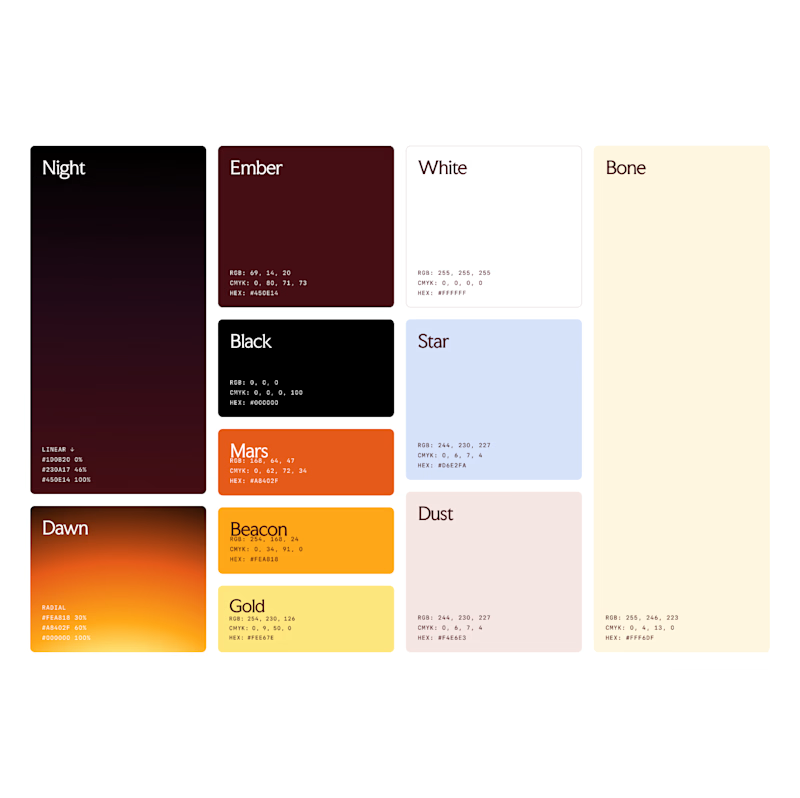
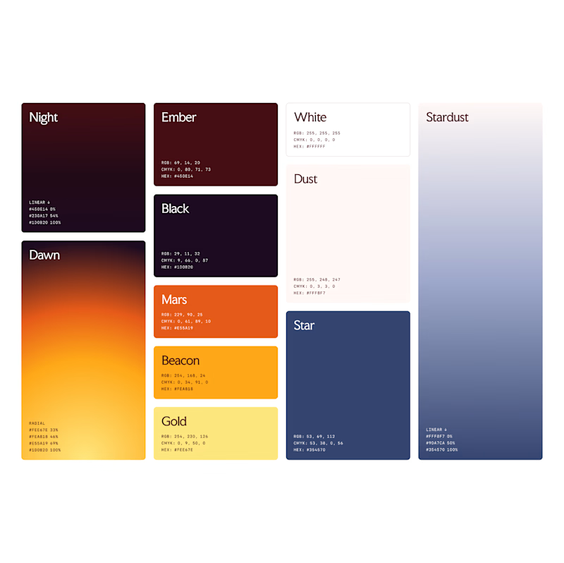
Which color palette feels more masculine to you?
16 voted
15%
94 voted
85%
110 votes
Closed