The network for creativity
Join 1.25M professional creatives like you
Connect with clients, get discovered, and run your business 100% commission-free
Creatives on Contra have earned over $150M and we are just getting started
Back to feedPost

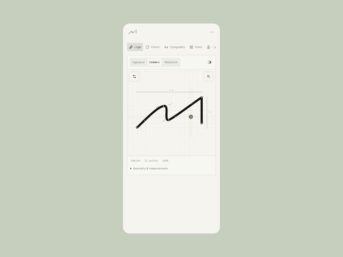
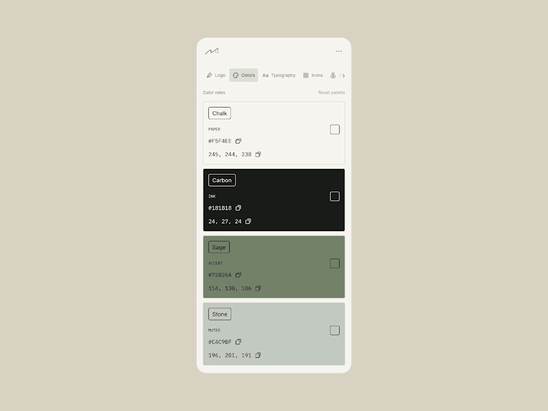
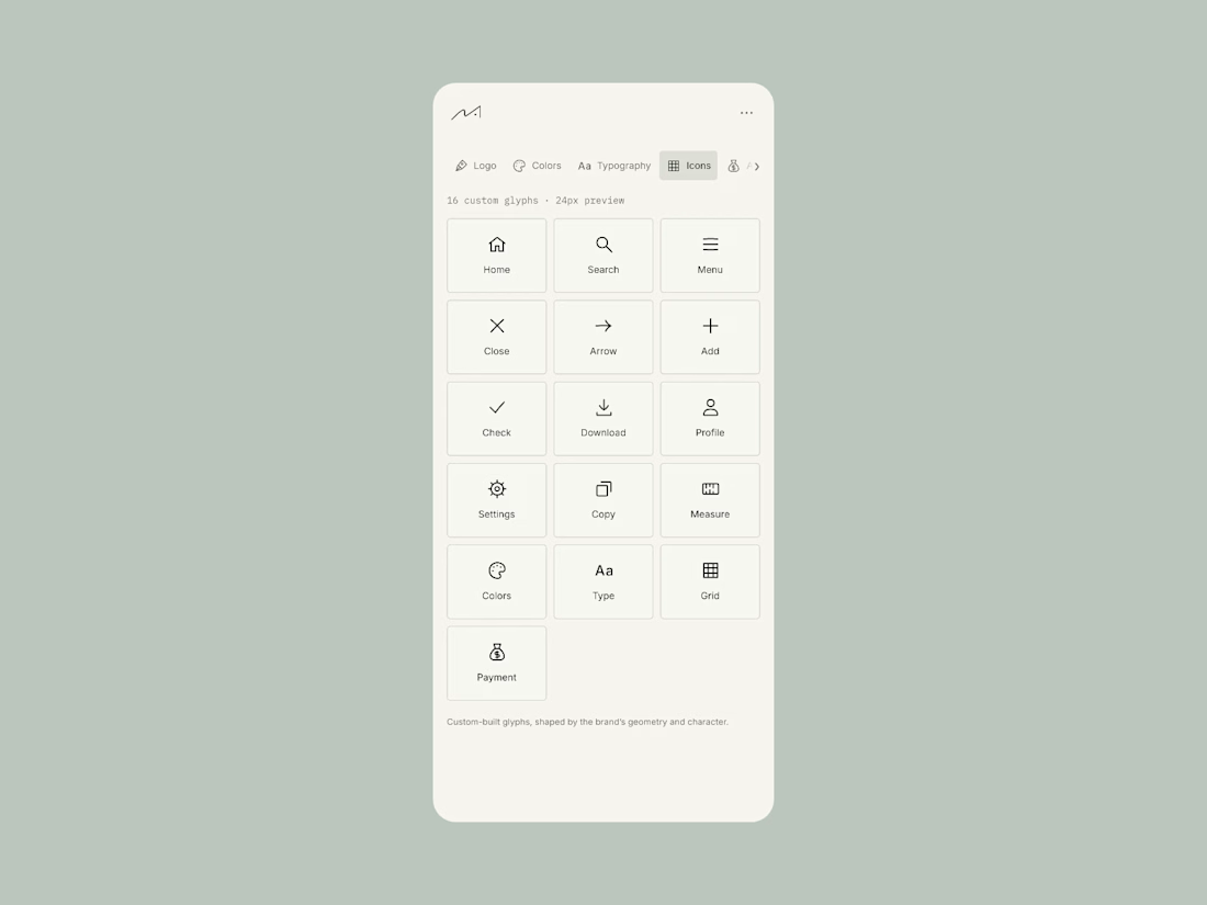
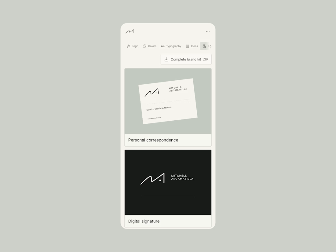

Clean personal brand! The signature logo feels premium on that muted green. Really smart use of minimal UI to let the logo breathe.

✍🏻 Thank you Naim. Also love how minimal it is

The way the signature mark anchors the personal brand is clear — the muted green keeps it premium without shouting, and the minimal UI around it does the right thing and just gets out of the logo's way. Where I'd push this next is consistency across the motion of that signature:...
Thank you Wisdom. And great point on integrating the motion. The brandmark is a signature after all

Such a lovely signature, Mitchell! Did you draw it by hand?
Thanks Thayline! I drew it on paper initially then vectorized and refined it

Wou amaizing
Thank you Sagar
The network for creativity
Join 1.25M professional creatives like you
Connect with clients, get discovered, and run your business 100% commission-free
Creatives on Contra have earned over $150M and we are just getting started








Related posts


Design Sprint: ESCO Token
How do you build a brand for a business most people can't explain?
ESCO Token is built to become the standard behind Europe's Digital Product Passport: the system that will track what a product is made of, where it came from and where it goes next. Necessary, regulated, and completely abstract for most people.
One sprint. Zero to an identity that works:
- Micro-design style: restraint over noise, shaped by European design discipline.
- Wordmark and symbol built to hold up anywhere.
- Full brand identity.
- Landing page ready for the go-to-market.
When a business is hard to explain, the brand has to do the talking.
Teaser below.


Wonderful craftsmanship! 🎯


A little behind the scenes of a site launch video I'm working on 👀


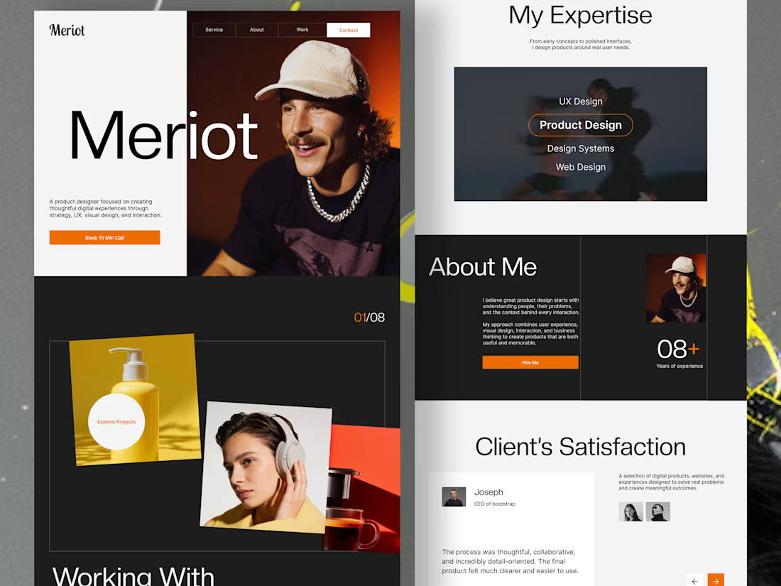
Product Designer Portfolio Website
Client focused solutions
The goal was to create a digital experience that presents a designer’s expertise, showcases selected projects, and guides potential clients toward taking action.
From the split-screen hero section to the interactive-looking project showcase, expertise section, and client testimonials, every section is designed to balance visual impact with usability.
From the split-screen hero section to the interactive-looking project showcase, expertise section, and client testimonials, every section is designed to balance visual impact with usability.
Design highlights:
Modern, editorial-inspired visual direction
Bold typography and clear visual hierarchy
Engaging project presentation
Structured expertise and about sections
Client-focused layout with clear calls to action
Minimal, high-contrast design with vibrant orange accents
Looking for a portfolio website or a landing page that makes your brand stand out? I design thoughtful digital experiences that combine aesthetics, usability, and business goals.
Have a project in mind? Let's connect and bring your vision to life.


Outstanding approach.