The network for creativity
Join 1.25M professional creatives like you
Connect with clients, get discovered, and run your business 100% commission-free
Creatives on Contra have earned over $150M and we are just getting started
Back to feedPost

Last day of the month, I'd like to showcase four projects I've done this week.
But before I go, I'd like to leave the last words to Shakespeare:
"Fear no more the frown o' the great
Thou art past the tyrant's stroke
Care no more to clothe and to eat
To thee the reed, the reed is as the oak
The sceptre, learning, physic, must
All follow this and come to dust
All lovers young, all lovers must
Consign to thee and come to dust"

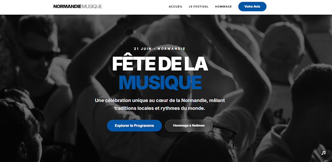
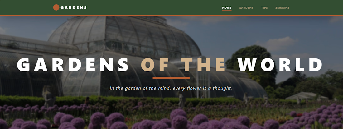
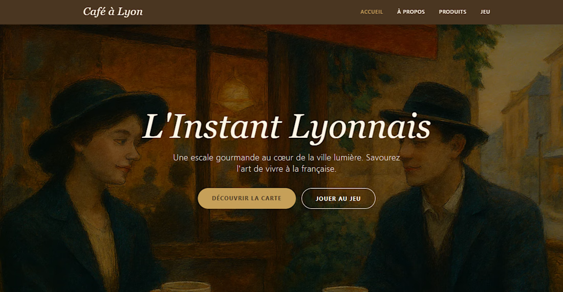

Good job

Strong way to close the month. The range across these projects shows both versatility and cohesion — excited to see what next month brings.
That means a lot, Ciro. You’ve been shipping consistently — excited to see what you build next too.

Nice work ciro. I loved the 2 and 4 a lot
The network for creativity
Join 1.25M professional creatives like you
Connect with clients, get discovered, and run your business 100% commission-free
Creatives on Contra have earned over $150M and we are just getting started





Related posts

This project is very meaningful to me because this is the first project that I'm building for a competition.
Marlowe and Ash is a project which allows single owners to convert "Can I book?" into "You are booked." This project also helps clients to reduce the friction so they can book their favorite salon within minutes. Not only that but Marlowe and Ash was created using Lovable with a little bit of imagination. I would like you to take a peek at this project and let me know your thoughts in the comments

Business Name is Marlowe & Ash Colour Studio (Sarasota, FL)
I turned a solo colourist's DM-and-voicemail booking chaos into a self-serve flow where clients book and pay a deposit in under a minute, while automations handle reminders, rebooking nudges, and waitlist backfill so the owner spends her time on hair, not admin.

Very nice

The 2027 calendar won't draw itself, and the printing won't order itself either 🐐 It's the Year of the Goat, so this one has to be the GOAT. Question of the day: 1 — a cartoon goat with attitude 2 — an artsy one, like last year's Drop a number below, and I'll go sharpen my pencils (and horns)
#midjourney
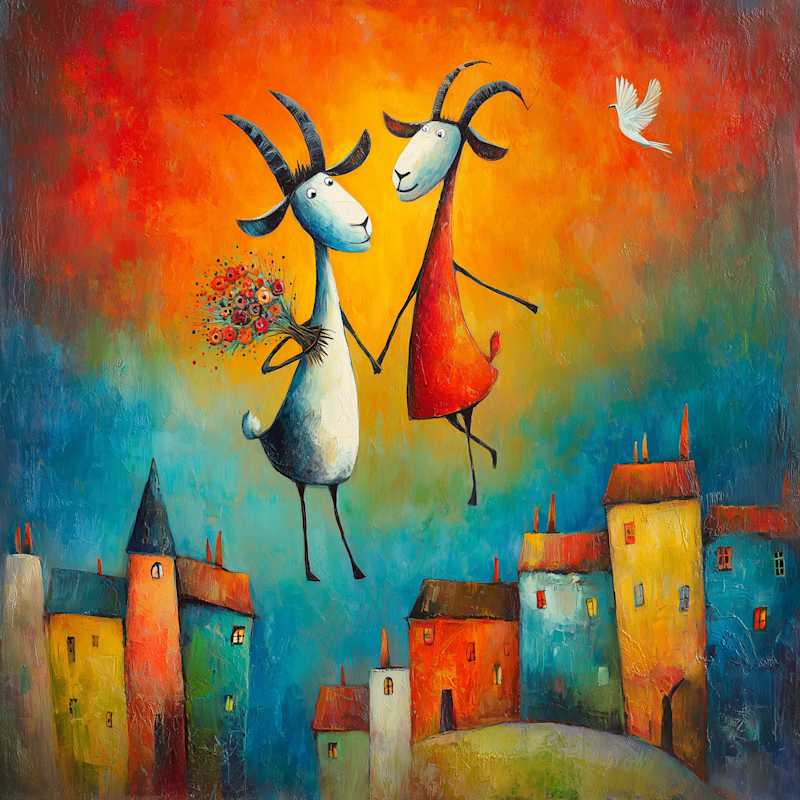
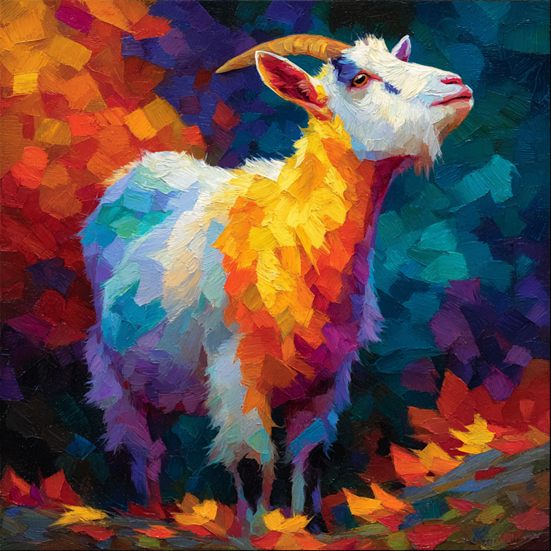
16 votes
Ends in 1d


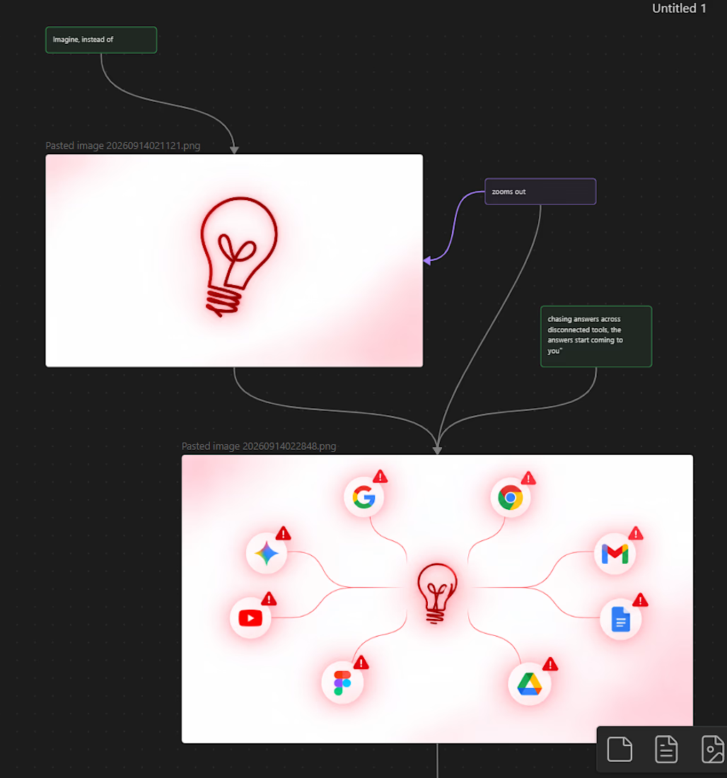

The storyboard-to-final progression reads clearly.