The network for creativity
Join 1.25M professional creatives like you
Connect with clients, get discovered, and run your business 100% commission-free
Creatives on Contra have earned over $150M and we are just getting started
Back to feedPost

I think 1 image design was great!


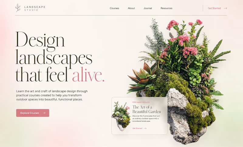
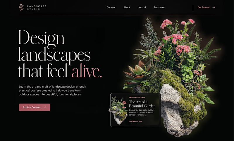
Color Changes Everything
Sometimes, all it takes is a change in color – and the exact same design can feel completely different.
The light version, with soft pink tones and natural textures, feels fresh, light, and airy. It creates a sense of calm, natural beauty, and a closer...
128 voted
66%
66 voted
34%
194 votes
Closed

My fav Dark mode, and nice design👍

Looking beautiful

Wowwww


Both perspective is good but i think the dark version is more visual and get more attraction for users.

I disagree with you
The colours on the dark version make it noisy to look at

Nice work!

This is really amzing designs,i have a questions about this designs?

Both stekches are looking good only.

The light version reads clearer to me too. The softer palette lets the imagery lead, and for a small business site I would test that lighter version first, since it usually feels more welcoming on a first visit.
The network for creativity
Join 1.25M professional creatives like you
Connect with clients, get discovered, and run your business 100% commission-free
Creatives on Contra have earned over $150M and we are just getting started
Related posts

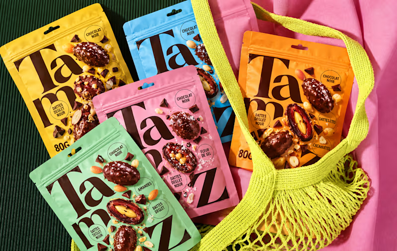
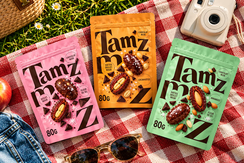
Which option works better? 👀
Option 1: the full lineup with the mesh bag
Option 2: the picnic setup
7 voted
20%
28 voted
80%
35 votes
Closed


option 2 for me, the picnic setup feels like something you would actually want to buy


Keeping the Halloween-inspired concepts coming! 🕯️✨
This time, we're sharing Ovelle — a luxury candle e-commerce website with warm tones, elegant typography, and a moody editorial aesthetic. Would love to hear your thoughts! 🎃


