The network for creativity
Join 1.25M professional creatives like you
Connect with clients, get discovered, and run your business 100% commission-free
Creatives on Contra have earned over $150M and we are just getting started
Back to feedPost
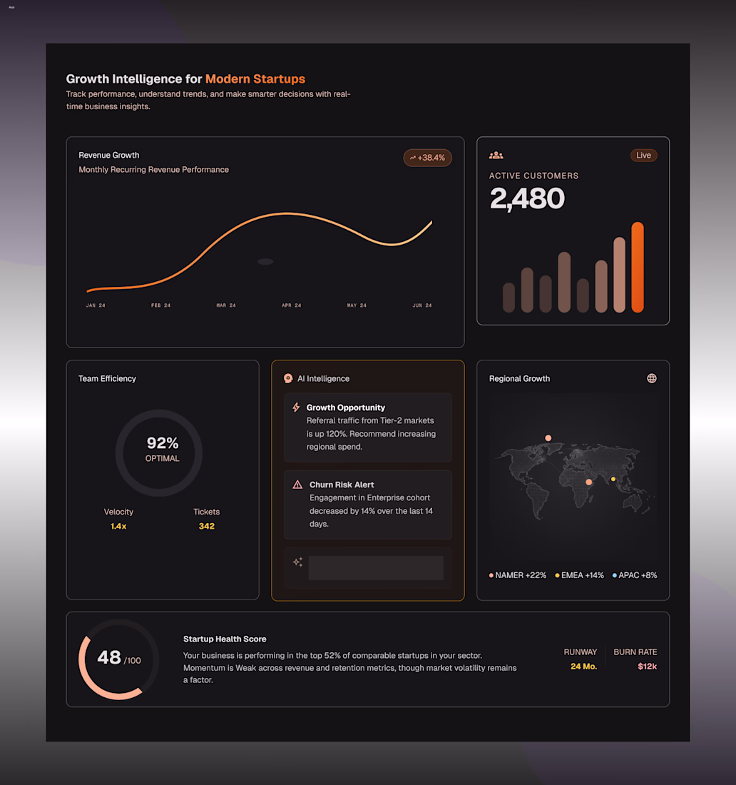
Designed a Growth Intelligence section for a startup SaaS concept.
Explored how revenue, customer growth, AI insights, and business health metrics can be presented in a way that's both informative and easy to scan.
Focused on:
• Data visualization
• Information hierarchy
• SaaS dashboard aesthetics
• Decision-focused UX
• Modern startup branding
Designed in Figma.
The info hierarchy here is doing real work. Keeping MRR trends, active customers, team efficiency, and AI insights on the same screen without it feeling cluttered is genuinely hard to pull off. The amber accents against dark really help group the key metrics.
Thank you! Balancing multiple data points without overwhelming the user was the main challenge here, so I’m glad the hierarchy and color grouping came through clearly
This is awesome😎 👍
Thanks a lot! Happy to hear that 🙏
YOu are most welcome
The network for creativity
Join 1.25M professional creatives like you
Connect with clients, get discovered, and run your business 100% commission-free
Creatives on Contra have earned over $150M and we are just getting started
Trending
Claude
Claude has entered the design space. How are you using Claude Design?
Contra University
Learn from expert creatives how to earn more using next-gen AI tools.
creativeaiflow
Creative AI workflows are evolving. What tools do you use, and what are their strengths and weaknesses?
freelancerlife
Freelancer life is wins, pivots, and everything in between. What’s yours right now?
Related posts
Love this!
Retro Reel Timer — Minimal Cartoon UI
A playful reinterpretation of a classic reel-to-reel timer, redesigned with a softer colour palette, simplified shapes and a clean cartoon-inspired visual style. The interface keeps the nostalgic character of analogue recording equipment while presenting the controls in a modern, friendly and easy-to-understand layout.
The design focuses on strong visual hierarchy, balanced spacing and clear interaction states. Bold timer typography, rounded controls and subtle depth help the interface feel approachable without becoming visually cluttered, creating a distinctive concept suitable for a mobile timer, audio recorder or productivity application.
The reel spools doubling as eyes is a smart way to add character without adding extra elements, keeps the layout clean while still being playful. Nice fit for a productivity tool that doesn't want to feel sterile.
Just launched my latest Framer template a few days ago. Tensor is a modern marketing website template built for startups, SaaS, and agencies.
Tensor looks well positioned for SaaS and agency marketing sites. For template launches I also find SEO on the product page itself makes a big difference later. Wrote a short guide on that here: https://noel.marketing/blog/digital-product-seo-guide/