The network for creativity
Join 1.25M professional creatives like you
Connect with clients, get discovered, and run your business 100% commission-free
Creatives on Contra have earned over $150M and we are just getting started
Back to feedPost

Corporate Office Building — Architectural Visualization
One building. Four moments. One consistent architectural vision.
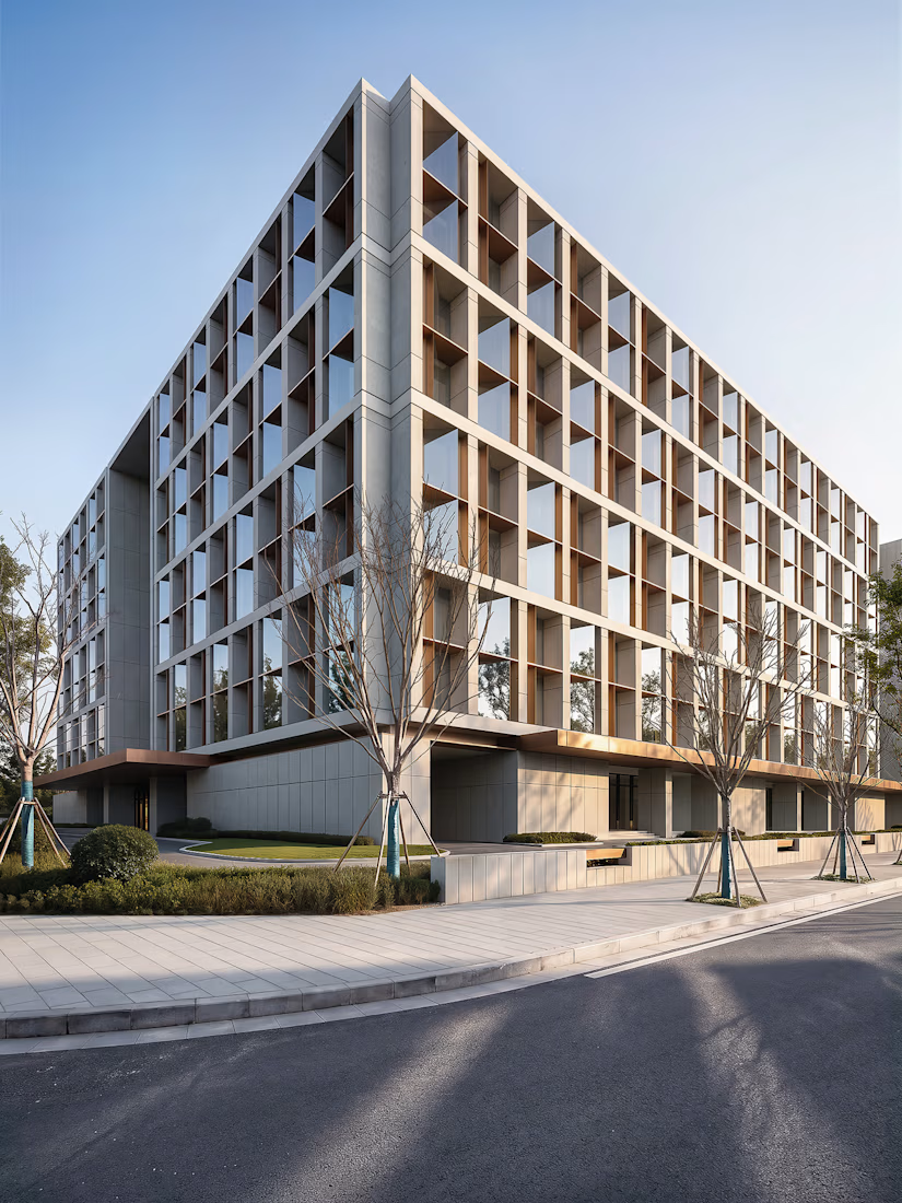
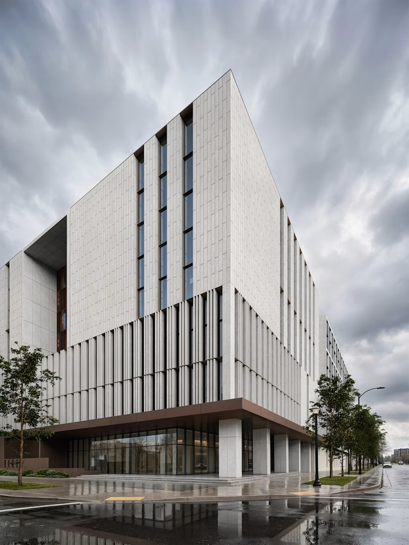
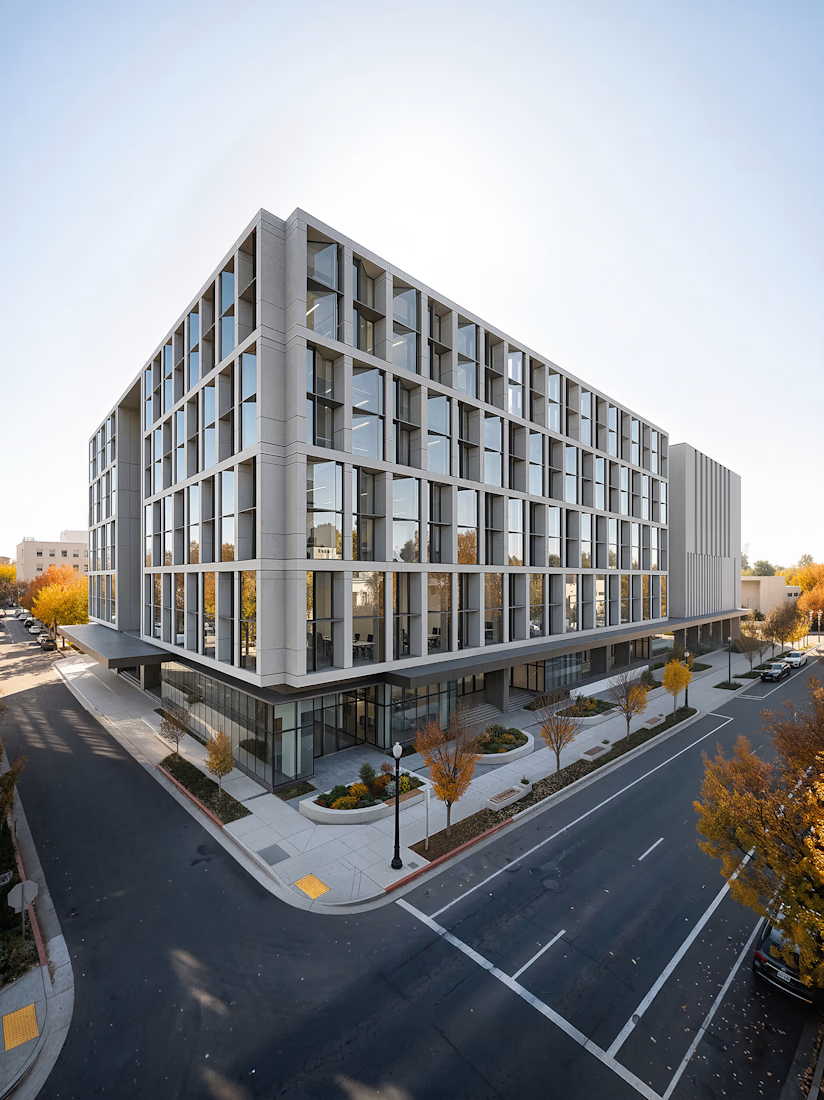
This visualization explores how a single corporate office concept responds to different times of day, weather conditions, and viewpoints.
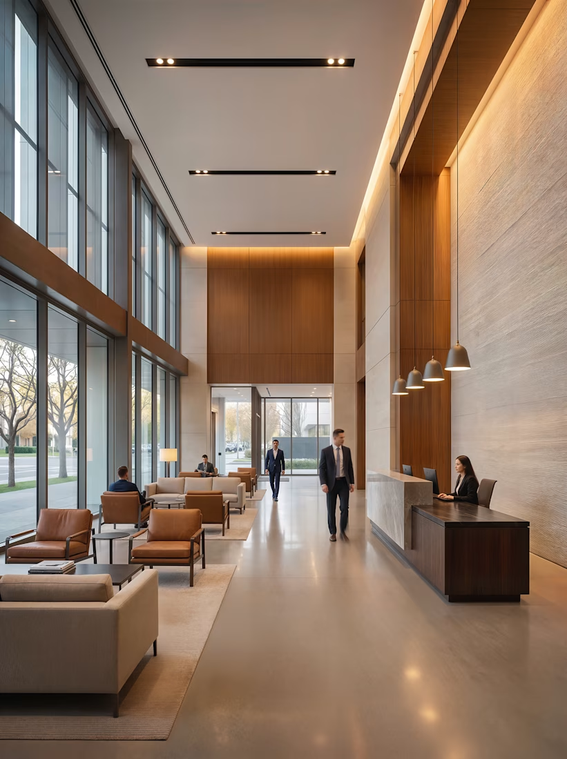
The building combines two distinct façade expressions within one cohesive volume: a textured precast concrete grid with deep vertical fins on one elevation, and a warmer timber-accented curtain wall on the other. A continuous glazed ground floor and deep cantilevered canopy unify the composition while creating a strong street-level presence.
The visual series captures the architecture across changing conditions—from a rain-washed morning and crisp autumn afternoon to a warm dusk where interior lighting begins to glow through the curtain wall. The interior continues the same material language, combining timber, stone, and soft pendant lighting within a double-height lobby.
I handled the 3D modeling, scene development, materials, lighting, rendering, and post-production, with a focus on realistic architectural representation and atmospheric storytelling.
Software: 3ds Max · Corona Renderer · Adobe Photoshop · Stable Diffusion
Year: 2026
The goal was simple: to show that strong architecture should not depend on a single hero shot. It should remain convincing under any sky, at any hour, and from any angle.
ArchitectureArchitecture & Interior DesignInterior Design Adobe PhotoshopAutodesk 3ds MaxChaos Corona


The network for creativity
Join 1.25M professional creatives like you
Connect with clients, get discovered, and run your business 100% commission-free
Creatives on Contra have earned over $150M and we are just getting started

Challenges
View all


Related posts

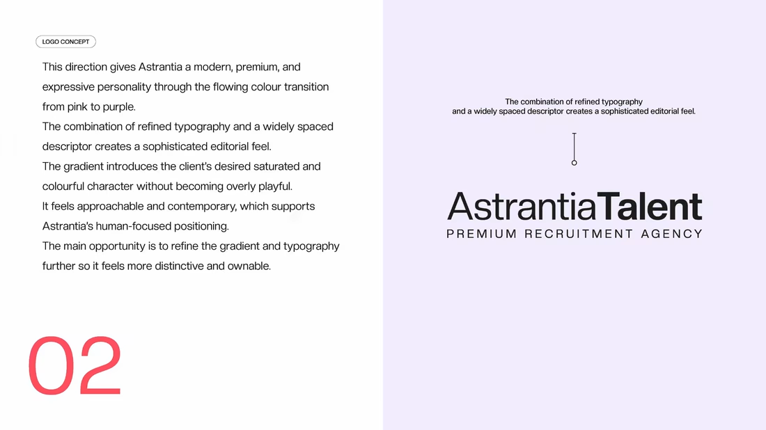
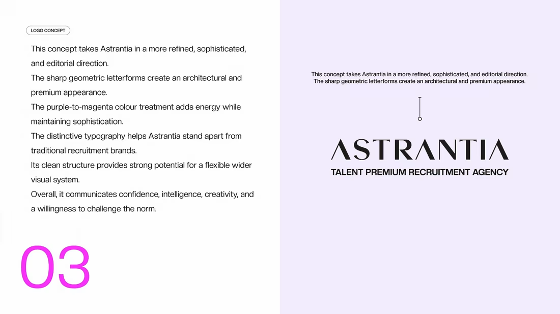
Logo design and brand identity project for Astrantia Talent, a premium recruitment agency. Explored three wordmark concepts bold geometric type, editorial gradient, and architectural serif built around a vibrant purple-to-magenta palette for a modern, memorable recruitment brand identity.



A logo should do more than look good.
It should tell a story before a single word is spoken.
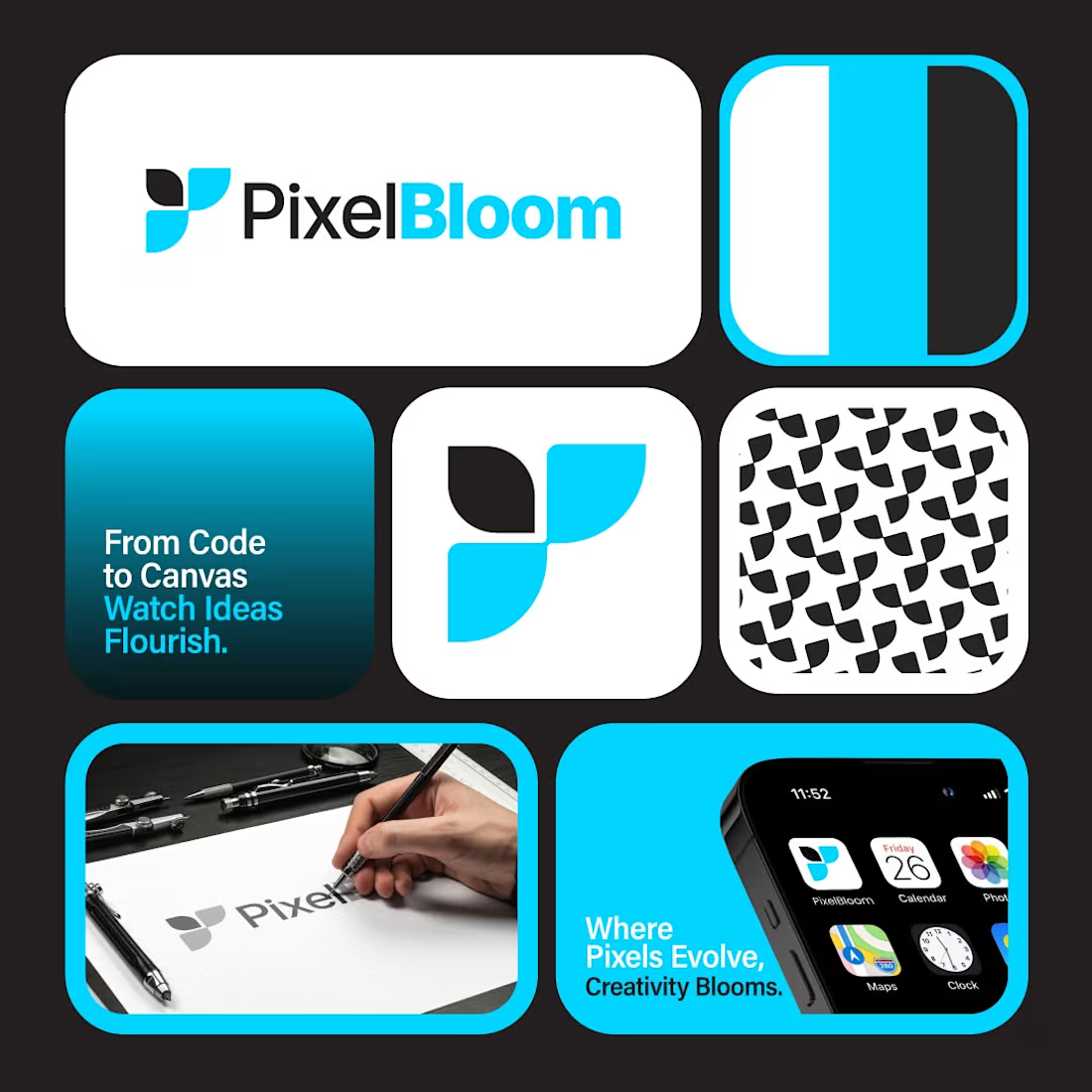
PixelBloom was created for a modern creative brand that values simplicity, innovation, and growth. The clean geometric icon represents ideas coming together, while the vibrant color palette adds energy without sacrificing professionalism.
Every curve, proportion, and application was carefully refined to build a brand identity that feels memorable across both digital and print.
Strong brands aren't built overnight.
They start with one unforgettable logo.
💬 What's the first word that comes to your mind when you see PixelBloom?
If your business deserves a professional identity that stands out, let's build it together.
#logodesign #branding #brandidentity #graphicdesign #visualidentity #modernlogo #creativebranding #minimaldesign #branddesigner #identitydesign #logoideas #graphicdesigner #designinspiration #designsburner #logopresentation


Outstanding work

Just wrapped another real estate project, this one for Amirah Estates.
They are a luxury residential brokerage across premier US metros, working in a market where a third of transactions never hit the open listing. The portfolio and the track record were already there. The deck was not.
The brief: take a discerning client or investor through market data, services, and featured listings without ever dropping the tone the brand runs on. A standard real estate deck was never going to work.
So we built around stillness and weight. Deep forest green with gold used sparingly. Editorial property photography, restrained rather than stacked. Market numbers like luxury price growth and days on market given room to land instead of crammed into a chart. Featured listings treated as three moments, not a table.
The result is a deck that feels as considered as the properties inside it.
If your work is premium and your deck is not, that gap is usually the thing I get hired to close.


Nice work