The network for creativity
Join 1.25M professional creatives like you
Connect with clients, get discovered, and run your business 100% commission-free
Creatives on Contra have earned over $150M and we are just getting started
Back to feedPost

Meridial — Wealth Management Platform
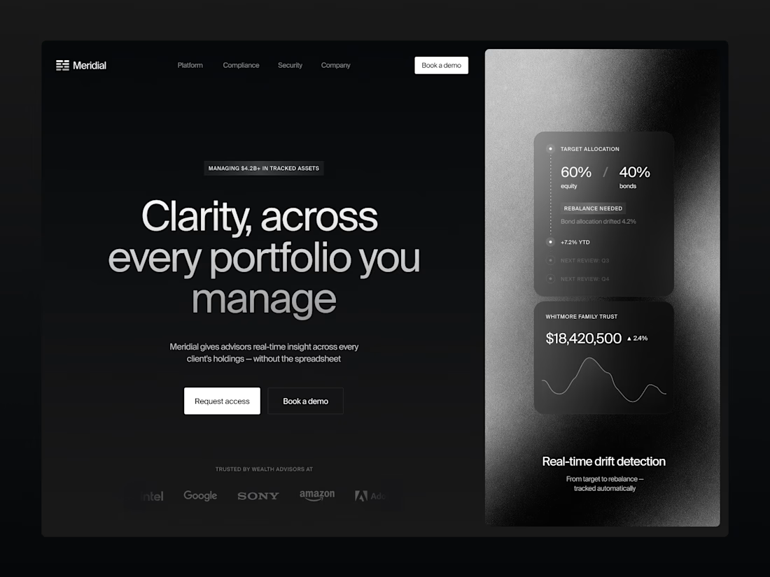
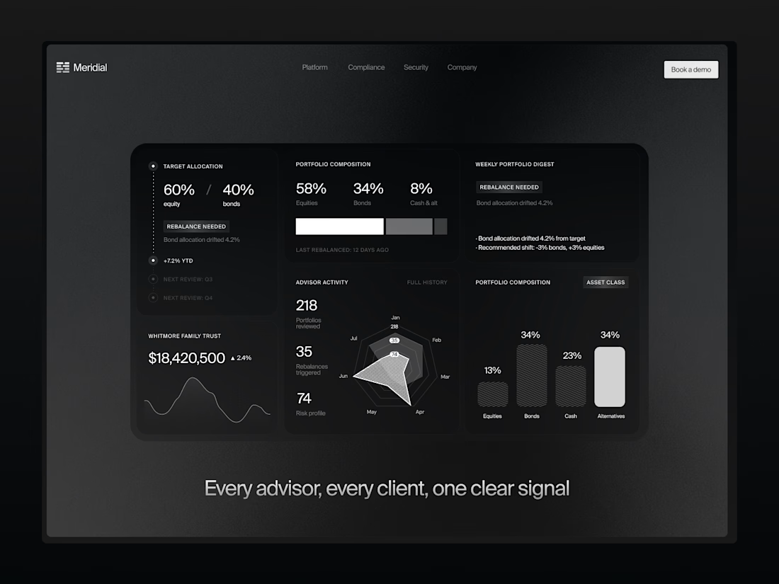
For Meridial, I designed a system where the one thing that matters — portfolio drift — always surfaces first, no matter how many clients an advisor is tracking.
Signal over noise, even at 200+ portfolios. ⚪
The challenge:
Advisors managing dozens of portfolios need to instantly spot what's drifted from target — without digging through spreadsheets or noisy dashboards that bury the signal in data.
A dark, grain-textured UI gives Meridial a private-banking feel instead of typical fintech blue. The landing page proves the product directly in the hero with live allocation and drift cards, while the dashboard extends the same card system into radar charts, composition breakdowns, and a weekly digest — built so advisors can scan hundreds of portfolios at a glance.
A case in making complex portfolio data resolve into one clear signal.



That's an amazing work, Kris! Goated

The dark grain-textured UI gives this a truly exclusive private-banking feel. Did you animate the allocation drift cards and radar charts using Jitter or native Figma prototypes?
Jitter, thank you!

So good!

Simple back to basics dark UI. Looks great!

Really like the focus on surfacing what actually matters first. Good SaaS design isn't about showing more data—it's about showing the right data at the right time.

Outstanding UI/UX! Surfacing rebalance signals instantly instead of hiding them behind tables is a massive efficiency win for advisors. The dark grain texture looks incredibly premium and fits the wealth management niche perfectly. Sleek, focused, and clean! 🖤📈

great🙌

Fantastic work !

CLASSY!!

Amazing 😍 🤩

Remarkable job!


The dark colors give it a nice feel. The focus on portfolio drift is smart.

Letting portfolio drift lead instead of burying it in a table is such a smart call, premium and clear.

Surfacing portfolio drift as the priority signal instead of just another metric on a dashboard is a smart call for advisors juggling 200+ accounts. That grain texture on the hero also keeps the dark UI from feeling flat.
The network for creativity
Join 1.25M professional creatives like you
Connect with clients, get discovered, and run your business 100% commission-free
Creatives on Contra have earned over $150M and we are just getting started
Trending

Claude
Claude has entered the design space. How are you using it?

Contra University
Learn from expert creatives how to earn more using next-gen AI tools.
Brand Design
The best brand designers are on Contra. Scroll to see what's trending in brand design. What are you building?
creativeaiflow
Creative AI workflows are evolving. What tools do you use, and what are their strengths and weaknesses?
freelancerlife
Freelancer life is wins, pivots, and everything in between. What’s yours right now?






Related posts

Sharing something I'm working on right now.
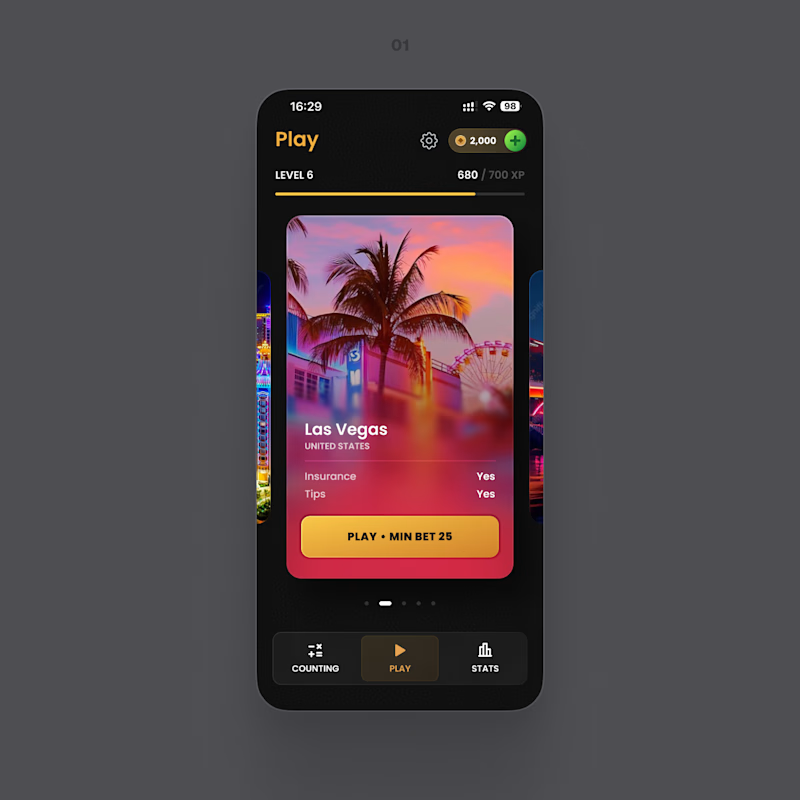
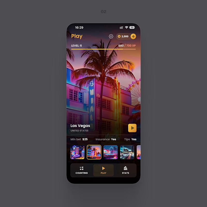
Two directions for the same screen. One keeps everything in a focused card – the button and the conditions right where you look. The other turns the whole screen into the place: more atmosphere, less interface.
Which one feels easier to use? And if the prettier one isn't the easier one for you, tell me in the comments – that's the part I'm stuck on.
8 voted
42%
11 voted
58%
19 votes
Closed

Both of looks clean and well thought out. How long did it take you to bring everything together?

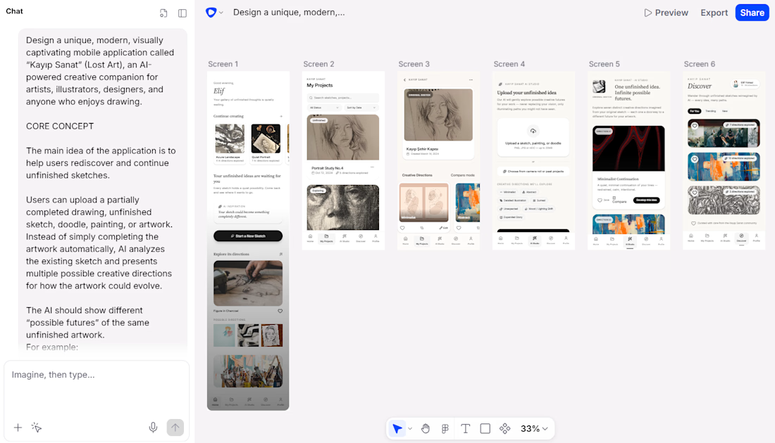
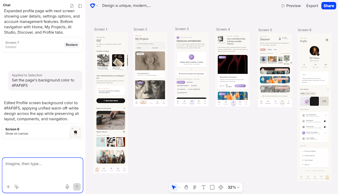
We developed the Lost Art mobile application using Flowstep, an AI-powered application development tool.
The entire app concept, user experience, interface structure, and visual design were developed directly through Flowstep, without using Figma. Lost Art is an AI-powered creative art platform designed to help users rediscover unfinished sketches and transform them into new creative possibilities. Users can upload unfinished artwork, explore multiple AI-generated creative directions, discover other artists' creative journeys, and develop their own artistic ideas. The application also features a dynamic color system that analyzes each artwork and adapts the app's visual atmosphere to reflect its unique colors and identity. Lost Art is not designed to create art instead of the artist, but to help artists discover possibilities they may not have seen themselves.



Hey @Şule Ağaoğlu this is great but it looks like you're missing a link to your project. Make sure to include it in the comments here so the judges can properly review your submission.


Nice work! - I like the combination of MCP to canvas to code

Built an entire fintech UI in one session - 16 screens, zero Figma files.
Connected @flowstep_ai MCP to Claude Code > generated every screen directly on the canvas via prompts. No manual pixel-pushing.
Used design skills (hallmark, impeccable, prompt-master) to refine each...

Great work, Good luck🙌