The network for creativity
Join 1.25M professional creatives like you
Connect with clients, get discovered, and run your business 100% commission-free
Creatives on Contra have earned over $150M and we are just getting started
Back to feedPost
Taste Test
Sharing something I'm working on right now.
Two directions for the same screen. One keeps everything in a focused card – the button and the conditions right where you look. The other turns the whole screen into the place: more atmosphere, less interface.
Which one feels easier to use? And if the prettier one isn't the easier one for you, tell me in the comments – that's the part I'm stuck on.
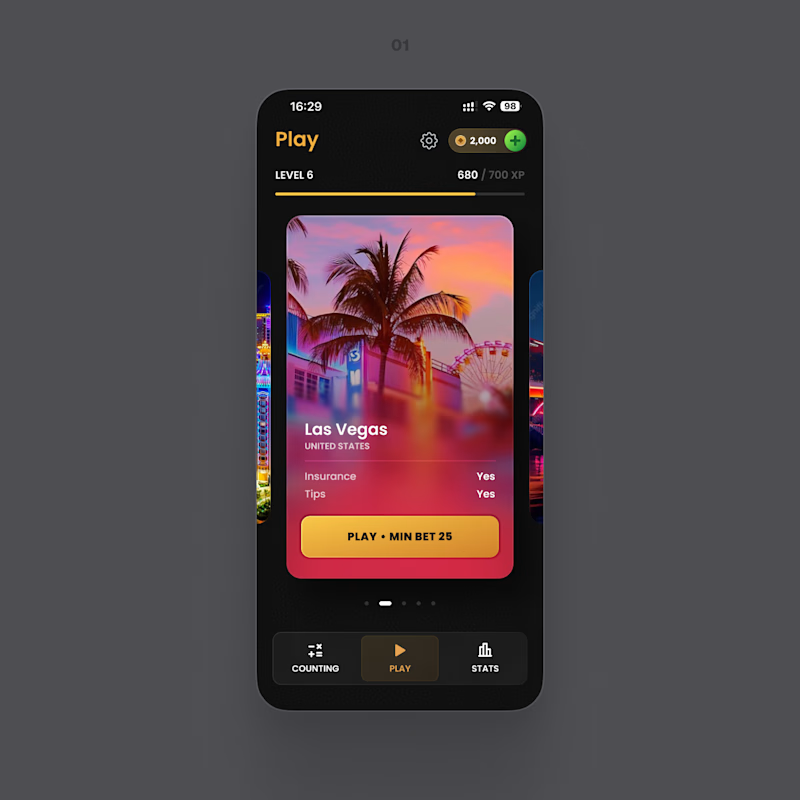
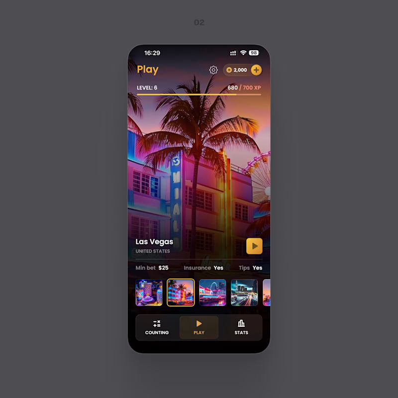
12 votes
Ends in 1d

Both of looks clean and well thought out. How long did it take you to bring everything together?

Feel no 1 is a little bland somehow, don't know why.

Appreciate the feedback! My guess is it’s the flatter color/contrast.


The network for creativity
Join 1.25M professional creatives like you
Connect with clients, get discovered, and run your business 100% commission-free
Creatives on Contra have earned over $150M and we are just getting started
Related posts

Hard to choose which layout I should go with 🤔


10 voted
31%
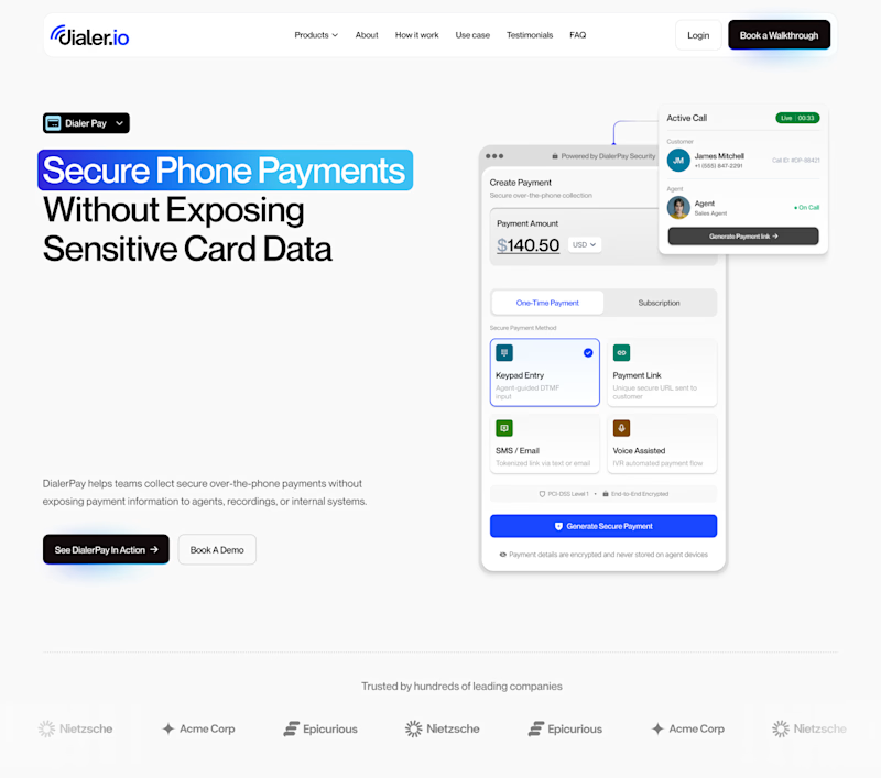
22 voted
69%
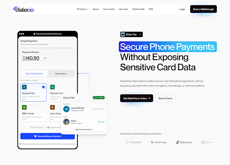
32 votes
Closed

Hero Section 2

XPlace — Crypto-Backed Visa Card Website design
Designed the interface for XPlace — a platform that lets users borrow against their crypto holdings and spend through a Visa card, without selling assets or triggering taxable events.
The challenge:
Create a product that feels both trustworthy and premium — avoiding the typical "startup" look, and steering clear of the neon/gradient clichés so common in crypto design.
The solution:
A dark, cinematic mood built around a monochrome landscape backdrop, bold expressive typography, and a metallic Visa Platinum card as the central visual anchor. Minimal elements, maximum focus on one action: get the card.
What's in the interface:
— Full-bleed hero section with an atmospheric background
— Large-scale headline that communicates value in seconds
— 3D card render as a trust-building element
— Transparent glass-effect header
Built in Framer — this isn't just the landing page, there are several more screens and flows I'll share case study separately 👀


That design, scroll transitions and color palette is very well designed with a great presentation. I like how you blend different type of scroll animations in different sections. Fits my dark sci fi aesthetic, good work!


He plays the role of an venture OS expedition guide that works agentically in the background via routines as well as normal chat to get various tasks done.
Currently working on his hat collection and dance moves that can be configured from the settings panel of the platform.
Here's a preview:


Love this concept. Have you thought about adding idle animations while he is thinking like having frank pull out a compass or check a map while waiting for an AI response?









Trending

Claude
Claude has entered the design space. How are you using Claude Design?

Contra University
Learn from expert creatives how to earn more using next-gen AI tools.
creativeaiflow
Creative AI workflows are evolving. What tools do you use, and what are their strengths and weaknesses?
freelancerlife
Freelancer life is wins, pivots, and everything in between. What’s yours right now?