The network for creativity
Join 1.25M professional creatives like you
Connect with clients, get discovered, and run your business 100% commission-free
Creatives on Contra have earned over $150M and we are just getting started
Back to feedPost
Taste Test

Same prompt. Same concept. Two AI tools. 👀
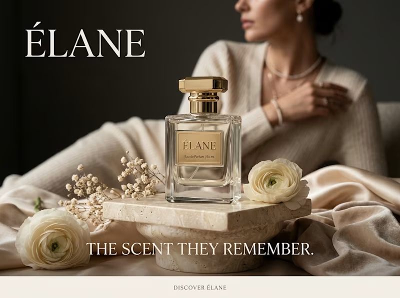
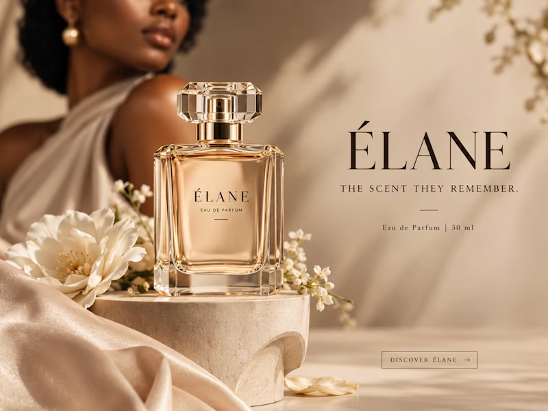
I gave ChatGPT and Gemini the exact same prompt to create a luxury perfume ad creative.
No changes. No extra instructions.
Now I want to know what YOU think:
Which creative did it better?
🔵 A— Gemini
🟣 B— ChatGPT
Look at the overall concept, visual quality, composition, typography, and how “ad-ready” it feels.
Who wins this round? 👀
Vote below and tell me what made you choose your answer.
#AIContent #AIAdvertising #AdCreative #CreativeStrategy #ChatGPT #Gemini #SocialMediaManager #SocialMediaStrategy #SocialMediaMarketing #MarketingStrategy #DigitalMarketing #ContentCreation


11 voted
39%
17 voted
61%
28 votes
Closed

B for me. You can easily tell what the product is because of how the "camera" is focused on it and then the title and the descriptive texts at the right side is excellent. ChatGPT executed the task better than Gemini in this case.👍

Honestly B is more focused on the product 🎉🎉

Wow

I went A. The moodier lighting and the tagline placement feel more like a real perfume campaign. B looks softer but a bit stock.

A looks better, as B seems like the everyday saturated concept usually used

A still look better

Whilst I like the text being bigger on A, I can hardly see the perfume bottle and it looks empty, however, I like that it looks more like a real bottle (purely because of the top cover. As someone with a tidy perfume collection, I love the design work of B but wish the sub texts...

Perfection is visible clearly🙌

B wins on layout and scannability. Proper negative space for the typography makes B look like a finished campaign ad.

I will go for ChatGPT, it looks more unique. The background also goes well with the tone of the product

I will go with Chatgpt on this.
It looks more luxurious and eye catching 🔥


The network for creativity
Join 1.25M professional creatives like you
Connect with clients, get discovered, and run your business 100% commission-free
Creatives on Contra have earned over $150M and we are just getting started






Related posts


Should a personal brand hero lead with the name or the promise?
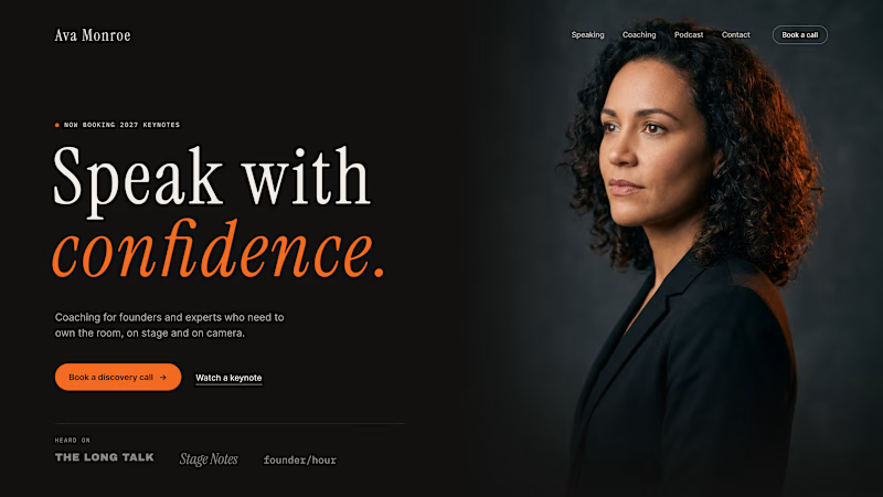
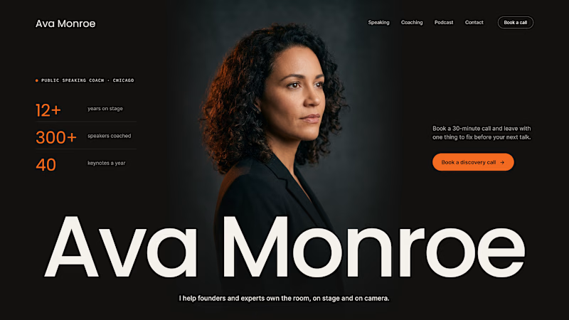
A client of ours is a speaking coach. People find her by name: podcasts, stages, word of mouth. Yet her first hero hid that name in the top-left corner.
We tested two directions:
The promise first. "Speak with confidence" in big type, the name small in the nav. Clear, but it could be any coach on the internet.
The name first. Her name at billboard scale, the promise in one line above it, her face right behind. Someone arriving from a podcast knows instantly they're in the right place.
When people search for you, your name is the headline.
Which one would you ship for a personal brand?
43 voted
51%
42 voted
49%
85 votes
Closed

Name first — podcast listeners arrive looking for her.

two brands, one tiny taste test.
would you rather look through an Oriel or answer a Calling?
winner gets the full brand. reply with your pick.
35 voted
85%
6 voted
15%
41 votes
Closed

The biggest misconception about branding is thinking it's just a logo. What actually saves founders time and money later is a compact system a focused 2–3 color palette and clear sub-brand rules so every new deck, social post, or product launch looks cohesive without starting from scratch.

Lime Cream or Peach Fuzz? 🍋🟩🍑
Two animated isometric sets — same system, different mood. Cast your vote 👇
68 voted
78%
19 voted
22%
87 votes
Closed
Lime Cream. The dark linework pops more on it.