The network for creativity
Join 1.25M professional creatives like you
Connect with clients, get discovered, and run your business 100% commission-free
Creatives on Contra have earned over $150M and we are just getting started
Back to feedPost

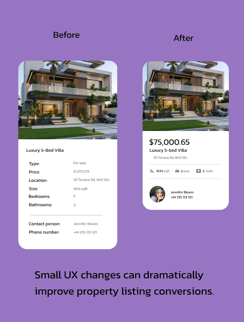
Most real-estate apps overload users with information.
When users see too many details at once, their brain feels cognitive overload → and they leave.
So I redesigned this property card with better UX hierarchy.
Before
• Too much text
• No price emphasis
• Weak visual hierarchy
After
• Price becomes the main focus
• Key details shown as quick icons
• Agent contact placed where users expect it
• Cleaner layout → faster scanning
Good UX isn't about adding more.
It's about showing the right information at the right moment.
What do you think — Before or After?
-Harika freelancer
UI/UX Designer
The network for creativity
Join 1.25M professional creatives like you
Connect with clients, get discovered, and run your business 100% commission-free
Creatives on Contra have earned over $150M and we are just getting started
Trending
retrofuturism
Share your favorite designs from the past exploring the distant future. Or your own take on the aesthetic 🚀
halftone
Dots. Texture. Grain. Let's see your designs using the halftone technique.

Midjourney
Creatives are showing off what they're making with Midjourney.
colorgrade
Video editors sound off: How do you enhance the mood of your video in color grading?
Related posts

Good design isn't about adding more.
It's about knowing what deserves to stay.
For this client, we focused on the UI design and creative UX flow - simplifying the experience without making it feel basic.
Less noise.
Better flow.
More intentional interactions.
Simple product. Thoughtful design.
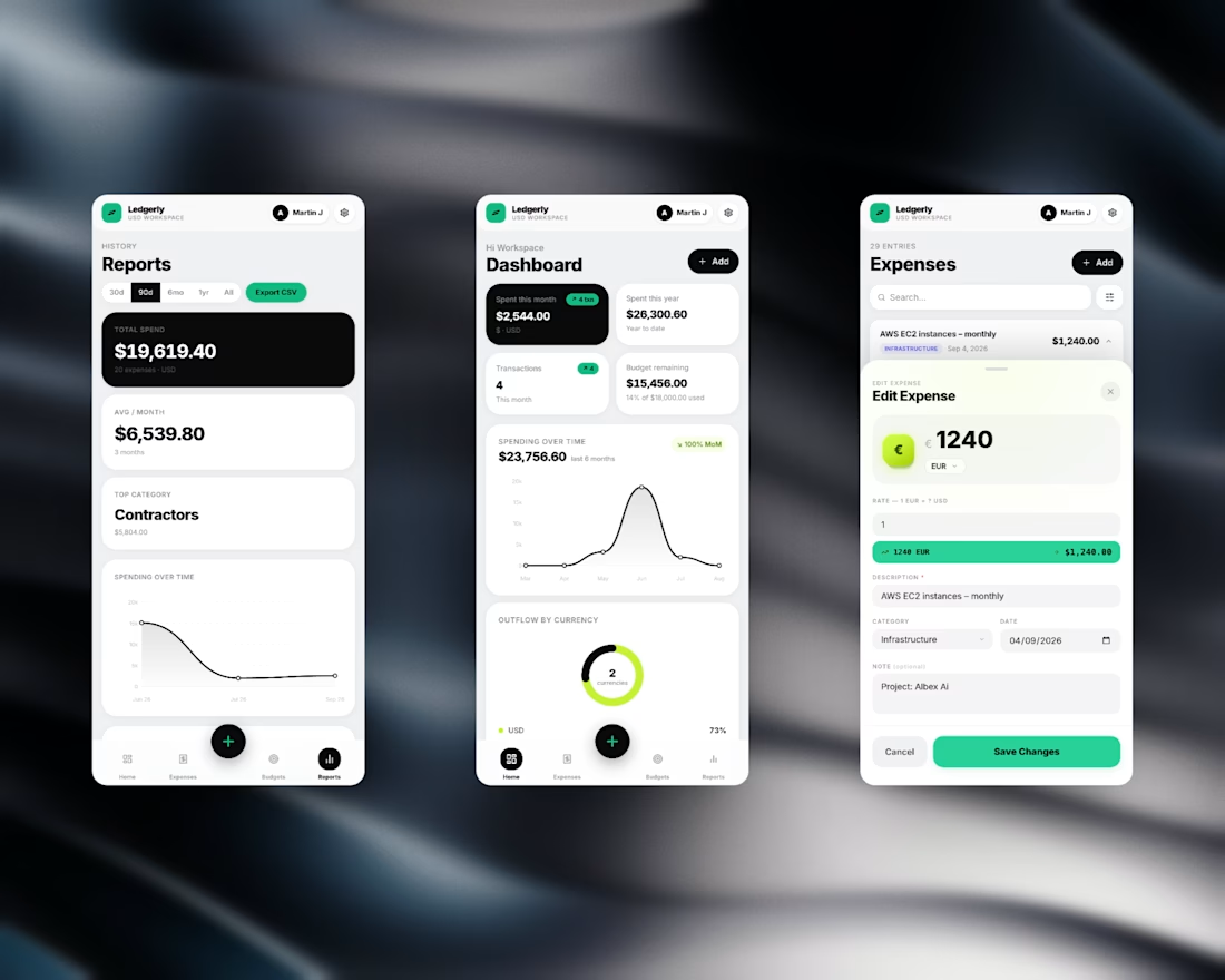

Looks super clean. Any plans to share the before screens to showcase how much the UX improved?


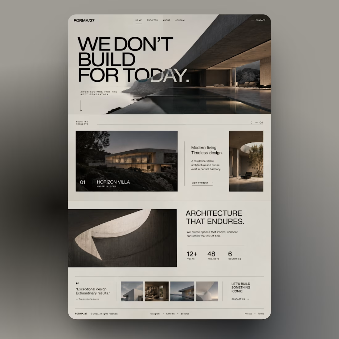
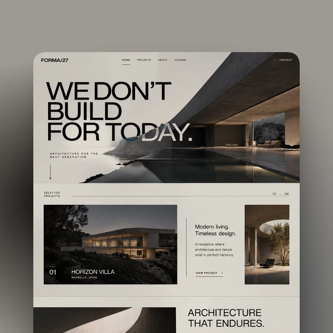


So cool with aesthetic visuals and negative text overflows!

Which background mesh gradient works better for a modern Auth UI: Left or Right? 🎨👇
I’m working on a clean login concept with animated ambient gradients, micro-interactions, and a minimalist form layout.
Design Breakdown:
🟢 Option A (Teal / Emerald):
• Dynamic contrast that instantly catches the eye
• Adds energy to the overall white UI card
• High visual hierarchy for landing/auth pages
⚪ Option B (Monochrome / Slate):
• Subtle, sleek, and dark-mode friendly
• Less visually distracting, higher focus on the form
• Minimalist luxury aesthetic
Which one creates a better user experience for a SaaS onboarding process? Drop your thoughts below!


28 voted
53%
25 voted
47%
53 votes
Closed
Option b would be incredible if you were to match the gradient color on the right panel with the visual color in my opinion, but in this case i will go with a