
Harika konda
UI/UX Designer for SaaS, Startups & Digital Products
- 1
- Followers

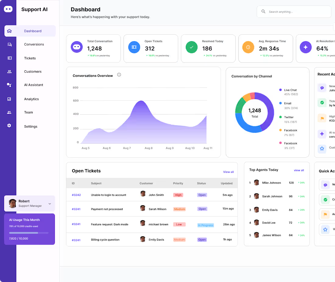
Support AI — Customer Support Management Dashboard
A customer support dashboard designed to help teams manage conversations, tickets, and agent performance.
Problem: Support teams need a clear way to manage customer requests and understand support performance.
Solution: I designed a centralized dashboard with ticket management, agent activity, performance insights, and customer information.
The goal was to improve visibility and streamline customer support workflows.
Dashboard UX
AI Product Design
SaaS/Product Design
Figma
#UIUX (https://www.linkedin.com/search/results/all/?keywords=%23uiux&origin=HASH_TAG_FROM_FEED) #DashboardDesign (https://www.linkedin.com/search/results/all/?keywords=%23dashboarddesign&origin=HASH_TAG_FROM_FEED) #SaaS (https://www.linkedin.com/search/results/all/?keywords=%23saas&origin=HASH_TAG_FROM_FEED) #AIProduct (https://www.linkedin.com/search/results/all/?keywords=%23aiproduct&origin=HASH_TAG_FROM_FEED) #ProductDesign (https://www.linkedin.com/search/results/all/?keywords=%23productdesign&origin=HASH_TAG_FROM_FEED) #UXDesign (https://www.linkedin.com/search/results/all/?keywords=%23uxdesign&origin=HASH_TAG_FROM_FEED) #Figma (https://www.linkedin.com/search/results/all/?keywords=%23figma&origin=HASH_TAG_FROM_FEED)
0
83
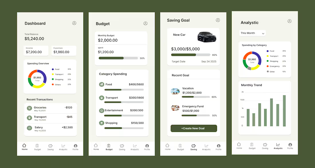
MoneyMate is a personal finance app designed to help users manage their money more easily. I focused on creating a clear and intuitive experience for tracking finances, organizing spending, and understanding personal financial information. I designed the mobile UI/UX in Figma, focusing on simple navigation, clear information hierarchy, and an easy-to-use experience.
0
122
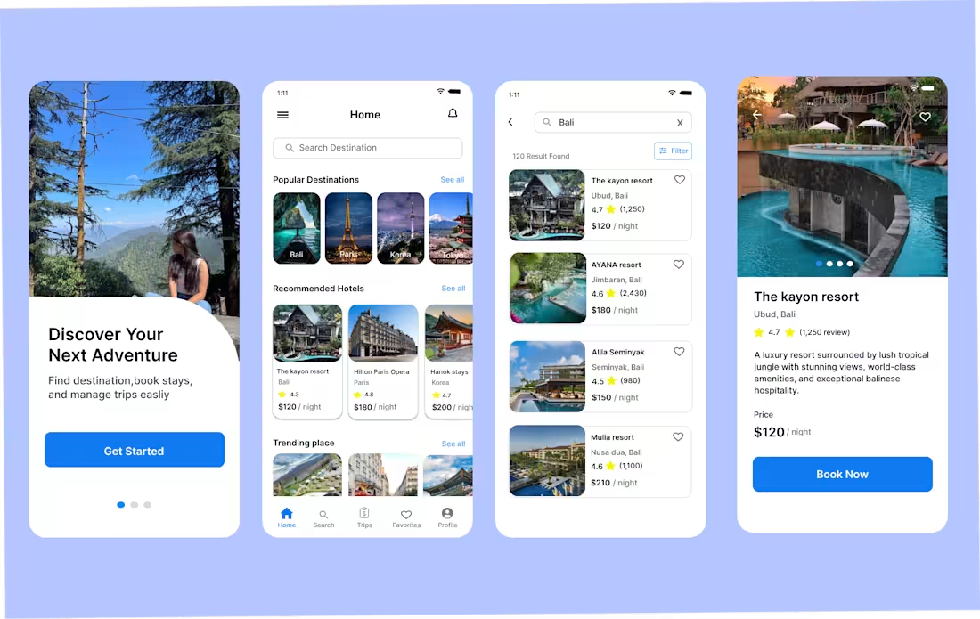
Every extra step in a booking flow is another chance to lose a customer.
While designing my travel booking app, I focused on one goal:
Make booking feel simple.
Instead of adding unnecessary screens, I kept the flow to four clear steps:
* Search a destination
* View hotel details
* Book your stay
* Complete payment
Why?
Because users don't open a travel app to admire the interface—they open it to book a trip.
A shorter, clearer flow reduces confusion and helps users complete their booking with confidence.
One design decision can make the difference between someone finishing a booking or leaving the app.
What booking app do you think gets this experience right?
0
115
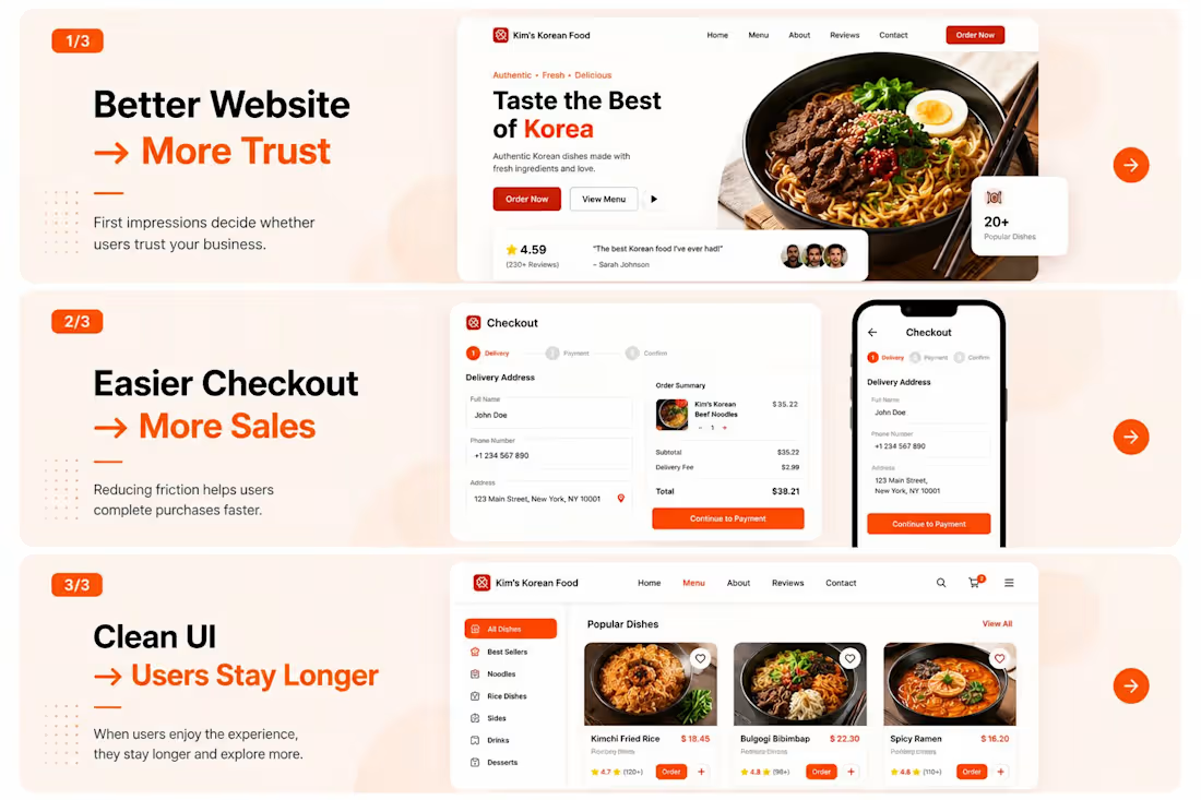
Many clients hesitate before hiring a designer.
Not because of price.
But because they think:
“Can this designer actually deliver what I need?”
Fair question.
That’s why I focus on:
✔ Understanding the business goal first
✔ Creating clean, modern UI
✔ Making revisions based on feedback
✔ Delivering on time
Design isn’t just making things look nice.
Example:
Better website → more trust
Easier checkout → more sales
Clean UI → users stay longer
It’s solving business problems through a better user experience.
Every project helps me improve—and I’m excited for bigger projects ahead.
0
112