The network for creativity
Join 1.25M professional creatives like you
Connect with clients, get discovered, and run your business 100% commission-free
Creatives on Contra have earned over $150M and we are just getting started
Back to feedPost

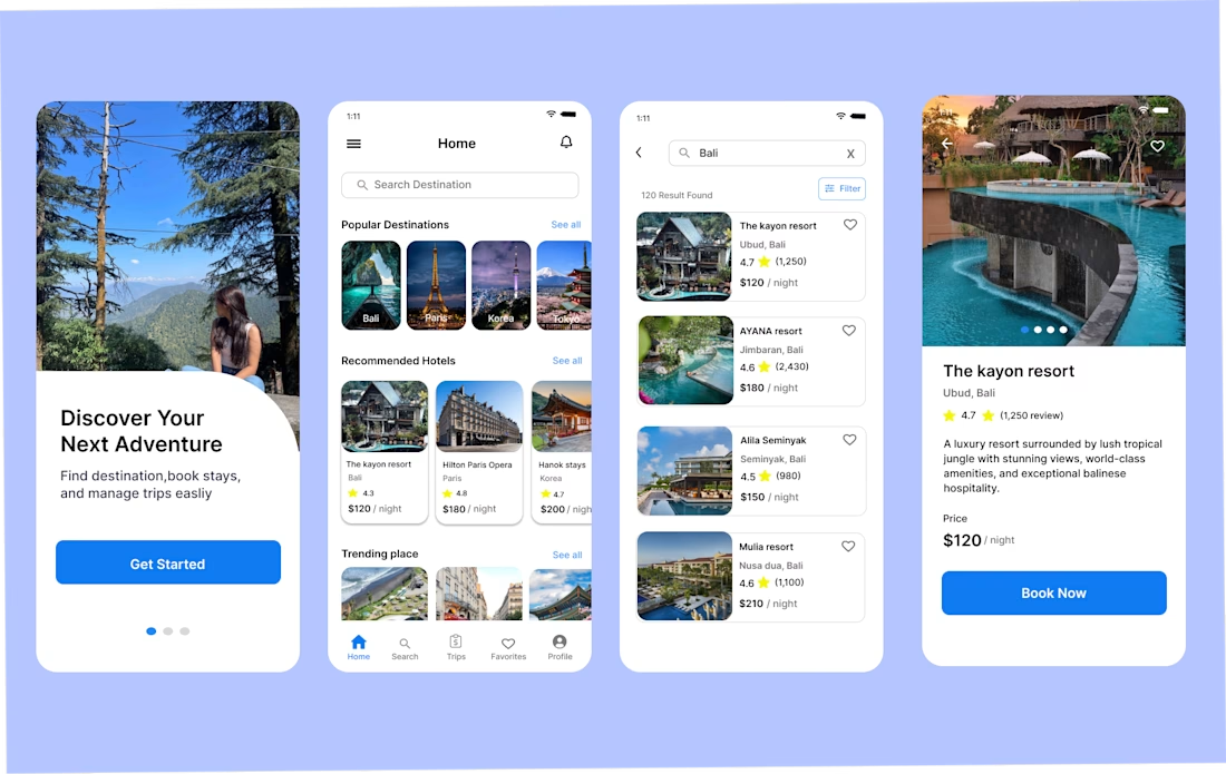
Every extra step in a booking flow is another chance to lose a customer.
While designing my travel booking app, I focused on one goal:
Make booking feel simple.
Instead of adding unnecessary screens, I kept the flow to four clear steps:
* Search a destination
* View hotel details
* Book your stay
* Complete payment
Why?
Because users don't open a travel app to admire the interface—they open it to book a trip.
A shorter, clearer flow reduces confusion and helps users complete their booking with confidence.
One design decision can make the difference between someone finishing a booking or leaving the app.
What booking app do you think gets this experience right?

The network for creativity
Join 1.25M professional creatives like you
Connect with clients, get discovered, and run your business 100% commission-free
Creatives on Contra have earned over $150M and we are just getting started
Trending
retrofuturism
Share your favorite designs from the past exploring the distant future. Or your own take on the aesthetic 🚀
halftone
Dots. Texture. Grain. Let's see your designs using the halftone technique.

Midjourney
Creatives are showing off what they're making with Midjourney.
colorgrade
Video editors sound off: How do you enhance the mood of your video in color grading?
Related posts

Attention is your strongest currency.
Most people never ask what they’ve been funding with it. Tithe is the first app built for the people who finally set the price.
Onboarding isn't for instructions it's for setting the tone.
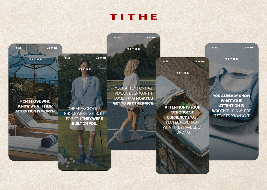

This is a really strong approach to onboarding. The raw imagery combined with that bold copy makes it feel much more like a manifesto than a standard app tutorial.

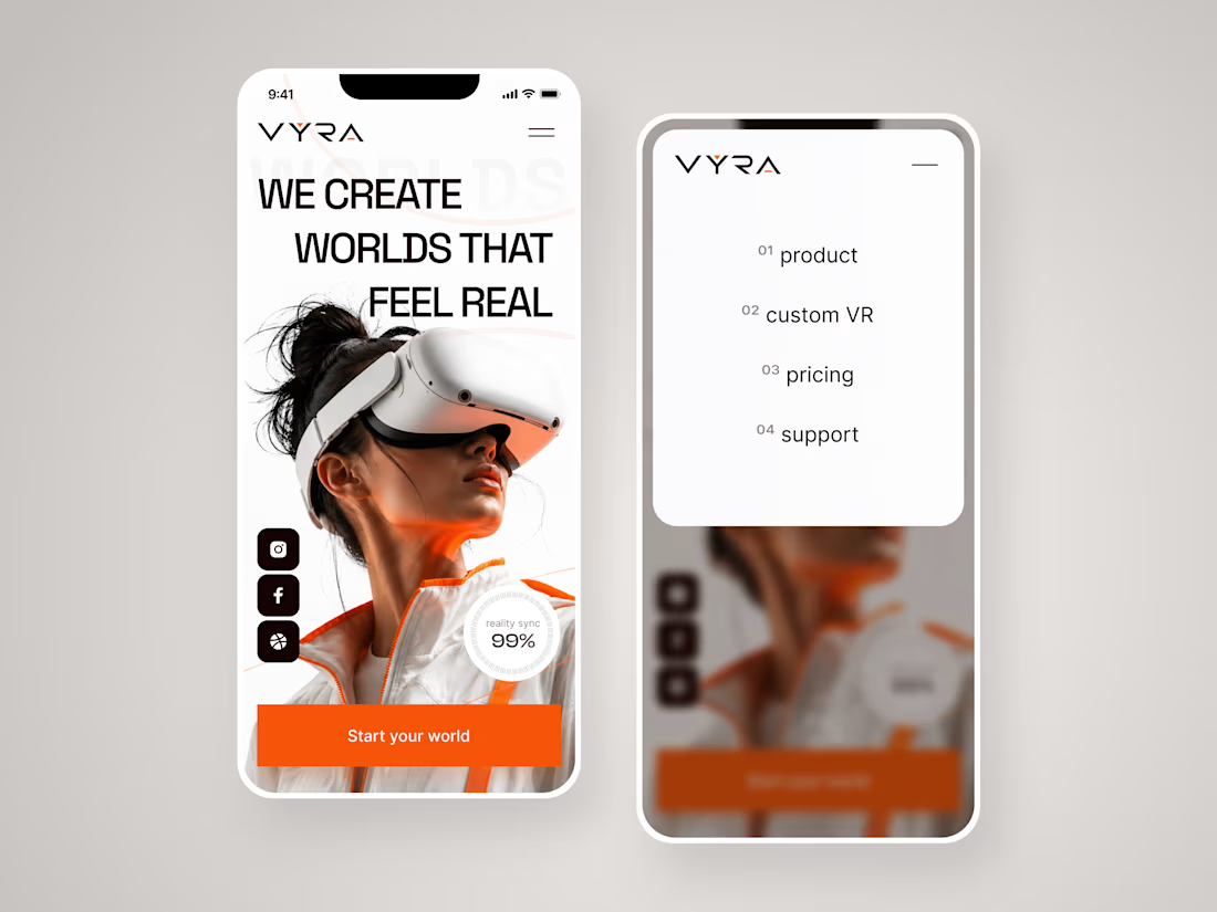
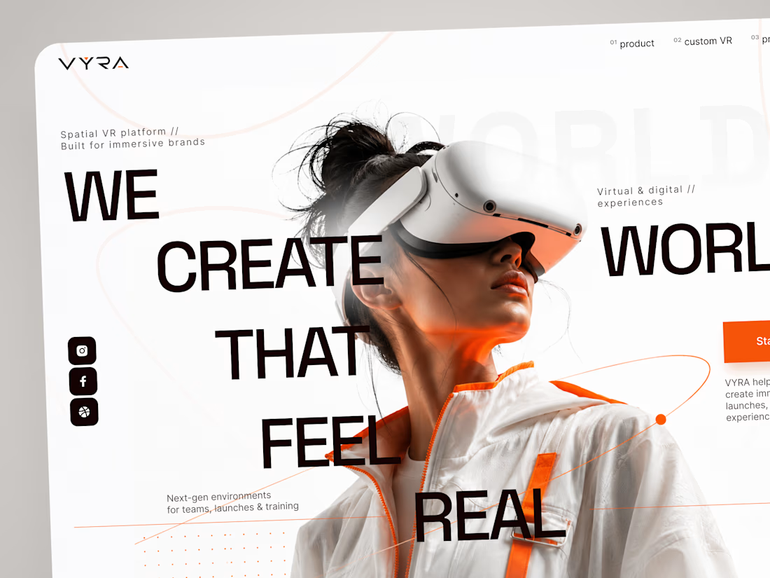
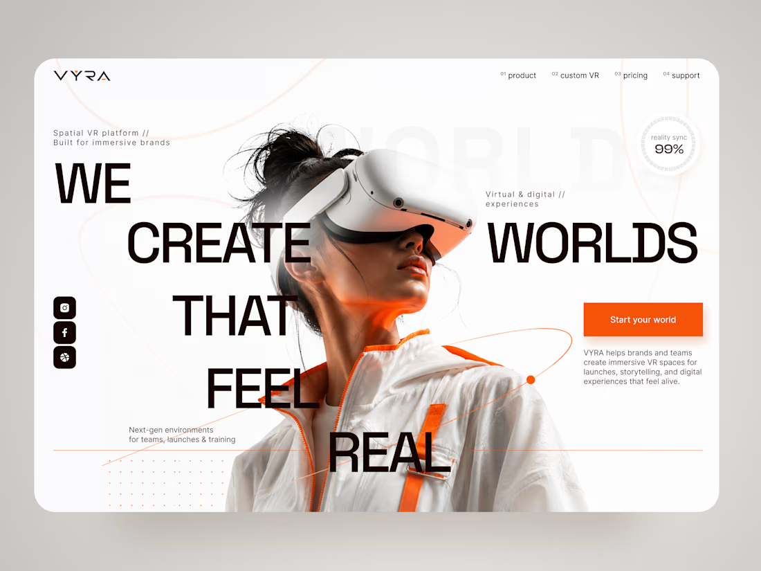
VYRA — Immersive VR Experience Landing Page 🥽✨
VYRA is a futuristic landing page concept for a spatial VR platform that helps brands and teams create immersive digital environments for launches, storytelling, training, and interactive experiences.
The goal was to translate the feeling of entering another world into a clean, premium digital interface. The visual direction combines oversized typography, immersive photography, minimal UI, and vibrant orange accents to create a strong sense of technology and motion.
Special attention was given to:
• a cinematic hero composition that immediately introduces the VR experience;
• oversized typography integrated with the main visual to create depth and movement;
• a minimal black, white, and orange palette that keeps the interface futuristic without feeling overly technical 🟠;
• subtle orbital graphics and supporting details that reinforce the idea of spatial environments;
• a clear “Start your world” CTA that connects naturally with the brand message;
• supporting metrics and micro-elements that add a sense of technology and precision;
• responsive mobile layouts that preserve the visual impact while simplifying the composition 📱;
• a clean mobile navigation experience that keeps product, custom VR, pricing, and support easy to access;
• a flexible visual system suitable for VR products, immersive platforms, and emerging technology brands.
The result is a bold digital experience that makes spatial technology feel premium, accessible, and exciting — turning the website itself into the first step toward an immersive world.
Looking to create a memorable website for your VR, AR, AI, or emerging technology product?
Let’s build a digital experience that feels like the future 🚀



Amazing


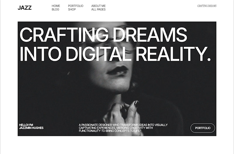
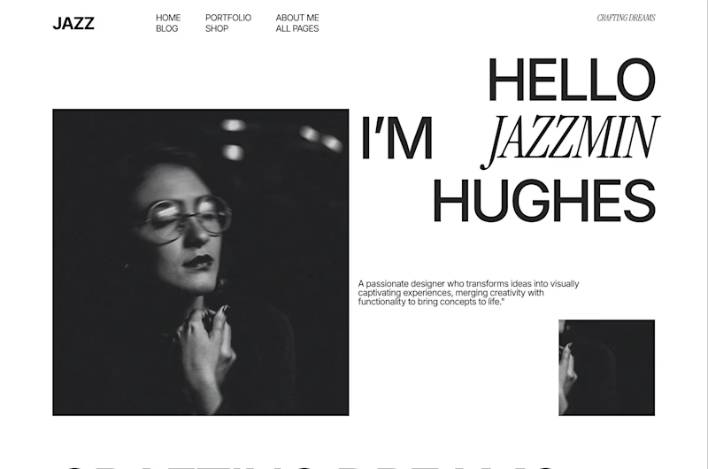
You’re looking for a designer and land on one of these.
Same person, same photo, two very different introductions.
Which one makes you want to see their work?

70 voted
52%
64 voted
48%
134 votes
Closed


the two intros feel very different. which one won?