The network for creativity
Join 1.25M professional creatives like you
Connect with clients, get discovered, and run your business 100% commission-free
Creatives on Contra have earned over $150M and we are just getting started
Back to feedPost



Beautiful work!

Thank you!


So cool with aesthetic visuals and negative text overflows!
Thank you!

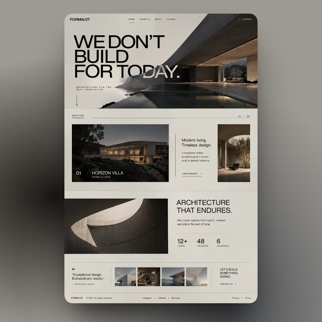
The whitespace balance here really lets the copy breathe. Did this end up in Framer or Webflow, or did it move between both before you landed on a stack?
Thanks! I’m building it in Framer right now. And yeah, that was the idea — just giving the text some room to breathe and keeping things clean and simple.

Thank you.

Love the layout
Thank you.

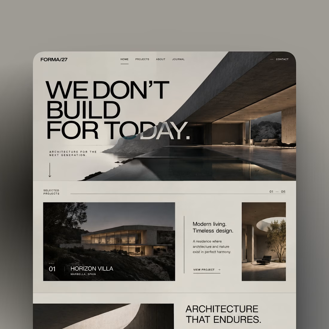
Really strong visual hierarchy here. The dark, atmospheric tone combined with the structured grid gives the whole brand a very timeless, enduring feel
Thank you.


Clean design !
Thank you

Thank you

This deserves more than just liking, this deserves to be featured! 🏆 Clean layout architecture paired with generous negative space makes the UI feel ultra-polished.
Thank you. Glad to hear that

Super clean and premium, great job Stefano!
Thank you. I appreciate it

Which tool you have used? Framer?
For prototype design : Figma
And now im working on it in Framer.
Website will be able in few days.
great..💯

LOOKS NICE ✨
Thank you

Exceptional work! 🔥🔥
Thank you

Looks cool, great work!
Thank you

nice design...
Thank you

Love it
Thank you

Thank you

wow... loved it!
Thank you

Thank you

The restraint here is excellent—strong typographic hierarchy, generous spacing, and that architectural imagery make the landing page feel both premium and easy to scan.
Thanks

Great work
Thank you

Thank you

you really nailed with this designs, deserves a goat
Thank you very much
You're welcome man

Great typography, color and composition!
Thanks


great work
Thanks

Nice🔥
Thank you

Love the way the page bg color blends with the hero image.
Thank you

Thank you

It leaves an impression
Thank you

Thank you
The network for creativity
Join 1.25M professional creatives like you
Connect with clients, get discovered, and run your business 100% commission-free
Creatives on Contra have earned over $150M and we are just getting started





Related posts


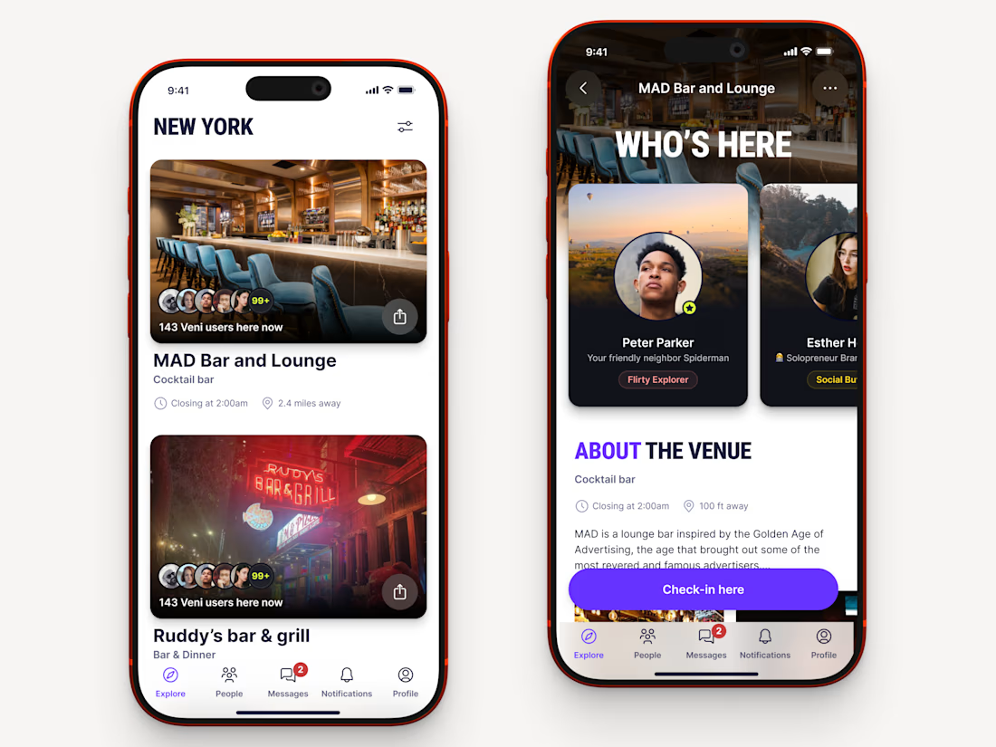
Recently worked on a mobile app for local networking.
Find venues (bars, clubs, conference halls, etc..) nearby, see who's there and connect.


I haven’t posted much lately because the work got intense.
Two Webflow builds I’ve just finished: MavBio and Jemba9.
One works with biomaterials for medical and research applications. The other builds mission-critical technology for the space industry.
Very different worlds, and genuinely exciting projects to work on.
I’ve also wrapped up a much larger wellness platform that is now being turned into a full case study, while a few new projects are already underway.
A small preview for now. More soon!


wow, the smoothness is mindblowing here

Sections from Landing page design for Folk.
The design style was very exploratory, had to find the right approach at every turn.
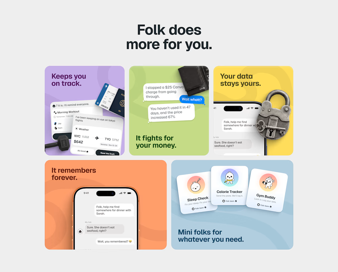
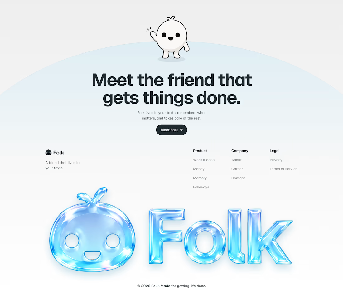
The right one is high end