The network for creativity
Join 1.25M professional creatives like you
Connect with clients, get discovered, and run your business 100% commission-free
Creatives on Contra have earned over $150M and we are just getting started
Back to feedPost


The network for creativity
Join 1.25M professional creatives like you
Connect with clients, get discovered, and run your business 100% commission-free
Creatives on Contra have earned over $150M and we are just getting started







Related posts


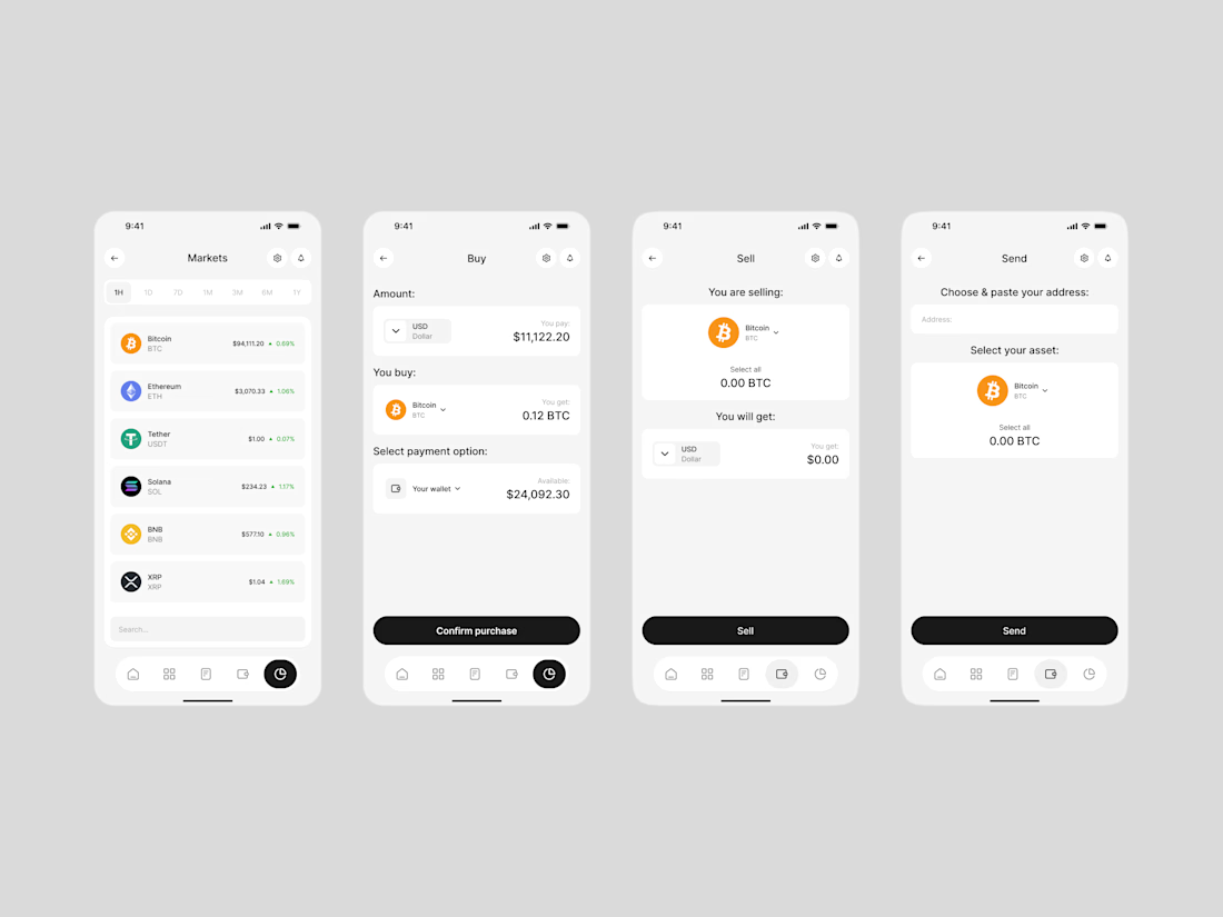

You nailed the overall mood here. The details just reinforce it nicely.

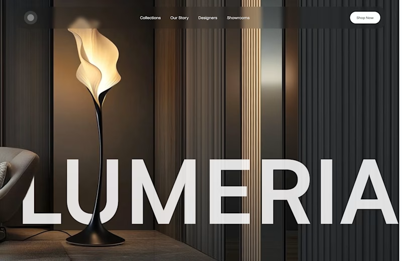
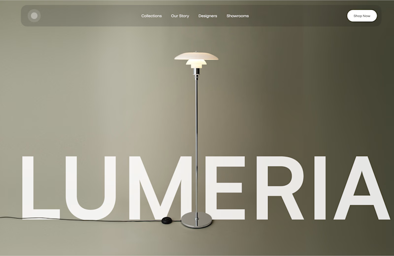
A little design exploration for practice ✨
This time, I’m working on a concept for a lighting brand.
Which direction do you prefer?
74 voted
70%
31 voted
30%
105 votes
Closed

Atmospheric, for a lighting brand it feels almost unfair not to show the product actually doing its job in a real room. The minimal version reads more like a furniture catalog to me. Is Lumeria leaning toward a specific price point or market that would push this one way or the other?

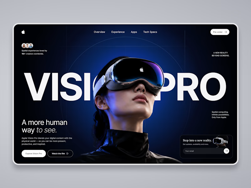
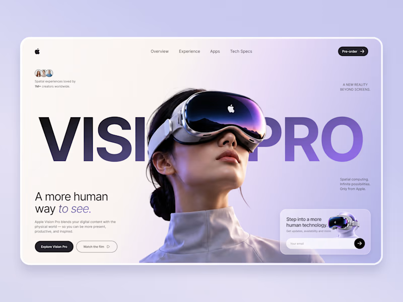
Which Apple Vision Pro Landing Page Feels More Premium?
I'm exploring two visual directions for an Apple Vision Pro landing page concept and would love your feedback.
Option A: Dark cinematic interface with immersive spatial-computing vibes.
Option B: Soft lavender & light minimal interface with a premium Apple-inspired aesthetic.
Which version would you choose for a real product launch page, and why? Your feedback will help shape the final case study.
10 voted
59%
7 voted
41%
17 votes
Closed

Option A wins...Its visual appearance suddenly grad against Option B!!