The network for creativity
Join 1.25M professional creatives like you
Connect with clients, get discovered, and run your business 100% commission-free
Creatives on Contra have earned over $150M and we are just getting started
Back to feedPost
Taste Test
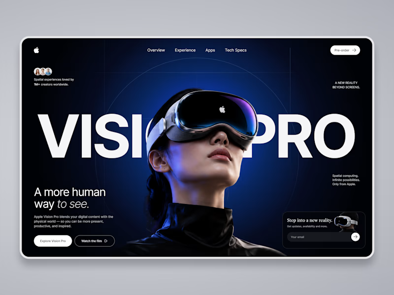
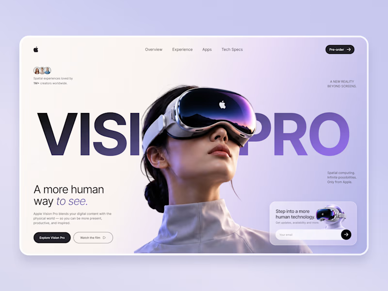
Which Apple Vision Pro Landing Page Feels More Premium?
I'm exploring two visual directions for an Apple Vision Pro landing page concept and would love your feedback.
Option A: Dark cinematic interface with immersive spatial-computing vibes.
Option B: Soft lavender & light minimal interface with a premium Apple-inspired aesthetic.
Which version would you choose for a real product launch page, and why? Your feedback will help shape the final case study.

11 votes
Ends in 1d


Thanks a lot, Ganesh! 🙌 Glad the lavender gradient and imagery stood out to you. That balance between a soft futuristic palette and product focus was exactly what I wanted to achieve.

Option B looks clean and futuristic 💜
Thank you so much! 💜 Really happy you liked Option B. I was aiming for a clean, futuristic feel while keeping the Vision Pro aesthetic minimal and premium.

A for me. The dark cinematic direction feels more immersive and gives the Vision Pro a stronger sense of depth and spatial computing. It also makes the product feel more premium without adding unnecessary visual noise.
Appreciate the thoughtful feedback, Ankit! 🙏 I can totally see why Option A feels more immersive. The cinematic depth was a strong direction, and it's interesting to see different perspectives on premium visual storytelling.

Option A for the launch page. Apple sells Vision Pro on depth and environments, and the dark cinematic frame lets the hardware and the spatial UI actually glow, the way their own product pages do. Option B is lovely, but it reads closer to a wellness app than a spatial computer,...

Option A wins...Its visual appearance suddenly grad against Option B!!
The network for creativity
Join 1.25M professional creatives like you
Connect with clients, get discovered, and run your business 100% commission-free
Creatives on Contra have earned over $150M and we are just getting started




Related posts


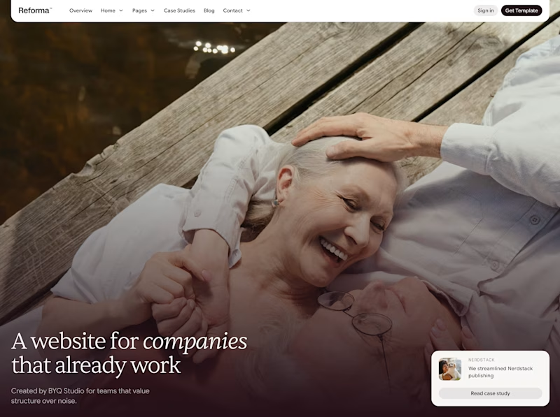
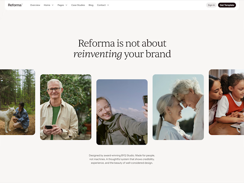

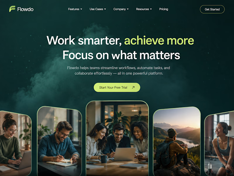
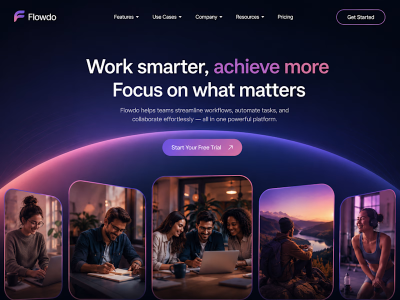
One header, two color stories.
Green: cool tones, feels productive and safe
Purple: gradient glow, feels modern and premium
Same words. Different first impression.
Which one would make you click "Get Started"?
26 voted
59%
18 voted
41%
44 votes
Closed

Went with calm and focused. The copy is literally asking people to focus on what matters, so a header that competes for attention with a glow works against its own message.

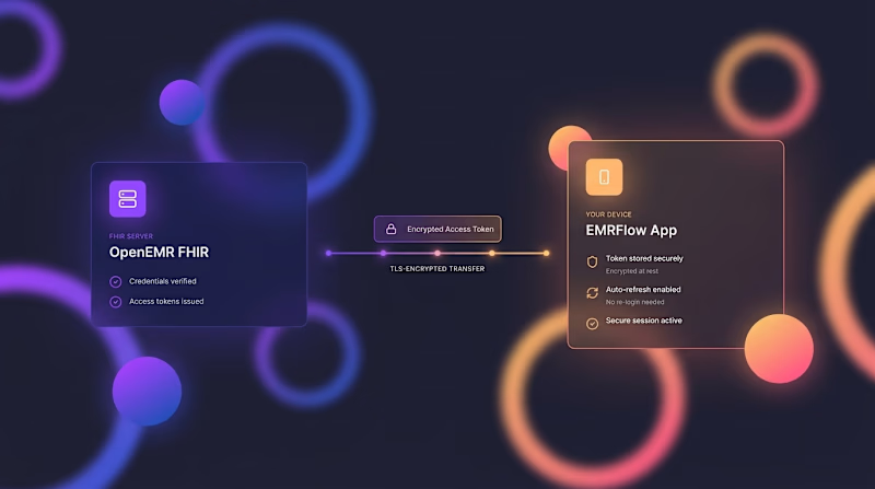
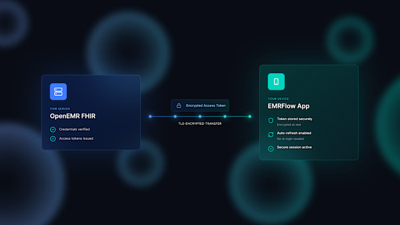
Today in the program, we have a color palette battle for the next video. The two color codes compete for the right to be replaced with regular white during the montage phase 😂🤣

19 voted
50%
19 voted
50%
38 votes
Closed

A is the best