The network for creativity
Join 1.25M professional creatives like you
Connect with clients, get discovered, and run your business 100% commission-free
Creatives on Contra have earned over $150M and we are just getting started
Back to feedPost
Taste Test

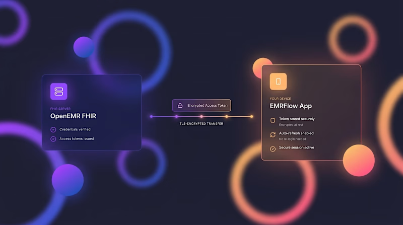
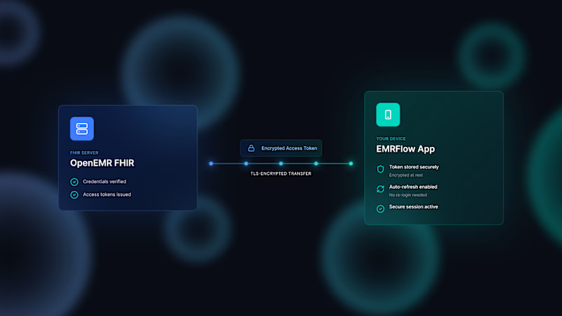
Today in the program, we have a color palette battle for the next video. The two color codes compete for the right to be replaced with regular white during the montage phase 😂🤣

6 votes
Ends in 1d

Went with B. The teal reads calmer and lets the white UI cards stay the focal point, the orange in A is nice energy but it starts competing with whatever accent color the actual product uses.
Thanks, Rafee, it's really useful comment

B for me cooler tones just feel more "secure/trustworthy" for a security product, A feels more like a lifestyle app 😄
Thanks for deeply comment

However both are best in their space. A is vibrant, B is more 'tech' cool.
Intresting opinion, thanks Joyjit

B has the stronger hierarchy for me—the teal keeps the UI cards calm while the soft glow gives the frame depth. Nice way to turn a simple palette test into a clear motion-design decision.
Thnaks a lot, Rohan


I’d pick B. It feels more distinctive and gives the visuals more personality. The color direction adds more energy and makes the piece stand out.
The network for creativity
Join 1.25M professional creatives like you
Connect with clients, get discovered, and run your business 100% commission-free
Creatives on Contra have earned over $150M and we are just getting started

Challenges
View all


Related posts
A new challenge arose before us, what style should we move into? More reserved, or, as we call it, "Glamour" 😁
15 voted
43%

20 voted
57%

35 votes
Closed
Option2, but it depends on what kind of brand this is.


🎛️ TASTY TEST 05/30
No growth insight today. Just playing with mobile app design and making digital music feel a little more physical.
Same music app. Same record. Two ways to explore it.
💿 A PULL ONE OUT
Browse the crate, explore formats, and make the collection part of the interaction.
🟥 B PICK A SIDE
One record takes over the screen. Cleaner, bolder, more graphic.
One direction is about discovery and tactility. The other is about focus and visual impact.
No metrics. No right answer. Just a playful mobile UI and interaction design experiment.
Which one do you prefer, A or B? And why?
❤️ Like it if you want more experiments like this.
Follow me for more mobile app concepts and product ideas.
Which direction would you want to play with first?
A 💿 Pull One Out
B 🟥 Pick A Side

40 voted
47%

45 voted
53%

85 votes
Closed

A! super smooth work🙌


Dark